I completely understand the apprehensive feelings people get when they are deciding to make color and design choices for their homes or commercial spaces.
I get it! It can be very daunting and confusing to choose colors and design schemes that could potentially last for years. This is especially true for beginners who have little-to-no experience.
Whether homeowners are picking exterior paint colors or interior paint colors, without the guidance of an experienced color consultant – the process can be very overwhelming. Thankfully, you’re not alone.
It’s my passion to help people improve their lives with color; even experienced designers need help from time to time.
In this post, I am offering some design tips and color-inspiration strategies that might be just what you need whether you are a beginner or an experienced professional.
In this article, I’m going to cover five color and design tips that beginners can use to bring some beauty and inspiration into their lives. No prior experience necessary!
1. Consider the Emotional Intention of a Space
Let the emotions of a space guide your color selection.
We’ve discussed how colors affect mood, and it’s very important to keep this in mind when choosing colors and design motifs for areas in your home. I suggest you give some thought to specific emotions you want to feel in a space.
Do you want it to be relaxing, soothing, or understated? Perhaps you want a space to feel energized and fun.
Consider the emotions you want to feel, and let that be your first step in creating the color palette for your home.
If you are looking for soothing colors, think of softer colors whether they are in the blue-greens, softer grays and even delicate colors such as a pink or salmon color.
Are you looking for a more energetic palette? Try colors such as playful lime green or bright orange. Bright and cheerful, these colors might be too much for a whole room but they might be just the accent colors you need!
In addition to the emotions, focus on what the needs are for the room. Perhaps you want a quiet and relaxing bedroom or a bright and cheery breakfast room.
Think about your emotions and the needs of the room first. It’s a great place to start when creating your color palette or planning the colors that will be the foundation of your design.
If you’d like to add some color accents to space to add some personality and flair, that is great. But you don’t want to make a color choice for a space that is counterproductive to what activities happen within it.
2. Simplify, and Rely on Color and Texture
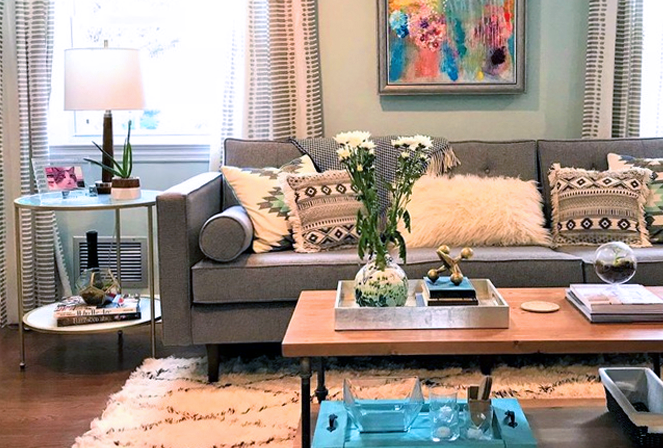
Take a close look at the textures you are incorporating in your design, and find your color inspiration within those beautiful textures.
By adding some color to match the mood and accentuating the natural textures, you can create a beautiful, color-inspired room without letting the textures inspire you. Also, start with a simple design, and let the design elements add to the space over time.
People tend to add too many accessories and additional elements to their design schemes and lose track of the goals in their design. Your kitchen, mudroom or even master bedroom will not feel more inspired just because there are more pieces of furniture, items, knickknacks or soft furnishings occupying the space.
I may add, I am not against design/decor accessories. I love pillows, candles, fine art and other accessories placed tastefully in a space.
But, these accessories should not be used to overcompensate for a space that is void of color or design inspiration. Use tasteful and dynamic color schemes to highlight areas of the home, areas that work hand in hand with the textures of your home.
Want to understand what colors will work best for your space?
My Online Paint Color Consultant services can help!
3. Design for Your Line of Sight
Colors visually overlap when you are choosing the colors going from one room to the next. You have probably heard the words “choose colors that flow” throughout your home.
Another part of that decision is to think about not only the colors, but also the elements in each room and what you see from every angle as you move through your space.
When thinking about the design layout of a room, you should consider what the line of sight will be for the tasks that will be happening in the space.
For instance, you’ll want to orient furniture and hang your television at eye-level height for an optimum viewing angle for anyone in the room without furniture obstructing the line of sight.
For your kitchen, if you’re thinking about where to put an island or bar top, think of how guests will enter the space and where you would like their eyes to focus while dining and relaxing.
In your home office, it’s optimal to orient the space so you have a lovely window view, if possible. Put your furniture and work supplies in a space that allows for some visual freedom to look at sights other than work screens.
You want your design scheme and layout to support a positive line of sight, and whatever items, furniture or architectural features that occupy that space to be pleasant. If you’re in a small living space, see my blog on best practices for working within the confines of a little room.
4. Accent With Contrasting Colors
Dark colors, like a deep navy blue or black, are excellent to use as accent colors on the interior or rooms of your home.
Bright colors like brilliant corals or sky blues, can be equally effective as an accent color that will liven up a room.
If you are looking for colors that have the power to create dynamic contrast in the room, dig deep and think of colors you absolutely love that make your heart sing.
You may not want to decorate a whole room with a brilliant red, but choosing it as your accent color might be a perfect choice! If you are designing your space with neutral or softer colors, adding contrasting accent colors can be a whole lot of fun!
Use your accent color sparingly and they maintain the excitement you are looking for. Some people choose their accent colors first, and once you have those colors chosen decorating the room in a subtle or neutral color is an easy way to go and is not nearly as daunting.
Wherever you have contrasting accents in the room, colorful rugs and pillows in the living room or dark granite countertops, accent colors can drive a successful design.
They can even be an accent color for the legs on your kitchen table. Accent colors add personality to a room and can give a neutral space the spark of interest that will keep the room interesting and fun to spend time in.
Find Your True Color-Inspiration
Although I have outlined some basic guidelines to follow with color and design, I don’t want you to be afraid to experiment and discover your true color-inspiration!
Sure, you don’t want to make lavish and dramatically impulsive decisions when painting your home, but it doesn’t mean that you shouldn’t be listening to that little voice in your head telling you a color palette excites or inspires you.
Test out those colors that you have always wanted to try, and find the inspiration that can pull together a whole design.
Here are a few different ways to jump-start the design of your home. Find the one that feels right for your sense of style.
Layout your design elements and remember to sample the colors before you go right to painting room after room. Experiment with your tastes and find a balance that works best for your use of each space and your personality.
Remember, a color expert is available to help you discover the best color and design schemes for your spaces.
If you have any color and design questions, please reach out!
Excellent advice, Amy! Especially to consider line of sight – doubly important in smaller spaces that need to feel cohesive to live large!
Great point Janet, the flow of colors through a space is of utmost importance!
Great tips and I was inspired by playing with the idea of a great accent color on the table legs:) I am going to have to try that!
Yes Mary Ann, I love that idea, especially because it’s an unexpected place for an accent color! (It works beautifully!)
Such great ideas on where to start with color. I particularly like your advice on accent colors
Thanks so much Lisa, I am glad you are enjoying my blog posts!
Excellent advice, Amy. All of your tips are perfect for someone who is not sure where to start!
Thanks Sheri, as an excellent designer it’s easy to know where to start. For the less experienced, starting the process can be so daunting!
I love this Consider the Emotional Intention of a Space.
Thanks Robin, this is sometimes the most important factor to keep in mind!
Hi Amy: As the color expert. you are, I loved all of your tips, especially the one on line of sight. That’s so important to consider. Having spent so much time this year at home, I am acutely aware of this one.
Thank you Leslie, I find homeowners think of one room at a time, where the most successful color plans take all the rooms into consideration at once.
From you the color expert Amy, my fav of your points was to determine the mood of the room. I wrote in my book about a home’s soul which is exactly my take away from your point nimber one. The line of site was also critical that many underestimate its value. All good points for beginners and pros alike. Bravo again!