What crazy times we have been through starting almost a year ago! 2020 was a trying year, to say to least; it tried our patience and raised our stress levels in many ways. However, as a color expert, you know I’m a firm believer in the healing power of color and design, and I think 2021 will be an excellent year for a fresh start with fresh colors!
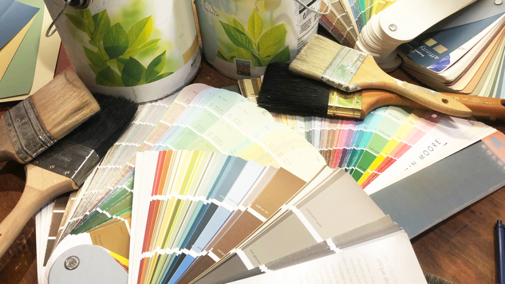
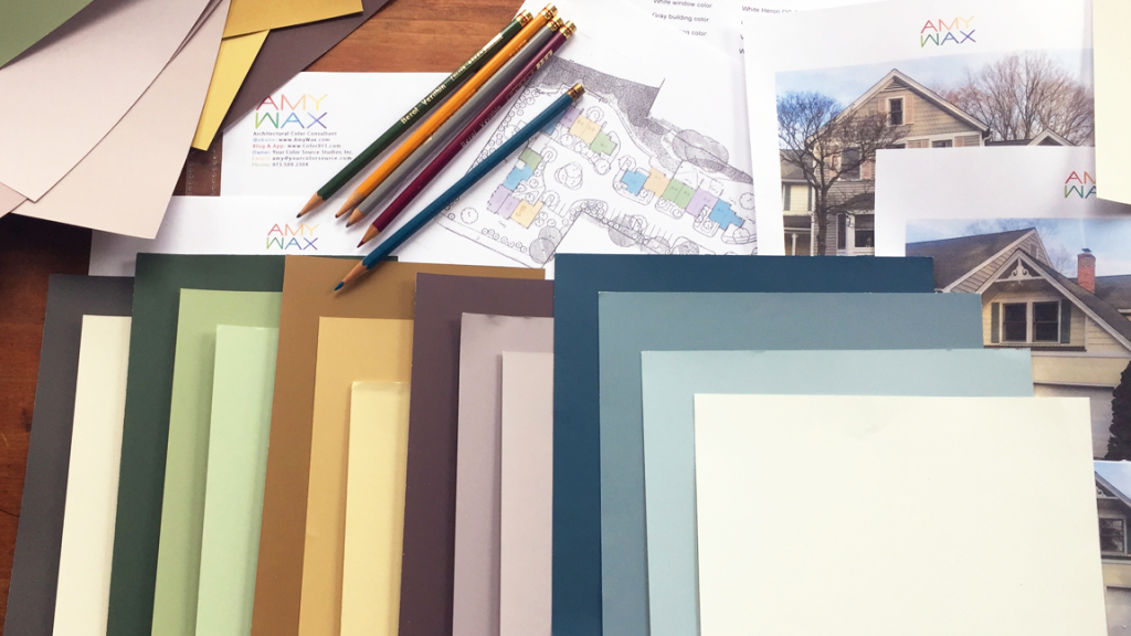
In this blog, we will be discussing what I believe will be the top 2021 color trends to look out for as we begin the new year. This is the perfect time to regroup, look at where we are, and look towards the future.
If you follow me on Instagram and Twitter, you will know I am not someone to be pulled down by the world around us; I am quite the opposite. Let’s look to see how we can improve our lives through the use of color and design. There’s no better time than now to get started!
I feel interior designers and color consultants will be leaning heavily on playful colors that are simultaneously relaxing to the body, mind, and spirit.

Among what is to be the most popular and discussed 2021 color trends comes from Pantone. Pantone’s color of the year is eagerly awaited by many fashion, art, and design communities. This year to the shock of many, Pantone has picked two colors to receive their prestigious color of the year award.
The two colors chosen by Pantone are meant to be appreciated as a brilliant combination that is much stronger than each color standing on its own. The colors are PANTONE 17-5104 Ultimate Gray and PANTONE 13-0647 Illuminating.
The ultimate gray is precisely what the name represents, a stable and firm gray that is simultaneously calming and neutral. The Illuminating color is both a warm and bold yellow. Together these colors create a lovely harmony of emotion.
Pantone describes the colors as supporting one another, which we all need to do this upcoming year. These color choices represent how unified colors, even though different, can create a confident, bright, and hopeful ora in the home. As Pantone puts it, the color combination is:
“Practical and rock solid but at the same time warming and optimistic, the union of PANTONE 17-5104 Ultimate Gray + PANTONE 13-0647 Illuminating is one of strength and positivity. It is a story of color that encapsulates deeper feelings of thoughtfulness with the promise of something sunny and friendly.”
Don’t be surprised to see this color combination and similar combinations very popular with homeowners and designers in 2021.
If we think back to one of the essential reminders/lessons we experienced in 2020, it was a return to a deep appreciation for nature. Sharing nature and partaking in routine outdoor activities became so necessary in 2020.
Going into nature wasn’t just to maintain a sense of calm and mental health; it was also one of the few places we could safely meet friends and family while practicing safe social distancing. This is why I expect earth tones to be trendy among homeowners and interior paint consultants in 2021.
Colors that are rich, deep, and warm like a deep tree bark brown, moss green, and oceanic blues will help bring the outdoors indoors, honoring the nature around us that is too often taken for granted.
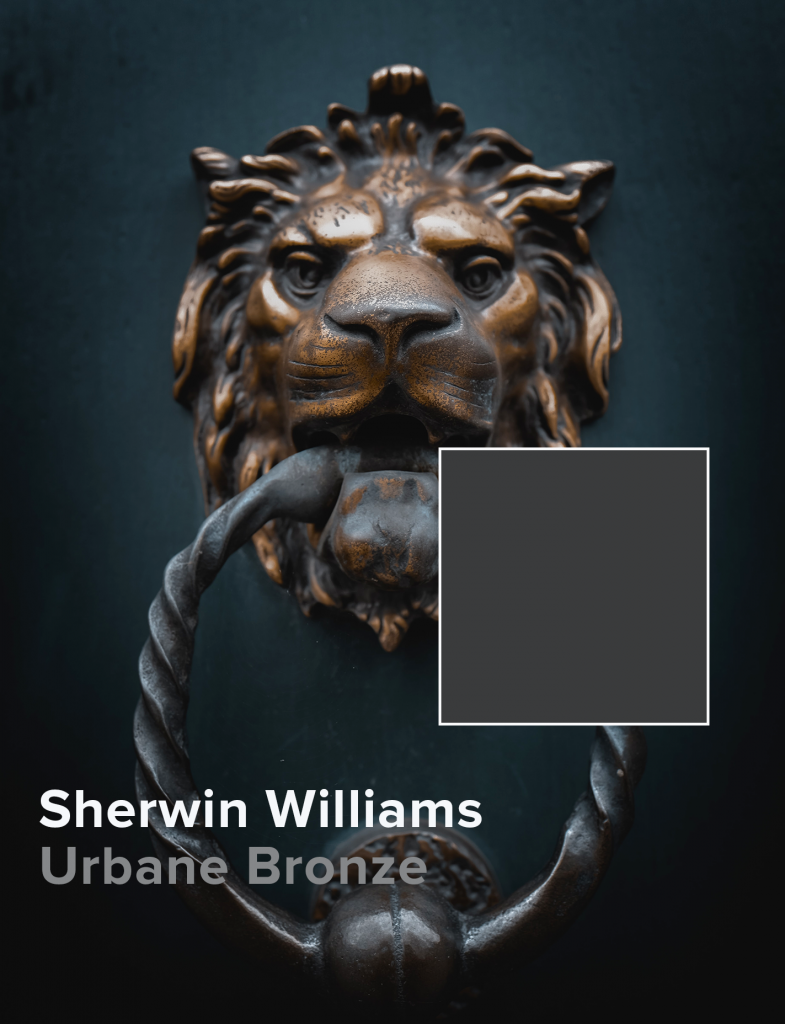
Looking at colors that some of the dominant paint companies are celebrating this year, they appear to be taking a closer look at nature’s color palette. Sherwin Williams selected Urbane Bronze as their color for 2021, and I think it is a great choice. A color that reflects our need for coziness and warmth; it anchors every space with deep saturation without appearing muddy or muted.
Sherwin Williams describes it this way: “Urbane Bronze might be a color rooted in nature, but it also has a unique ability to ground a room through organic appeal.”

There are two other choices that I want to mention, which I see as looking positively towards the future. If we are looking for a comforting color that is soothing and safe, that leads us to Benjamin Moore’s choice of Aegean Teal. A dustier blue-green, this color is more versatile and easy-going than many colors in the color wheel. I love this choice because it blends beautifully with both dark and lighter colors, everything from shiny brass to earthier chocolate browns.
Benjamin Moore’s Andrea Magno describes it this way: “It has a really beautiful blend of blue and green with a touch of gray that gives a softened elegance that’s very inviting,”
I find another choice genuinely inspiring with brilliant clarity, and that is the color selected by Dunn Edwards. Their color for 2021 is called Wild Blue Yonder. I enjoyed watching their video, and I highly recommend looking at it yourselves. It talks about our starting in the blues, reflecting on our last year, and energetically looking towards the future. That is exactly where I am at, and the reason I wrote this blog post.

Sara McClean describes this optimistic choice this way: “a light, airy and soothing pale blue — encourages us to slow down, take a deep breath, and approach 2021 with new hope and confidence.”
It’s time to look ahead and focus on improving our lives by surrounding ourselves with colors that bring you happiness.
I expect to see brighter neutral colors for 2021 color trends. Darker neutrals will take a back seat to slightly more optimistic neutral colors, like creams, mints, and happy blues. On top of that, I anticipate a popular market for upbeat and friendly colors that express our future optimism. I have seen many an article predicting more spirited colors intended to lift our spirits and give us a fresh start!
No one in the world was unaffected by the events of 2020. As we enter 2021, each of the companies I listed above is sharing collections of colors that work together.
Each color is only as good as the colors it is paired with, and choosing the color you will choose to live with works the same way. Feel free to select one of the four colors listed above, or take a closer look at the colors that complement each other for a more complete, complementary color palette.
I’d love to hear how you think colors will help change people’s lives for the better and what trends you believe will emerge in the coming year.
Have a safe, happy, and color-inspired new year! Please reach out with any color questions. I’d love to hear your story.