As I sit here writing, we are on the verge of fall. While it’s still very summery-feeling outside, and the heat has not left us entirely, there’s a hint of crispness in the air, and the light of day is fading into something softer and more relaxed.
September is a beautiful month of transition; people have such an affinity for it because it calms the mind, the pace slows down, and we all get to say goodbye to summer the way we please. I’ve cautioned against rushing September away in favor of the all-mighty pumpkin season and all that comes with it, and I stick with that sentiment.
With this article, I wanted to create a “master guide” to help you prepare for harvest season and approach your harvest color and decor choices with ease and fluidity. Enjoy the rest of September; don’t rush it away, but use these tips and design strategies for when harvest season kicks into full gear!
There’s a high likelihood that you don’t need me to tell you what the classic/timeless harvest colors are, but just as a brief reminder, here are the core colors to work with as the season sets in:
Harvest (pumpkin) Orange – The color most synonymous with harvest season; variations of deep, earthy orange will evoke the warmth that defines autumn and add a vibrant, cozy touch.
Soft Golden Yellow – Picture the harvest fields and fall sunlight during a late afternoon walk. The color is simultaneously vibrant and gentle, an unmistakable harvest color.
Burgundy Red – A rich, deep, and weighty hue that adds depth and grounds the other harvest colors with foundation.
Sienna – A warm, earthy brownish-orange that grounds the more excited harvest colors and offers a strong base to work with. I like to picture rich soil after a fresh fall rain.
Olive Green – While not the most synonymous with harvest season, a soft, muted green represents that fleeting moment when the trees are holding onto summer but collapsing into fall.
Harvest season is all about embracing warmth by surrounding ourselves with warmer colors. It’s not at the same level of embrace as it would be in the middle of winter, but it acknowledges that the seasons are transitioning. With the crisper, cooler weather, it’s about reintroducing a more intimate, cozy setting back in the home.
Here are some fantastic colors that meet that criteria but also offer some alternative presence to the classic harvest colors:
Plum – A rich, deep purple that is much more powerful than some people give it credit for. Plum is a focused and mature color in the purple family that adds elegance and warmth to any space.
Copper – I love copper; it’s a magnificent earth mineral. Its rich and warm earth tone is both sweet and spicy. Copper is in the warm-brown family, so it goes beautifully with wood. I also love using actual copper with its rusty shimmer; it’s the perfect accent color for any fall arrangement.
Mustard Green – A muted yellow-green, mustard green is great in this sense; it’s not too different from some of the classic harvest colors but has just enough unique identity to be distinguished as different.
Dark Sky Blue – A cool, dusty blue that balances the warm tones of fall. A deep sky blue, not unlike plum, is a great color that comes with an evening in the fall. It has enough weight and presence to balance the more animated, warmer harvest colors.
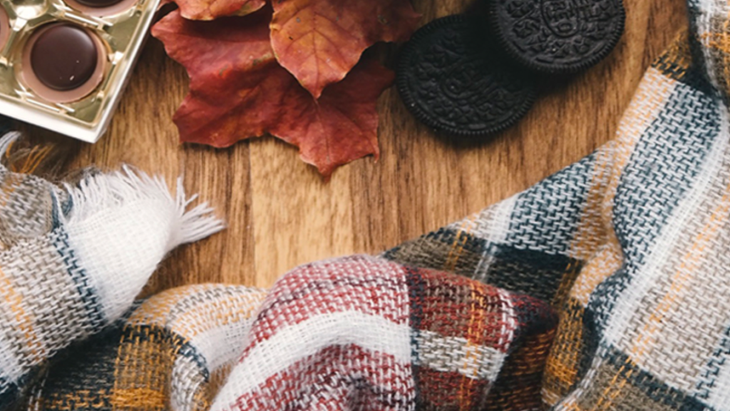
The classic colors and patterns synonymous with the incoming season come with every seasonal change. Plaid is one of those choices that says we’re headed into fall!
I love plaid as much as the next person, but I occasionally witness people going a little overboard with plaid power during the harvest season. Like any other pattern, plaid must be applied tactfully to remain tasteful and balanced.
As your trusted color expert/color consultant, I recommend starting with a neutral or understated base palette – think creamy whites, soft beiges, warm greys, and possibly an accent color or two. If you choose to add plaids to your decor, I recommend going lightly and choosing a pattern you truly love! A well-placed, colorful plaid throw on a solid-colored sofa or plaid cushions paired with a simple, earthy armchair can rustic charm without overpowering the room. Mixing and matching textures is key in keeping the rest of the decor cohesive.
If there’s a message I’m trying to convey here, it’s this: it’s easy to get excited and go overboard with harvest color and decor.
My suggestion is to ease yourself into this delicious time of year! I enjoy a pumpkin spice late as much as anyone else, so treat yourself to your favorite holiday treat. Then gently start adding these harvest colors into your world. Do not simply swap out everything you have in interior and exterior spaces with hay barrels, pumpkins, plaid blankets, oakleaf wreaths, and scarecrows overnight. Start layering harvest decor and see how you feel when you swap one color or add one patio accessory. That way, you can take a collected approach and find a balanced design scheme or color palette that suits you.
So, what do you think? How do you embrace harvest colors and the autumnal season? What are your favorite parts about this time of year? Please share your thoughts and insights; I love our discussions!