My latest series of blogs has been diving into traditional home colors for a wide variety of architectural styles. Working as a professional color expert for many years has made me realize that many times, honoring the traditional and historic paint colors of a home is the best way to bring out its personality and the soul. So far, I’ve covered Victorian homes, Colonial house colors and mid century modern colors. Next up: American Craftsman house colors!
Keep reading to learn more about Craftsman colors, architecture and history.
Craftsman architecture in the United States was very much reactionary to both the Victorian Era and inspired by the British Arts and Crafts movement that began in the 1860s.
After decades of Victorian style featuring heavy ornamentation, grandiose architecture, angled framing and large tower structures, this movement and the Craftsman homes inspired by it emphasized simplicity, practicality and functionality.
These homes are designed to make living in them easy. With an emphasis on practicality, these simple homes utilize natural materials and attempt to blend into their surroundings.
Other common Craftsman features include:
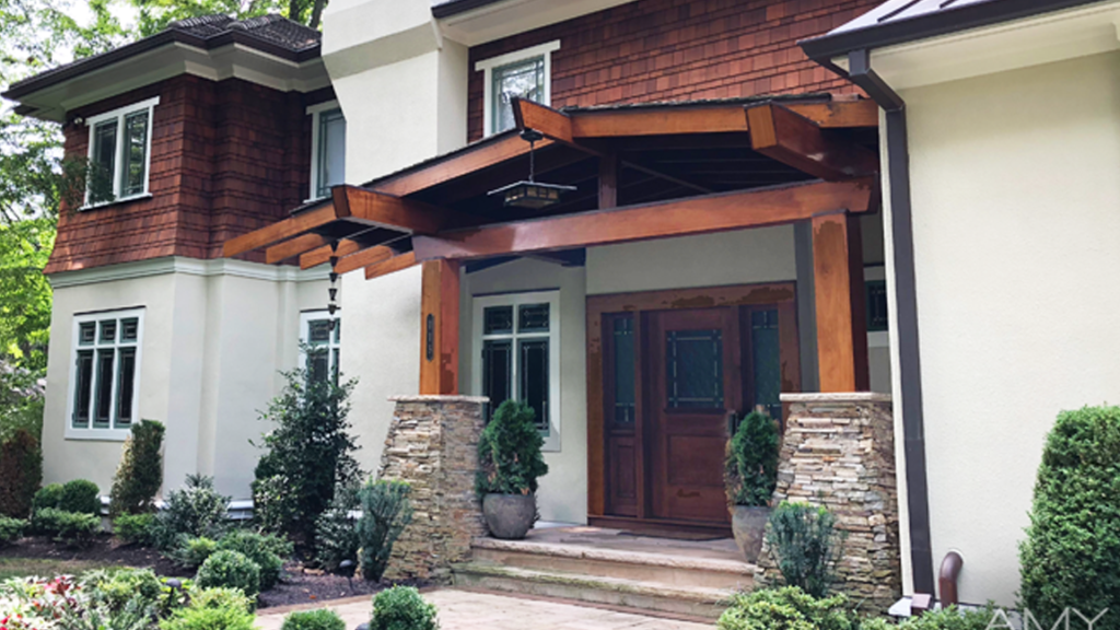
Often described as simple yet elegant, original American Craftsman homes were usually two stories with no ornamentation or decoration. Showing off the period’s love of natural materials, what you are seeing below is a home built honoring the style and design of the period.
Like the styling and decor of these homes, Craftsman colors are often simple and blend in with natural colors & surroundings.
Autumnal colors like natural browns, tans, oranges, reds and rusts, and greens are common with these homes. These often pair well with the natural wood and stone materials used in these homes as well.
While many Craftsman house colors can be either light or dark, the colors are also soft and natural. Not much contrast or crazy coloration going on with traditional Craftsman houses. Instead, the emphasis is on seamless integration of the home into its environment.
Many Craftsman house colors work to align with the natural colors in the landscape around them, making them each unique to the area where they’re built. Pretty cool!
Roof colors were usually limited to brown, red and green. The roof color would often influence the colors chosen for the rest of the home as well.
Brown roofed Craftsman homes often utilized body colors like olive greens, lighter russet brown or darker greens. As time went on, Craftsman homes gained some bungalow influences with softer toned browns & tans that border on light yellow.
Red roofed homes traditionally opted for the classic olive greens, variety of browns, and yellow-ish tans. They also were seen with greys, green-blues and even some white trim. Green roofed Craftsman homes work best with red, brown and yellow-toned body colors in either light or dark hues.
Because of the simplicity of the designs, Craftsman homes didn’t have much architectural detail to showcase with trim colors. As a result, many Craftsman homes have one simple trim color and one or two other colors for small accents.
Most trim and accent colors provide a bit of contrast to the body color of the home… but not too much! Save the bright and bold contrasting colors for Victorians or Mid Century Modern homes keeping a traditional Craftsmen subtle and soft byway of contrast.
If you have a dark body color, choose accents and trim that provide depth and contrast without making it glaring or striking. A green-blue body with a off-white white trim for example, or a dark green body color with a lighter russet trim.
Medium contrast between your body and your accents will work beautifully for these practical and simple homes.
Craftsmen colors can be some of the hardest to choose colors for because of the style’s simplicity. You really have to get it right with these homes if you want to honor the original colors and vision of the style.
Who knew color could be so much work! The good news is you don’t have to do this alone. I can work with you to help you understand everything that could influence your home’s interior and exterior paint colors.
Color experts like me exist for a reason: we can help you understand the history and background of your home, learn about your personal aesthetic and combine the two to recommend the perfect color palette.
Whether you have a Craftsman or a Victorian or a tiny apartment, I’ll find you the perfect palette.
Contact me to get started with an initial consultation!
