As a color specialist, I don’t always publish articles on trade or vendor news, but a few times a year, there’s an event that happens in the world of color, paints, or design that I feel is worth sharing with all my readers. Behr Paints, one of the most recognized and respected paint companies operating today, announced their color of the year, 2024; “Cracked Pepper.”
Why am I talking about this now, even though it was announced last summer? I’ve seen this color go from being a media recommendation to a staple in interior design!
I must say, this soft, warm, black cracked pepper is exquisite. I find it a very exciting and bold choice for Behr’s color of the year. Their decision has inspired me to write about the color itself and what soft black colors can do for home interiors!
Are you taking a fresh look at your colors? Whether we are coming out of winter, enjoying spring fever, or simply nesting instinct, this year has a different feel than years past. I’ve talked about the warming trend of colors, and I think this choice complements it beautifully. Are you seeking a fresh interior design motif in 2024? Are you looking for a color refresh? Behr’s Cracked Pepper may be the right color for you!

How can black be soft? Combining jet black with undertones of browns, reds, yellows, grays, or even deep purples helps soften the presence of black and create a more rounded, muted black. While very slight, these warmer, muted undertones within a soft black help ease it, and the results are always impactful.
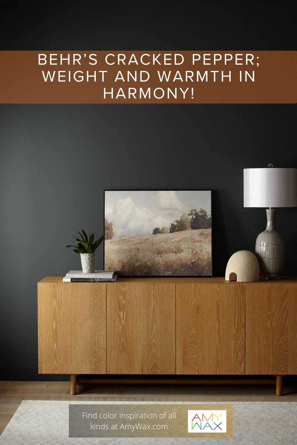
As for Behr’s Cracked Pepper, you’ll notice that it has a soft, warm-neutral undertone, giving a slight “airiness” to the black. The fact that they chose Cracked Pepper as the name is simply perfect; it looks like a fresh batch of pepper, recently ground in a pestle and mortar; I can almost smell it! Black, indeed, can have a soft warmth, and Cracked Pepper is a prime example of this.
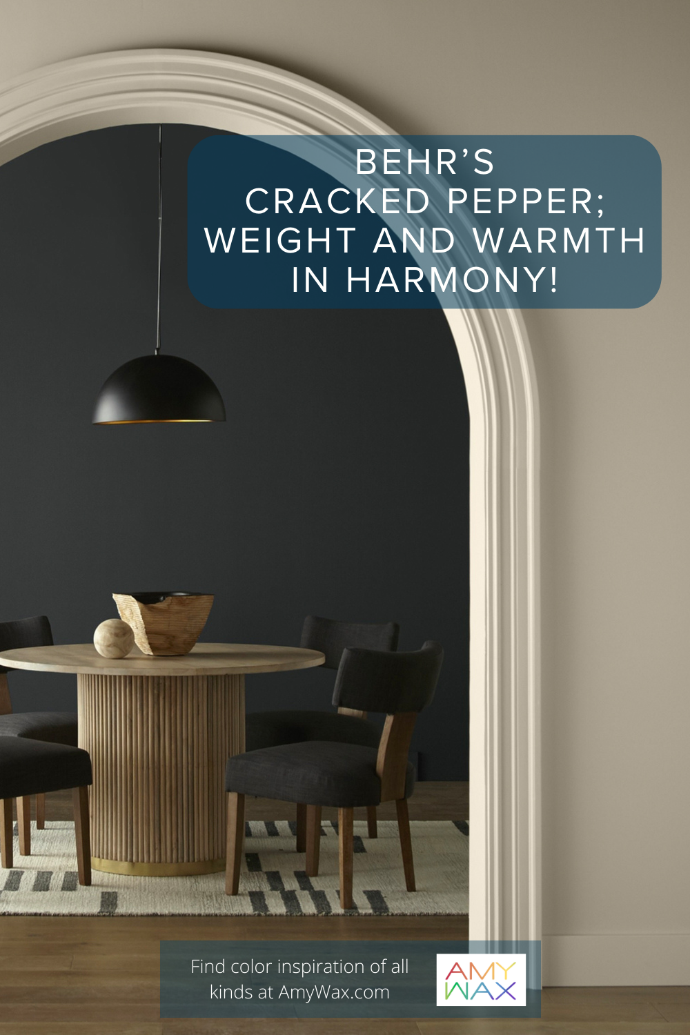
Soft black colors, such as Behr’s Cracked Pepper, are best suited for spaces where you want to create statement, contrast, and visual weight while having a touch of warmth. I mean, when you look at the color itself, it carries a presence of sophistication, elegance, timelessness, and even a bit of earthy elementalness. But, with all that said, it’s not too serious or heavily weighted to the point of intimidation. It’s hard to put words on it exactly, but when you see a soft black applied appropriately in a space, it’s simultaneously serious and relaxed/welcoming. It’s a magical color when used correctly.
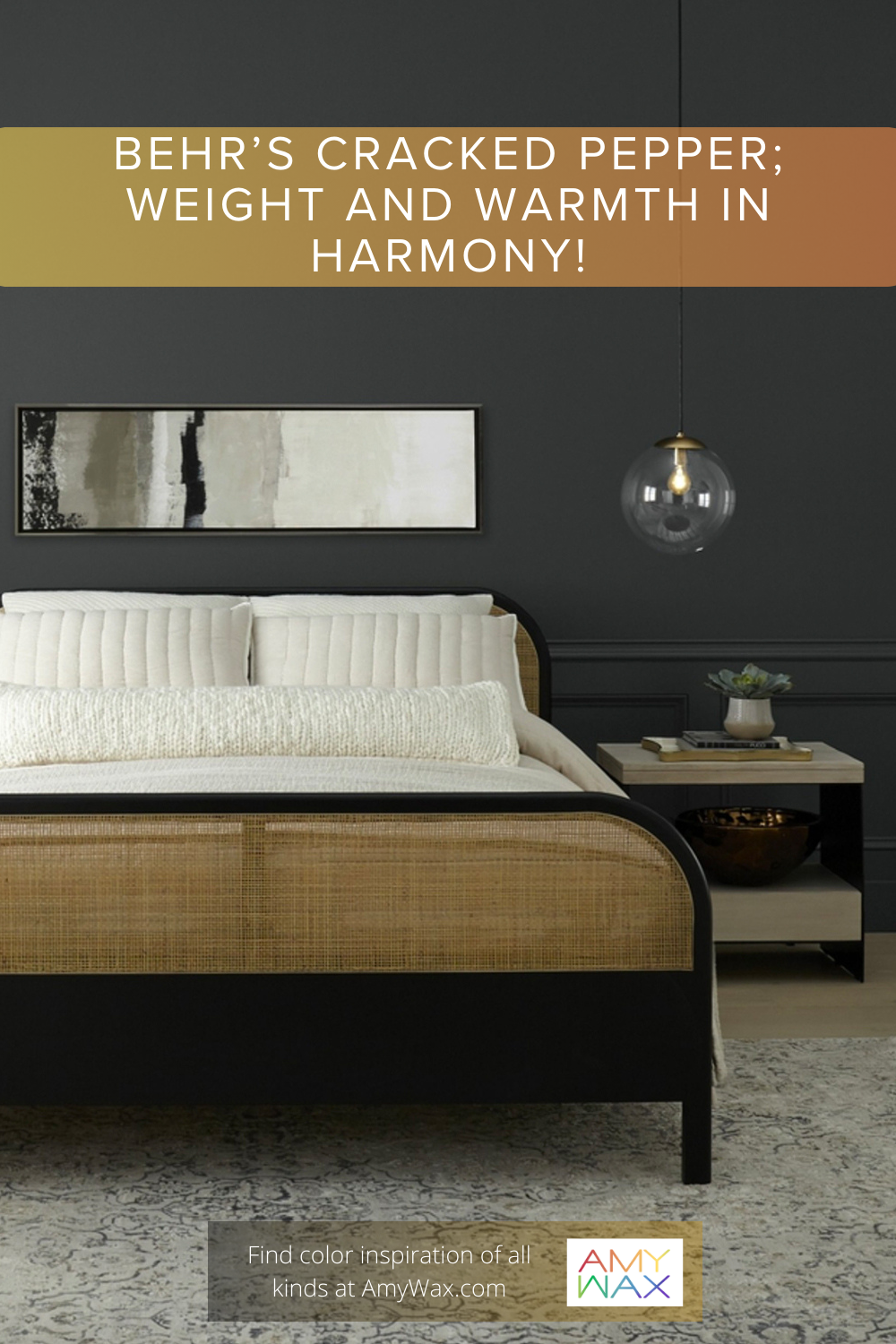
While it may seem a little gloomy to use a solid black color in the bedroom, soft blacks can be pulled off beautifully. Simply put, darker colors make spaces feel more intimate, and while a jet black would be claustrophobic and truly suck the oxygen out of the space, Cracked Pepper has just enough levity to it with the infusion of gray and brown, so, overall, it feels like a warmer-toned black.
If you paint the entire bedroom or just an accent wall in Cracked Pepper, it will add elegance and intimacy to the space. I strongly recommend balancing it with some creamy beige or sandy tones in the form of a comforter and pillows to help create accepting harmony in the bedroom.
The study or office is meant for concentration, focus, and relaxation. A warm black like Cracked Pepper will evoke these feelings. Black is renowned for its ability to absorb light, which helps to reduce glare and create a more focused environment, perfect for concentration. Albeit, the underlying warmth of the color is inviting, relaxing, and intimate. Cracked Pepper also compliments the rich warmth of natural woods. It’s remarkable what color tones can do to change the vibe of a room!
I know it may seem ridiculous to use any form of black in an area associated with dining, but believe me, it can work beautifully with warmer blacks like Cracked Pepper. Typically, breakfast/dining nooks are cornered in an area with lots of natural light, and when a warm black is applied to the space, it helps to ground the space and give intentionality and weight; when paired with some bamboo or light oak dining room furniture and a warm overhead hanging lamp, it’s a breathtaking contrast.
Okay, so I’ve established that this color is dramatic and warm, but what colors can you use it with? With its soft undertones, Cracked Pepper is especially successful when paired with warmer colors. What does that mean? It can mean off-white or warm cream to wheat and natural wood tones. It can also pair beautifully with warm blues, olive greens, earthy sage, or warm rusty hues. It does not need to be entertained by other bold colors; this color looks great when paired with the colors of nature. It’s as simple as that!
I love what Behr did by selecting Cracked Pepper as their Color of the Year 2024. They didn’t make the safe, conventional choice. Behr chose to be bold and different, offering some change that the design world needs. These choices can be risky, but venturing into the unknown is when history is made, and lasting impressions are formed, so I fully support Behr’s choice with Cracked Pepper.
So tell me, would you consider using a soft, warm black in your home? Are you open to making a bold color choice in your home? Please share your thoughts, feelings, and opinions with me!