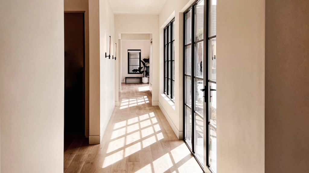
It’s been at least a decade of grays ruling the design landscape as the “go-to neutral” color option. You can’t enter any new development or apartment complex without being surrounded by cool/neutral gray variations. Now, I’m not anti-gray by any means, but I am anti-homogeny when using colors and design palettes! I’m ready for some variations to take the reign from gray as the trusted neutral color. Well, it just so happens that there’s a movement toward beige and colors on the warmer side of the color wheel.
Beige colors are primed to make big waves in the interior/exterior design world in 2024, and I support it. Beige is a wondrous color because it’s both 1) a neutral color and 2) warm! In this article, I will discuss why beige colors are great options for interior arrangements and why I believe beige will become the well-loved neutral color of choice in 2024!
“Beige colors,” what does that mean?! What is beige, after all? While many of us think of it as a dirty tea-stained white, in reality, it ranges from creamy off-whites to whispery soft tans—a color whose only identity is its warmth. Beige is as clean and fresh as an off-white and naturally warm/delicate like a pale brown. Beige is a whole category in and of itself.
If you’re unfamiliar with how beige is used in modern design, you may be slightly confused by my enthusiasm for the color. You may have associations with beige that are not pleasant and from a bygone era. “Beige? You mean the color of my great-aunt’s pantsuit she wore for every Sunday luncheon, 50 years straight?” It certainly has a reputation of being a tired old color of days gone by, but do not fret. Beige may have had some weathered, aged looks in decades past, but it has much to offer for design strategies today!
Versatility
Because beige is neutral, it can be used in almost every area you could need, which is why they’re such a great choice as a base color for living rooms, hallways, entertaining rooms, etc. They can seamlessly ingratiate into the background, allowing bolder colors to dominate the space with greater impact and presence.
Warmth/Coziness
Because of its light warmth, beige has the power to make spaces feel more cozy, inviting, and intimate. Imagine a color that can make a space feel cozier without closing it in! Gray is often used as a neutral because of its colorless presence, making spaces feel larger and more open. But, for larger spaces that feel cold and somewhat stark, beige is a marked improvement, making an area immediately more comfortable.
Support of Natural Light
Beige is exceptionally good at refracting light, which makes it ideal for areas with low natural lighting. If one can picture hallways with little or no windows, beige will reflect whatever natural light it’s exposed to and cast it about the space, illuminating an area with warm, glowing natural light; it’s very reminiscent of natural sunlight.
A Soothing, Earthy Tone
Beige is an earth-tone color. Earth tones are understated yet powerful in their presence. I find that earth tones help interior spaces feel more reminiscent of the natural world and less synthetic.
Beige is the color of a sandy beach on a beautifully crisp morning or sanding dunes in the desert just as the sun is about to set. There’s something elemental and ancient about beige, a feeling we instinctively need around us now and again. Pairing beige with various wood grains and natural stone is perfect for natural-feeling surroundings, as it heightens the earthy atmosphere even more.
So, why is beige poised to make a resurgence and breakthrough in 2024? I believe it’s a few reasons. The first, which I touched upon earlier, is that I think people are consciously and unconsciously tired of gray. Gray has had a lot of play in interior and exterior design in the past 10-15 years, and it’s time for a new neutral to step up to the plate; I also feel people desire comfort/warmth and to embrace the colors around them. It’s nice to have an inviting and friendly aura around you in challenging and scary times, not something indifferent and sterile.
PPG Paint’s Color of the Year in 2024 is “Limitless,” a yellow-leaning, honey-inspired beige, and I adore it. As PPG describes the color:
“A fresh, warm hue, that contains both the power of a primary color and the essence of a neutral.”
That sentiment is wonderful: an empowered, fresh start that is versatile. Who wouldn’t desire that feeling going into 2024!? It also doesn’t hurt beige’s popularity that it’s now striking a cord in the fashion/modeling industry. Even Kim Kardashian’s LA mansion is completely adorned with different shades of beige. Although she is not an icon of mine, we all know that some watch what celebrities do, and it gives them pause; people take notice and think, “Is that a style or trend that I like as well?”
If you’ve been reticent or uninspired by beige, I suggest browsing some fashion and design media outlets and giving beige another shot. I think it’s a wonderful color to adopt in different areas of your home, interior or exterior. If you feel like using soothing, calming arrangements that also feel fresh, give any color in the beige family a try!
As a color specialist, I’ve designed a color app that you can use in your day-to-day design needs. If you’re a homeowner or designer, it provides you with almost 140 color themes showing what colors look great together, and it’s the unexpected color combinations that will inspire you when you least expect it. Find a color that you love and use it as your guide. If you’re looking for some color assistance at your fingertips, check out the Color911 app!