The peak of spring is just such a delightful time of year. Delightful is the most earnest word I can think of to describe the feelings we all get as the flowers and trees bloom and nature reawakens as the sunlight and warmth bring life back to our outdoor areas. It’s simply the most energizing time of year!
While early spring colors are often more muted after winter, and late spring colors are heavily saturated and bold as they evolve into summer, peak mid-spring is when we can enjoy the full luminance of bright spring color palettes.
So, let’s embark on this journey together. Regardless of where you are currently, picture yourself in your garden, sipping a refreshing glass of iced tea or lemonade. Let’s explore how we can harness nature’s vibrant spring color palettes and savor these colors whether we bring them inside or enjoy them outside!
As I sit outside on my patio, looking at all that has bloomed by the second week of May, my heart is overflowing. I must admit, I find this time of year so exciting! The colors have come into full prominence, breathtaking and familiar simultaneously—the best kind of nostalgia. My neighbors have a peaked Crescent Moon Japanese maple; the glowing coral-colored pinks are bright and captivating. Cherry blossoms are also in full bloom around my neighborhood, including in my own backyard!
The grass is a rich, almost yellow color, bright lime-green, and so are the oaks and maples in my area. The trees are beyond budding, but the leaves still need to be fully developed, so the darker, richer greens are quite out yet. All around me, I can hear the spring birds chirping (they always have so much to discuss!), and to top it all off, I get a soft breeze that keeps me cool and lets me smell all the amazing earth around me. Even if it comes with allergies, it’s worth it! The inspiration for bright spring color palettes is the fleeting nature around us.

Here are some bright spring color palettes to try in both your interior and exterior design schemes:
Florals in bloom—Emulating nature brings spring’s ripe and bright colors into your home. The colors I described around my home, garden, and neighborhood inspired this palette.
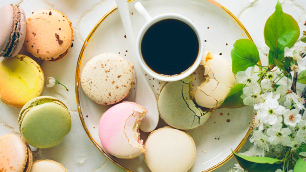
Picture off-white creams laying the foundation for the signature lime-yellow greens, soft pinks, and lavenders. If you have a sunny dining room or breakfast nook, using this palette for the remainder of your spring will keep the energy and spirits high! This combination of colors will also work beautifully on the outdoor patio or by the pool.
Sunnyside Weekends – To me, peak spring days are all about working outside, feeling the sun on my shoulders, enjoying the pale blue skies, and even getting my hands in the dirt; of course, as a color specialist, these moments give me color inspiration!
For a color palette that’s a little more subtle but still born from spring, try combining a sunny lemonade yellow with a light-earthy brown and soft, retro sky blue. This combination may seem odd initially, but light browns and light blues play beautifully off each other, as the cool tones and warm tones dance off each other without confrontation. The sunny yellow adds that extra zing of lively accent color.
Pinks, Yellows, and Whites – Keeping things simple is sometimes the best option, and I love this color combination with that notion in mind. Pink, yellow, and lime green are arguably spring’s most dominant colors, so why shy away from them?
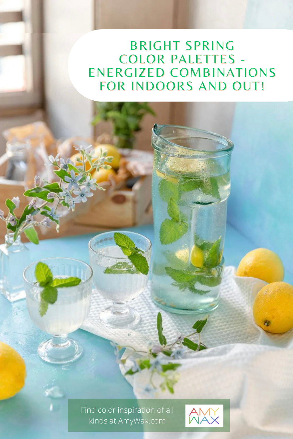
Picture this: You’re having friends over for a mid-late May brunch. Your outdoor patio table has a crisp white runner across the middle of your sky blue table, with light lemon-yellow drinks and green leaves of mint ready to enjoy. Think of what you’re serving as well as where you are serving it—it is all part of the event’s color palette!
Your colors can all come together beautifully when they are planned well. To cap it off, you have a cool, retro lemonade pitcher filled with pink lemonade (or perhaps some Rose’ Sangria). Doesn’t that sound divine?
My message to you is this: Enjoy spring’s fleeting colors and beauty while it lasts! Spring, similar to fall, is a shoulder season that presents us with beautiful color arrangements and natural beauty to behold, so whether indoor or outdoor, embrace those colors with your design ideas before the season is gone!
Before you commit to your colors, scroll through the Color911 color themes to see what colors look great together for inspiration. Whether you plan the colors of your garden or your table setting for an afternoon brunch with friends, it will come together beautifully if your colors look just right.