Color trends often arrive in bold waves. Over the last few years, color drenching, saturating an entire room in one deep, enveloping shade, has made an impression on designers and homeowners alike. It’s dramatic, moody, and very chic. But let’s be honest: not everyone wants to live inside a jewel box of emerald green or midnight navy. That’s where color capping comes in – read on, and I think you’ll love it!
Color capping is drenching’s approachable cousin. Instead of saturating your space with a single high-contrast color, stick to a single color family and play with lighter, softer versions of it. It’s a gentler, more versatile version of color drenching. The result is layered, cohesive, and polished without being overwhelming. It’s simply put, much more accessible and easier to accomplish than color drenching.
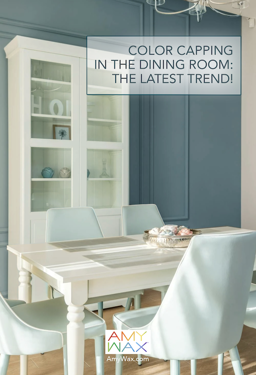
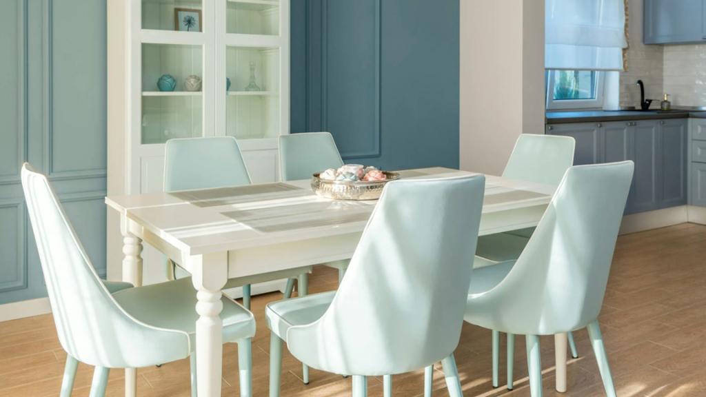
Still not sure about color capping? Well, imagine a dining room where the walls are painted a dusty sage, the trim leans into a paler mint, and the ceiling whispers with a faint, gray-green hue. It’s still a unified palette, but with room to breathe. How does that sound to you?
Dining rooms are natural candidates for this treatment because they often sit at the crossroads between drama and practicality. You want your guests to feel wrapped in warmth, but you also want the space to remain flexible enough to host everything from Thanksgiving dinner to Tuesday night, carefree pizza gatherings.
Here are what I see as the main strengths of color capping:
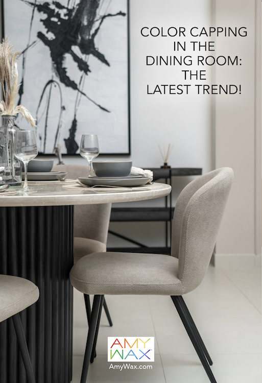
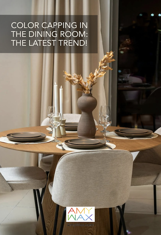
When selecting your color family, consider how you use your dining room and the kind of atmosphere you want to create. If you’re aiming for calm sophistication, muted neutrals like mushroom taupe, creamy beige, or soft greige, or even a whispery soft gray can strike the right balance.
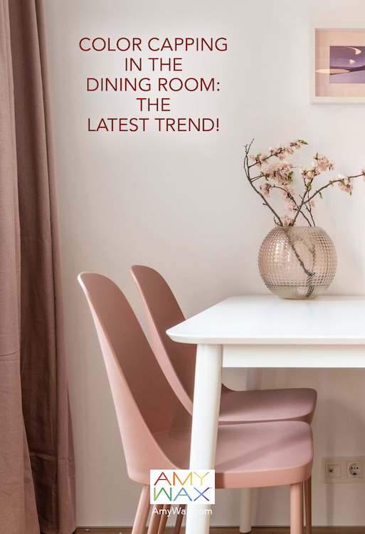
For something fresher and more uplifting, greens are a playful/classic choice. Imagine silvery eucalyptus walls paired with pale mint trim. And if your goal is warmth and coziness, consider layering gentle terracotta shades with lighter apricot tones.
No matter which direction you take, the key is restraint. Rather than going for high drama, color capping is about creating a gentle wrap of color that feels intentional, refined, and easy to live with —again, not overpowering. This trend is all about colors in the same family that are in harmony with each other!
The beauty of color capping is that it doesn’t have to stop in the dining room. Because it’s more flexible than full drenching, it also adapts well to other rooms. Picture a bedroom layered in blues or a sunroom where beiges and creams keep the focus on natural light. By starting with the dining room, you give yourself the option to expand the concept elsewhere without feeling like you’ve repeated the same design trick.
As a color expert/color consultant, I must say I’m excited about color capping because it is proof that sometimes subtlety wins the day! It’s a way to dip into the world of monochromatic design without diving headfirst into the deep end.
I look forward to revisiting color capping possibilities in the near future! It is one of the few trends that’s both easy to try and succeed at! I hope you’re inspired to give it a go!