Nature has a quiet transition from winter into spring. Every year, there comes a moment when winter loosens its grip. The snow begins to melt, the soil softens, and the first hints of green quietly emerge from the ground (for us living in the North East, it’s near heaven-like). It’s not quite spring yet, but something has definitely shifted.
As a color expert/color specialist, I love these types of “in-between seasons,” they’re unexpected and always refreshing to see. Benjamin Moore even names one of its paints Spring Thaw, a soft, misty color that sits somewhere between gray-green and gray-purple. It perfectly captures that early moment when the landscape is waking up, yet still carries traces of winter within it.
These are the colors of damp earth and new shoots pushing through soil. These are the early blossoms appearing in pale sunlight. They’re subtle, layered tones: muted greens, softened lavenders, gentle moss, and cool grays. When brought into the home, these earthy colors create spaces that feel fresh, calm, and quietly optimistic.
When we think about springtime colors, we often imagine bright tulips and cheerful purples and yellows. But the earliest stage of the season is much quieter than that. Before the flowers arrive, the landscape is dominated by softer tones: mossy greens, misty grays, pale lilac, and the deep richness of fertile earth preparing to burst into life.
These transitional tones are part of a larger family of natural palettes often referred to as earth tones. These colors feel particularly soothing inside a home because they sit comfortably between seasons. They lighten the heaviness of winter décor without rushing straight into the bright intensity of full spring.
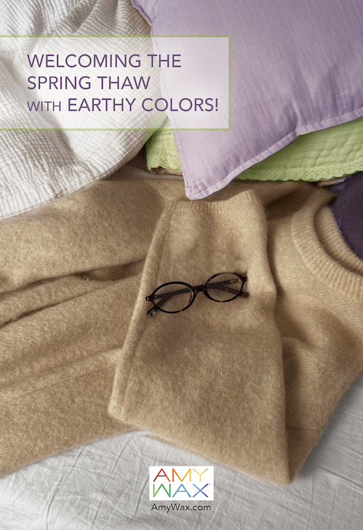
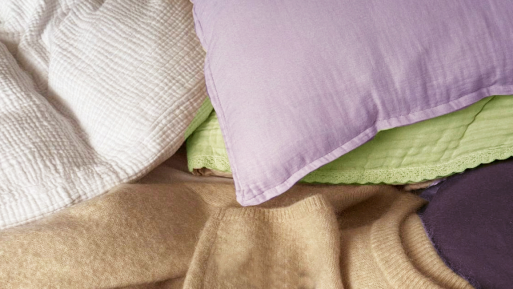
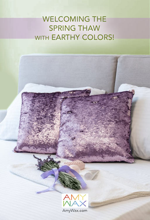
One lovely way to explore this palette is through textiles and accents. A pair of soft lavender pillows resting against neutral bedding instantly evokes the gentle tones of early-blooming flowers.
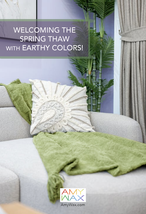
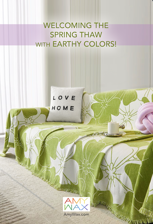
Living spaces are wonderful places to experiment with spring thaw tones because they often benefit from subtle seasonal refreshes.
Picture a sofa draped with a soft gray-green cover or throw, echoing the first leaves appearing outdoors. The color feels grounded and natural, especially when paired with warm woods, creamy neutrals, and textured fabrics.
Inspiration for these palettes comes directly from nature. Mossy greens layered with light neutrals feel restful and welcoming—like stepping outside on a cool morning and noticing that the earth is slowly turning green again. Even a few thoughtful accent pieces, like a knitted green pouf or a woven rug in layered greens, will shift the mood of an entire room.
Bedrooms are another ideal space for these early-spring colors because they support relaxation. Soft lavender, gray-green, and pale botanical hues feel calming, particularly when paired with gentle textures like linen and light wool. These palettes capture that delicate moment when nature transitions from dormancy to renewal.
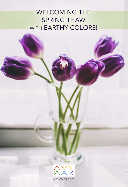
One of the most delightful ways to celebrate the spring thaw is with small, intentional details throughout the home. Picture a vase of purple tulips placed on a windowsill captures the moment perfectly—the first flowers arriving while the light is still soft and cool.
Similarly, accent pieces such as textured pillows, knitted throws, or subtle botanical patterns can quietly introduce the season into your space. These changes are simple, but they create a sense that the home is evolving alongside the landscape outside.
What makes the colors of the spring thaw so appealing is that they represent possibility. They remind us of the fertile earth beneath the surface and beneath our feet; the ground that has been resting all winter and is now preparing to burst into life!
In design, these tones help bridge the gap between the cozy warmth of winter and the bright energy of summer. They offer a gentle shift, a soft awakening rather than a dramatic transformation. And sometimes that’s exactly what a home needs this time of year: colors that whisper rather than shout, getting us all excited for the beauty that lies ahead!