OK, I think it’s fair to say 2020 has presented people with many challenges. I think it’s also fair to say that 2020 has been a little stressful. We are heading into the late fall with a global pandemic, a heated and divided political landscape, and for many of us our social interactions are for the most part done online. While we can’t do too much about it, stress relieving colors could make a difference.
In this article, I want to talk about stress and how it affects our well-being. Believe it or not, there are stress relieving colors that can help with the daily anxieties we face.
Stress should be a fleeting feeling. Stress is meant for fight-or-flight mode, not an ever-present emotion that’s hard to escape!
Colors have the power to relieve stress and bring a little more peace and balance to your day. As a color consultant, I must consider how colors affect our emotions every day.
Let’s discuss how color-inspiration can be your best allies in the battle against daily stress.
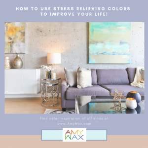
Are there specific colors? Yes there are, but more often the calmer colors come from colors that are combinations of two or more colors. Let me give you an example. Blues and greens separately tend to be calming colors, but the combination of these two color families exaggerates their best qualities.
For the purpose of guiding you to choosing a single color family at a time, I will review each color, and discuss what color combinations will be more soothing.
Blue is considered one of the most stress reducing colors out there. It is thought of as a soothing color because it is very elemental, and is considered a color many people are automatically drawn to.
Blue represents the earth, the sky and the ocean. We look to nature for relief when we pause during a hectic busy day. Delicate blues capture that sense of calmness and play well with surrounding colors in our world.
How many times have you taken a deep breath and look upwards towards the sky? Whether we are looking at the sky above us or the crashing waves of the ocean, there is a peaceful quality about this color. Blue promotes calmness in a busy mind. That is why it’s such a popular color for bedrooms.
Blue is particularly soothing when it is combined to create blue-greens, or more subtle blue grays or even blue violets. This brings me to my next color suggestion.
Violet is often confused with purple, but violet is not purple. Violet has a blue base and is less saturated than its friend, purple. Violet brings with it the calming sense that blue does, but it also works to achieve balance and inner peace within the mind. Violet is often associated with wisdom and understanding, which are very distanced from feelings of fear and stress.
Violet has an element of gray in it giving it that softer less intrusive quality.
The beauty of the color violet is that it pairs beautifully with a wide spectrum of softer colors. Because of its versatility, it is often considered a soothing, neutral color.
Green, much like blue, is a color we associate with nature. It’s an elemental color that reminds us of the pleasures of the outdoors, such as green grass, leafy forests and quiet parks.
Green also has a reputation for being naturally refreshing. There is a calmness and an optimistic feeling that green evokes. It is said green represents growth and tranquility, which is why it’s such an effective stress relieving color.
Green mixed with blues, light colored grays and delicate beiges feel like matches made in heaven. The more understated the green, the more soothing it is!
Gray is often misunderstood as being basic, boring and dull. But, the right shades of gray should not solicit feelings of sadness or plainness, but actually quite the opposite. Gray is a neutral color, which means it can accompany almost any other color or color palette. Lighter grays are easy on the eyes and are essentially a richer shade of white.
Cooler grays will have all the qualities of a blue gray, whereas warmer grays bring in the warm of an easy going taupe. Paired with every color from creamy yellows, softer blues and earthy greens, gray can be as soothing as the day is long.
For this reason, gray can act as an excellent buffer, and it will bring a sense of calmness, peace and relaxation to a space that may require it. Gray, in many ways, is meant to present the absence of emotions, which can be the stress-relieving recipe many of us need.
Generally speaking, loud, passionate and excited colors will not bring peace and serenity to a space in your home.
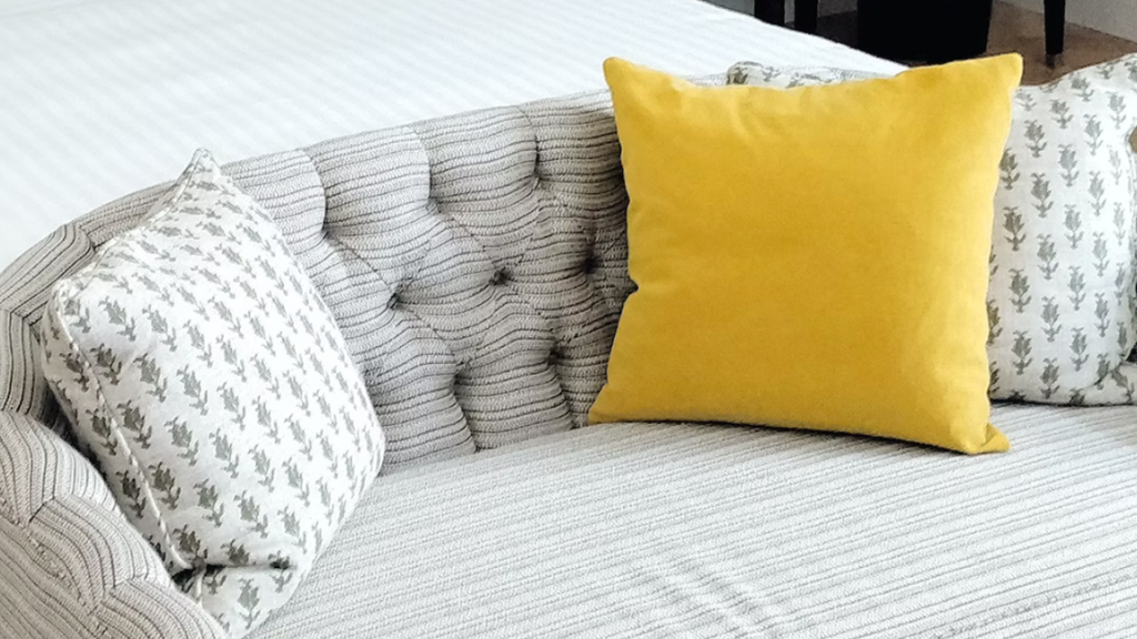
Electric yellows, oranges, reds and bright greens may be appropriate when balanced against other softer neutral tones in the right places, but they will not work if your goal is to elicit stress-free emotions.
I recently wrote about how colors affect mood, and this color principle permeates many lessons of color-inspiration. Colors have a strong power to influence our conscious and unconscious minds. This power can be used to heighten our emotions or relax them.
Consequently, if we are looking to relax our emotional state; the first place to make a change is to incorporate stress-relieving colors into our home and our wardrobe.
During these stressful times, if you are looking to create a space to wind down, relax and get away from the mayhem surrounding us every day, start with taking a closer look at the colors around us.
Eliminate the more energetic colors we might have used in the past. We are strongly influenced by the colors around us, removing more saturated colors is a first step to creating that quieter less stressful world!
What do I mean by this? Ok, it may not be possible to change the primary colors within the interior spaces of your home without first speaking to an interior paint consultant. But, you can add highlights of stress relieving colors without too much difficulty.
Do you have a bright accent piece in your living room? That’s fine, balance out its exciting color presence with some softer beiges or neutral light gray throw pillows, throw blankets, or even end tables!
Do you have a wall color that is a little heavy handed, and not as soft as you’d like it to be? We can work with that by adding softer colors on the surrounding walls to soften the feel of the room.
Do you have a large piece of furniture that is too bright that you really can not work with it? Think about covering it with slipcovers, throws, or even relocate it to another room. Stick to your goals and you can make this happen!
If you are thinking about doing some renovation work and painting the interior or exterior of your home, consider the places that you like to escape to when you need to find some stress relief.
For some, the kitchen can be a stressful place, especially if they don’t like to cook. But for many people, cooking can be a therapeutic and cathartic process. This is your chance to add colors to your kitchen to make it a more pleasant space.
Do you like to read when you’re feeling stressed out? Maybe you sneak off to the guest room/library to decompress after a long and stressful workday. Revisit the colors in that space to create the sanctuary you are looking for!
This is a perfect opportunity to consider new colors! Consider the blue greens, gray blues or softer violet hues! Violet will wash the stress out of that room and promote calm and collected emotions.
If there is one lesson to take away from this article, it’s that you must be in touch with your emotions within a space and incorporate stress-relieving colors to balance those emotions out.
Finally, take a look at the rooms in your home as if you are seeing them for the first time.
Are the colors as relaxing as they could be? Could your spaces be quieter, more soothing than they are now?
Sometimes changing even one wall gives you a focal point that is softer and more easy on the eyes. Even making the slightest change can make a big difference!
If you find that you CANNOT decompress or relax in a space within your home that is intended to be stress-free, it’s time to find the right color solutions for peace and balance.
To learn more about colors for stress-free spaces and other uses of color-inspiration, please reach out. I would love to hear from you.