I often touch upon lighting and lighting strategies in my blogs, but I’ve yet to go into great detail about it. Once I realized I had not directly addressed the concepts and science behind interior lighting, I knew I needed to remedy that immediately! Hence, here we are, and this article will be the first of my two-part series on interior lighting.
You might be thinking, “Amy, what’s a color specialist need to know about lighting? Isn’t it just the more light you have, the better the color choices are represented?” As a color expert, I need to know A LOT about lighting and how it works with or against my design choices. Let’s explore lighting a little more.
Now, I will only bore you a little with the science of lighting. Scientific lectures are not where my talents lay, but here’s a quick refresher on lighting basics. The type of lighting you will see in any environment is defined by its color temperature, measured in Kelvin (indicated with a K).
Warm lighting, also known as “soft white” or “warm white,” has a temperature of around 2700K to 3000K and emits a yellowish or orange hue that creates a cozy and comfortable atmosphere. The incandescent light bulb of yesteryear was equivalent to 2700 kelvin in terms of warmth in color.
On the other hand, cool lighting, also known as “daylight” or “cool white,” has a temperature of around 4500K to 6500K and emits a bluish-white light that creates a more sterile and vibrant atmosphere. Generally, the lower the Kelvin, the warmer the light; the higher the Kelvin, the whiter the light. Warmer lighting is common for residential living spaces, while cooler lighting is more common for commercial spaces.
I must state this loud and clear – if there’s a home out there with lighting arranged in entirely cooler color temperatures, it must be one of the starkest and most sterile feeling environments I could imagine being in. While it’s negotiable whether or not residential homes need areas of cooler lighting (4500K-6500K range), it’s nearly unacceptable for a home to neglect warm lighting. Why is this? Let me elaborate further.
Your home is where you rest, relax, recuperate, and for lack of a better term, “nest.” Warmer color temperatures put our minds and attention in a state of ease and neutrality. Cooler color temperatures/cooler lighting oppositely affect the brain; these color temps energize and activate our visual sensory organs and put everything in an attentive state. My philosophy of matching the “emotional intention of the space” transcends color choices on the walls and furniture; it also includes lighting! There can be conscious and unconscious irritations to our senses when in a place where the lighting is not aligned with emotional intentions.
If areas of your home feel cold/cool or neutral and seem like they’re missing some warmth, it may be your lighting situation. While you can add pieces of furniture, art or even paint the walls with new colors to add warmth, if there’s an issue with the lighting being too cool, it will be an uphill battle. Here are some changes you can make to your lighting that can make a world of difference!
There’s nothing worse than being stuck with the wrong lighting fixtures. If you live in an apartment complex, those places will often stick commercial lighting solutions in every fixture without considering how it impacts the residents. Try changing out the bulbs if you have recessed lights to something warmer and less searing overhead. Modern in-ceiling LED bulbs even allow you to adjust the color temperature with a switch. Don’t live with cold lighting above your head; It will create a colder environment, and I promise you you’ll regret it!
When working In my office, I will need to select colors for interior spaces and exterior daylit environments. I am very conscious of the lighting and the temperature of both environments. I have the light fixtures adjusted to be warmer and cooler, so if I am selecting colors for the interior of a home, I will do so under the appropriate lighting for that space.
If I am choosing colors for exteriors, I choose them under lighting that is the highest Kelvin. Truthfully though, I look at every exterior color palette I work on outdoors with natural daylight, no matter how hot or cold it is! I have found over the years that it can make a world of difference. When I am creating a color palette for any home, the colors have to be just right!
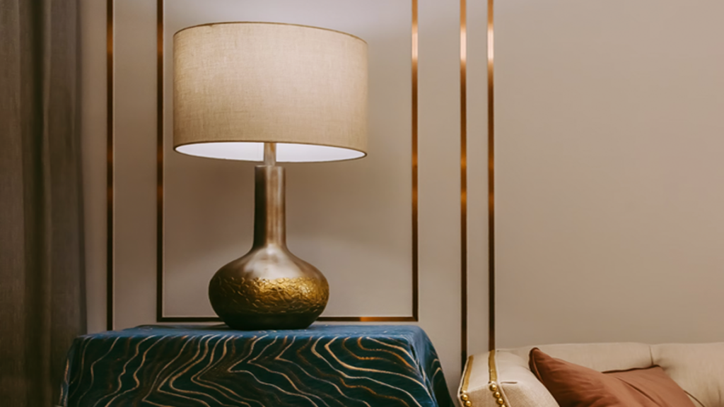
I’m a big proponent of using accent lighting wherever you can, and if you’re in a situation where you can’t change the overhead lighting for some reason, bring your lighting down to a lower level; floor or desk-based lighting can be your catch-all solution. Lamps and warm shades create a casual environment that’s not necessarily dark and sleepy but illuminated without presenting harshly, like a brightly-lit overhead fixture.
Sometimes lighting that makes an area present as cooler may be too concentrated/focused in one spot. What do I mean by this? Think of a concentrated overhead light without much diffusion; it’s almost like an overly-revealing spotlight. By using shading and light diffusion, you can cascade that beam of light into something gentler that scatters throughout the room and makes the whole environment more inviting/softer. String lights with warm Edison bulbs or even a smattering of candles will make the lighting effect airy, warm, and enchanting, perfect for bedrooms, patios, or even private spaces like studies or your favorite reading nook!
The colors around us don’t sit in a vacuum; they work with the natural or artificial lighting surrounding them. I must take these considerations into each environment I work with; whether in residential or commercial spaces, lighting opportunities and restrictions can be just as impactful as color choices.
Please share any thoughts or insights on lighting design; I’d love to hear them!