I’m about to declare something that I didn’t think I could in 2023; brown is coming back in a big way. Yes, brown colors of all hues and saturation points have come back into the minds of many interior designers and color consultants; in turn, more and more homeowners are gravitating towards browns and warm color palettes inspired by nature.
For many decades, brown was shunned as a boring, uninspired color. People would associate brown with horribly outdated decor, ugly shag carpeting, or ill-begotten basements. But not anymore!
I’m delighted to say that brown serves as the base color for warm color palettes deployed in homes of all shapes and sizes, from vintage to contemporary! I wanted to explore why this may be happening. What is making homeowners, color experts, and people from all walks of life gravitate toward darker, warmer, nature-inspired colors these days?
Warmer, earth-inspired color tones were very popular in the1960s through the early-to-mid 1980s. Browns, yellows, oranges, and dark greens were everywhere. You couldn’t go anywhere without seeing a carpet, drinking glass, or even a television without wood paneling, moss green finish, or brown stain. It was just all the rage.

Sometime in the mid-1980s, there was a rejection of the warm color palettes that had dominated furniture and interior design for something more modern. Now, “modern” in the mid-1980s was white shag carpeting, neon pinks and blues, and robotic-looking furniture. The Regan era was a time to embrace technology, excess, money, and very electric-looking colors. Earth tones were considered for older people, colors that were simply boring, not forward-thinking, and certainly not exciting.
As I always say, every design trend is cyclical, and we’ve come full circle to arrive back to embracing warm color palettes and earth tones in a big way, and I’m so glad we have! Homeowners are seeking out what these color arrangements offer.
So it begs the question, why are brown and other warm colors returning to interior design now? There are a few reasons why. I believe these colors have come back because of an innate desire to be closer to the natural world, a post-covid need to be surrounded by warmth and comfort, and a rejection of the minimalist and industrialist design trends that have dominated much of the 2010s.
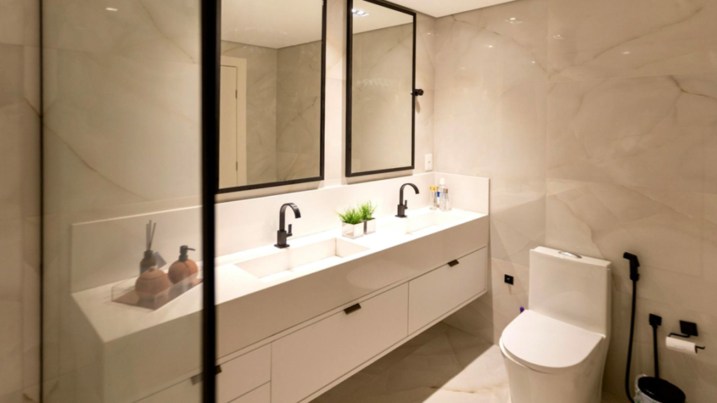
Do not take this as a slight against the neutral/cooler design color palettes used in modern construction and design; these color arrangements can still look great and have their time and place. However, developers all over the country have become overly reliant on these cooler palettes that are neutral, with little to no color, and ultimately safe choices. The result can feel mechanized and void of character and soul.

After so much forced separation from each other, nature, and overreliance on modern technologies and conveniences, it’s understandable that homeowners now want something a little less industrial and wish to incorporate designs with greater warmth.
If you are someone who doesn’t get excited about the thought of using browns throughout the home, read some of my design suggestions below and imagine how you’d feel walking into the spaces.
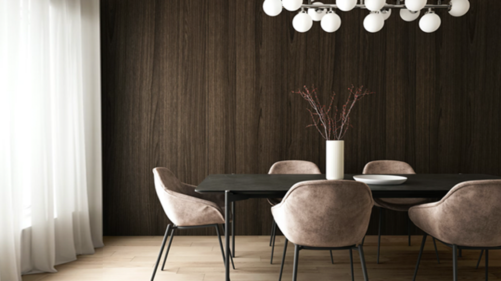
Picture walking into a lovely kitchen outfitted with blue, white, or creamy mosaic backsplash tiling on the walls, a pale neutral wall color, but instead of white or neutral painted cabinetry, it’s a deep dark cherry or oak wood stain. The contrasts add weight and dimension to the space, almost as if those who enter feel like they’ve entered the warmth and coziness of the forest.
Imagine walking into your study, parlor, or reading room; the walls are warm blue-gray, but the furniture is all rich chestnut-brown leather. The reading chair, the lounge, and the love seat are all rich brown leather that perfectly harmonizes with the surrounding walls to complete a warm, natural, and zen aura within the space.

It may seem like a bold choice, but using brown as a base color can yield wonderful results in rooms throughout your home. Too much brown can be drab and energy-sapping, but when you pair a brown wall with layers of lighter colors, such as muted greens, sky blue, off-whites, and creamy neutrals, it can truly emulate the feeling of being surrounded by warm nature scenes.
For those eager to try adding brown to your home decor but can’t quite give up on the sandy whites or pale neutrals, there is no need to worry; this post is for you! Use those creamy off-whites, textured decorative elements, and metallic accents with dark woods, and you’re there!
As I have said many times, it is all about balance. Add warm color palettes into your home alongside your delicate neutrals, and you’re exactly where you want to be!
If you want to incorporate more brown or warm color palettes in your interior design, please check out my Color911 color app! Look for color themes that have warm colors, whether browns, terra cottas, warm taupes, or grays. Look at the palettes for each color theme, and you will see how to use the colors from each color theme. You can also create a palette of your own. Find a photo you love or an image that inspires you. Create warm color palettes based on your photo, save your colors in the app, and use them as your inspiration and guide while decorating your home!
I hope you are inspired, regardless of how you find the warm colors. Take a look at this new trend; I think you will be surprised how these rich browns and darker neutrals will embrace you the minute you walk in the door!