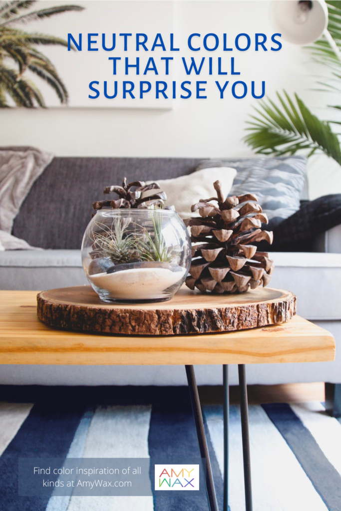
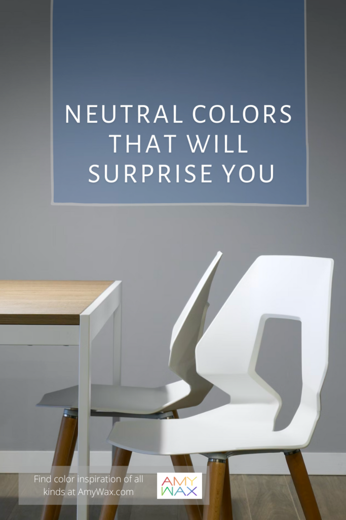
Once in a while, I find it advantageous to revisit concepts of color and interior design that may seem simple on the surface but are far more complex than some may think. The term “neutral color” is something I often see and is so entrenched in the design vocabulary, but it’s not as it appears. In actuality, what colors are neutral will definitely surprise you!
In this article, I will discuss some of the basic concepts of neutral colors, a “neutral colors 101,” if you will. Also, I will share some of my favorite neutral color design concepts and strategies to help you craft cozy interior spaces that will serve you well all year long!
Neutral colors are generally shades aside from the color wheel’s primary and secondary colors. Neutral colors are often described as shades that lack color, but that is an old theory; there are neutral colors that are full of color these days. Neutral does not refer to a lack of color; nowadays, it is quite the contrary!
Let’s start talking about neutral colors in the traditional sense. Colors like beige, taupe, and eggshell are all neutral colors with hues of primary or secondary colors within them. You can have a neutral white shade of color with a blue hue, creating a grey-type tone, a cool neutral. You may have a very soft neutral white, but it has some pink or yellow undertones, making it a warm neutral.
Neutral colors are intentionally non-disruptive within the context of the color palette they are placed in, but they are not absent of color, just toned-down/muted. Generally, this family of neutral colors is as understated and gentle as can be.
But there is another way of looking at what is considered neutral; read on, you’ll be surprised!
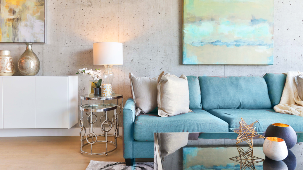
Another way of using neutral colors is thinking of them as colors that will compliment any color in the color wheel. I would not necessarily consider yellow a neutral color because you cannot use it with every color in the spectrum. Although some people consider purples or even navy blues neutral because you can use them with many colors, they will compliment the colors they are placed alongside. Imagine an indigo blue, for example; you can pair it with everything from pink to yellow to orange to green. It is as “neutral” as the color gray or black!

Neutral colors serve a few special purposes when curating a palette.
The first is to set up an emotionally subdued space that promotes feelings of purity, cleanliness, minimalism, and relaxation. Neutrals are meant to promote calmness on a conscious and unconscious level – when a space is comprised of all neutral colors; it’s a soothing effect. This type of design has become incredibly popular with interior design schemes, especially in minimalist, modern homes.
Neutral colors are often used as base colors to set the stage for more lively colors or design features within a space. A common example is neutral colors set behind pieces of art or even as the base color of a room that features elaborate furniture with bold accent colors.
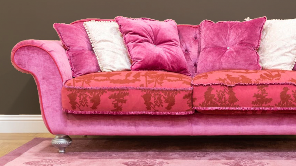
If you are using neutral colors that make a stronger statement, rather than being a calming one, they are the thread of color that works with every color in your palette. Imagine using warm colors throughout your design; a cordovan brown might be the connecting color that is the neutral color that goes with every room, every color palette in your design. It doesn’t have to be bold or colorful, but it might be the color that brings all of your rooms together, creating a visual flow throughout your space.
As a color consultant, you know that I love colors of all different types of emotional intention; I often find it hard to suggest to clients that a home featuring entirely neutral spaces is the way to go. While I appreciate minimalist design and how neutral colors can promote mindfulness and a calm emotional state, I don’t think using neutral colors needs to be at the sacrifice of using colors with different vibrancy or saturation levels. You can create a cozy space with both neutral and non-neutral colors as well!
Here are a few suggestions to create cozy spaces in your home with neutral and non-neutral colors!
As you might imagine, the bedroom is a perfect place to cast neutral colors and promote relaxation. For me, a light neutral grey base color for the bedroom is wonderful; picture a cool neutral grey with undertones of violet or blue. Now, layer in some complimentary warmer neutral colors for the bedding and furniture, like beiges or taupes. Then, just to add some pops of accent colors, deep auburn red or magenta throw pillows to round out the whole space!
Lighter, warmer shades of green do not fatigue the eyes. I feel a warm, sandy neutral color with undertones of moss or mint-green work beautifully for home offices. There’s a presence of warmth from earth tones, but it’s subtle enough not to be distracting while still promoting a fine balance between concentration and relaxation. Layer in some light, exposed wood furniture, and you have a serene, nature-inspired scene in your home for a productive day.
If there’s an overarching philosophy of the calming neutral color family, I would say they have an off-white base to them and blend beautifully with colors that come from nature. That can mean a wide range of nature-inspired colors, from cream to muslin, leather brown to stone color grays, relying heavily on what feels like colors from nature.
The great thing about interior design and incorporating neutrals is there are endless options. Neutrals don’t limit designers to just using white or grey; there are many color options and combinations to choose from and still achieve the calming effect neutrals have.
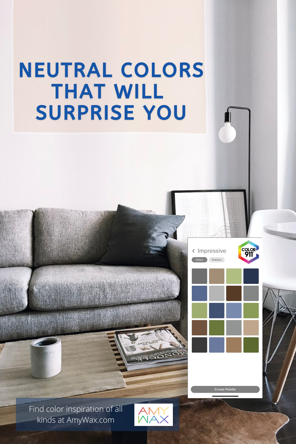
If you want to explore neutral palettes for your home, check out the Color911 app! You can create unique color palettes based on your photos or browse a large catalog of palettes arranged by me!
Let me know how you feel about neutrals in the comment below. Are they overused in modern design? Or do they serve an important purpose?