As a color expert, one of the most common questions I hear from would-be clients is, “Why does this paint color look completely different in my house than it did in the store?” It’s a fair question. The sample card looked perfect. The online room photos looked beautiful. Maybe an online source even suggested it. Yet once the paint is on your wall, something feels different; it’s not the hole-in-one you were hoping for!.
The color may seem darker than expected. It may suddenly appear blue, green, yellow, or even purple when it never looked that way before! Ah, that’s frustrating when you had envisioned a completely different look and feel to your interior space.
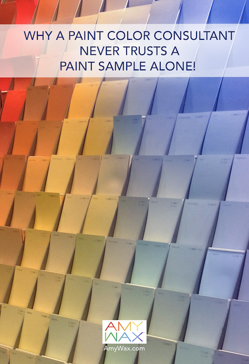
This is one of the reasons a color consultant spends so much time studying the room itself rather than focusing only on the paint chip. The reality is that paint colors never exist in isolation; they don’t exist in a vacuum. They are constantly reacting to their surroundings, and every home creates a unique environment that influences how color is perceived.
Natural light is one of the biggest factors affecting paint color. A room that feels bright and cheerful in the morning may feel entirely different later in the day. East-facing rooms receive warm morning light. West-facing rooms often become richer and warmer in the afternoon. North-facing rooms tend to receive cooler light that can emphasize blue or gray undertones. South-facing rooms typically enjoy the most balanced and consistent daylight.
The paint itself hasn’t changed. The lighting has this effect; this is why homeowners often love a paint sample at one time of day and question it at another. Color shifts as the light shifts – a valuable lesson for everyone, from designer to homeowner, is that lighting affects paint colors throughout the day!
The orientation of a room plays a huge role in how paint behaves. A warm beige may feel inviting and comfortable in a sunny south-facing room. Move that same beige into a cooler north-facing space, and it may suddenly appear dull and flat. A sophisticated gray that works beautifully in one room may reveal blue or lavender undertones in another.
As paint color consultants, we often begin by evaluating a home’s orientation before discussing color options. The way the light enters the room can make a world of difference. The room itself provides valuable clues about which colors are likely to succeed.
Many homeowners are surprised to learn that what happens outside can affect what they see inside. Think about the large trees, gardens, stone patios, brick walkways, water features, and neighboring homes that influence the temperature and quality of the light entering your rooms.
A home surrounded by lush landscaping may reflect subtle green tones indoors. A brick courtyard can introduce warm reflected light that changes the appearance of nearby walls. I’ve seen neutral paint colors suddenly appear greener because of mature landscaping outside the window, and I’ve also seen warm whites pick up unexpected tones from nearby surfaces.
The view outside becomes part of the room’s color story, whether you intend it to or not!
Paint doesn’t simply interact with light; it interacts with everything around it! Wood floors, cabinetry, countertops, upholstery, artwork, and area rugs all influence how a wall color is perceived. A warm white may look beautiful next to natural oak flooring, but feel completely different beside cooler gray furnishings. The same paint color can feel elegant in one room and disconnected in another, depending on the surrounding materials. Selecting paint before considering the furnishings can sometimes lead to disappointing results. Every room functions as a complete ecosystem where all the elements work together.
Today’s apps and AI-powered design tools can help generate basic ideas, but they cannot fully experience your home. They can’t watch how sunlight moves across your walls throughout the day. They can’t observe seasonal changes in lighting. They can’t account for every reflection, material, and environmental influence that affects color. A digital rendering is a useful starting point, but real life is far more complex and fluid.
Check out my post on what AI does not see, and you’ll understand that AI’s paint color suggestions are definitely not to be trusted!
As a color specialist, I still study the room itself rather than relying solely on paint chips or algorithms!
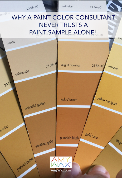
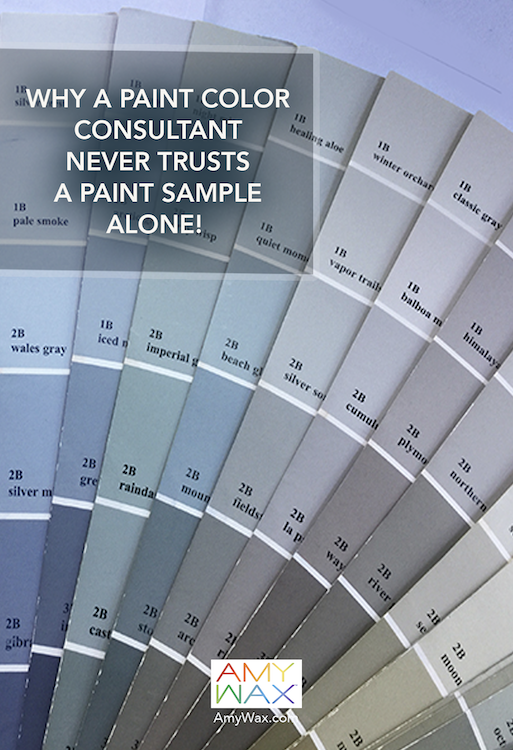
One of the most important lessons I’ve learned over the years is that the room always gets the final vote. The architecture and the people who live there all influence whether a paint color truly works. That’s why testing paint samples remains such an important part of the process.
I recommend sampling paint on a large whiteboard as a great way to test your colors. Move the board around to see your colors during a sunny time, late in the day, or in shadow. Look at it around the room before the paint brush even touches your walls!
A paint color may begin with a sample card, but its true personality doesn’t emerge until it meets the room. That’s where the guidance of a professional paint color consultant becomes invaluable!