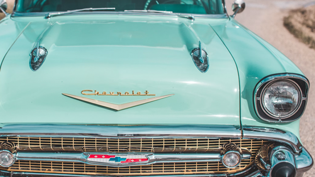
Let me ask you a question, what images pop into your mind when you hear the term “retro?” Do you think about different decades of fashion and design? Do you think about groovy pink knee-high boots in Soho in the 1960s? Perhaps you are thinking of cars the color of sherbert or sorbet? Do you imagine lava lamps, bean bag chairs, and platform shoes? Or do you imagine a lemon yellow kitchen with plastic moss-green chairs and jiffy pop on the stove?
It’s interesting to think about how one person’s vision of retro colors may be a little different from someone else’s. I can tell you, though, most people come up with an image in their heads that makes them smile when you suggest retro anything! Thinking back to old styles and design motifs of the decades’ past is always fun. It’s like playing dress-up all over again!
The truth is, we’re all a little bit nostalgic for certain color palettes, whether we consciously understand it or not. Retro color palettes in architecture, typography, furniture, accent colors, and fashion have been popular recently, and I find that super interesting.
There’s a reason we long for the color palettes of the past, and I believe it’s a desire to surround ourselves with warmer colors and simpler times. Also, the retro colors remind us of fun times, days when we were not as scheduled, not working long hours, and when we had a whole weekend to do whatever we wanted; what a concept!
In this article, I’m going to define retro colors, as a color consultant would use them, and offer some tips to using retro colors in your spaces in your home if you’re feeling nostalgic!
First of all, it’s hard to define a certain color group or palette as specifically “retro.” Still, there are qualities and characteristics to retro colors that we can follow to help identify them. If we wanted to get ultra-specific and develop sub-categories of retro colors, we could break them out by decade or even region of the world. For our purposes, I think it’s best to get a general idea of what someone is referring to when they say retro colors.
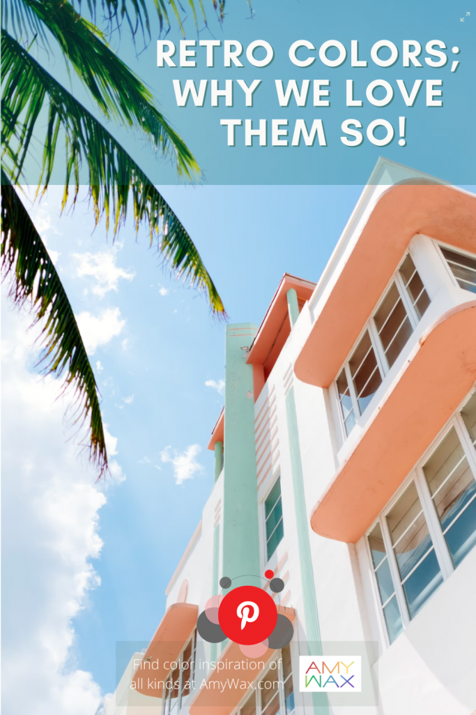
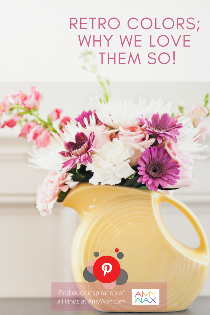
Retro colors are color palettes derived from/influenced by color trends from the 1920s through the 1980s; that’s a really long time! Generally, we think of colors that tend to be warmer, less bright, and overall somewhat muted. Also, retro color palettes don’t draw from primary colors like red, blue, and yellow, but more often from secondary colors like tangerine oranges, teal blues, and apple greens. They can even involve neutrals, like creams, yellows, yellow-browns, teal, pale peach, brownish oranges, and a range of pastel colors.
I think there are many reasons that colors and fashion come back into the consciousness of the masses. Retro colors call back to times that seemed simpler, slower, less tech-centric, and more down-to-earth.
I feel that with everyone constantly on screens, surrounded by colder/cooler colors in modern office buildings, stores, and even apartment complexes, a retreat into something a little friendlier and less frenetic is desirable.
Retro colors are extremely non-confrontational on the senses, so whether it’s an interior designer or marketing department, retro colors are used to bring a sense of laid-back charm and levity to whichever space or product they represent. These are colors that add a giggle or smile to any design!
I also have seen digital filters used in all types of videography and social media content these days; perhaps these “retro filters” on phones and cameras have helped push the aesthetic back into the spotlight as well.
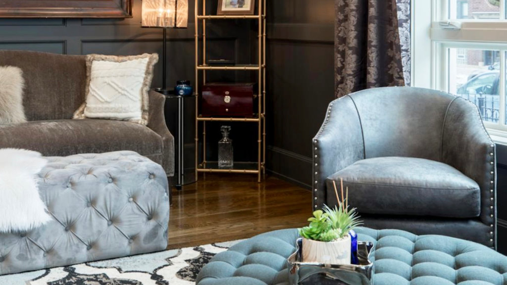
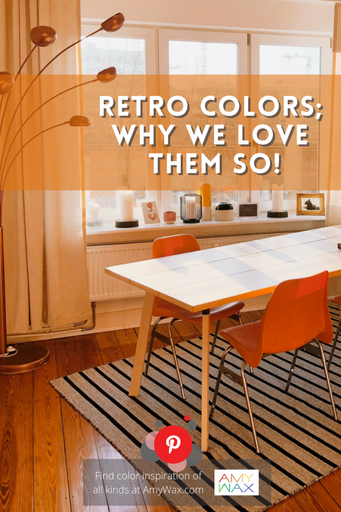
There are spaces within the home that are more in line with the vibe/aura retro colors promote. I feel retro colors work wonderfully in socially-oriented areas of the home. What do I mean by this? Retro color palettes can work beautifully in any entertaining room, a home theater room, a study/billiards room, or even a home bar! If retro colors are what make you happy, you can certainly use them in your home office!
Picture this, a lounge with dark-brown couches and love seats, teal accent pillows, a fun reconditioned coffee table, or maybe a mid-century modern piece that would be the perfect addition to the room! The walls are painted a pale peach. The colors are low-key neutral but also have hints of fun. Teal or green floor lamps are in each corner as the perfect accent pieces, and the bar has vintage martini shakers and colored glasses on top of a dark wood finish. To top it all off, a vintage shop sign hangs above the bar.
In recent years, I’ve had clients ask for color palettes in the kitchen that were certainly retro, whether they knew it or not. Picture a beautiful new kitchen, albeit it, instead of the standard whites, greys, and sterile cooler colors, they wanted something warmer that reminded them of their childhoods. Retro colors do not have to be heavy-handed, and the color platters can look quite modern and trendy when balanced with modern appliances and layouts.
Picture a kitchen with chestnut brown cabinetry and built-in appliances. Nowadays, the cabinets can be painted a pastel color, a tribute to the retro color palettes of the past! The walls are a muted creamy off-white beige. The countertop appliances are in pastel colors like teal or pistachio green, and there are hanging pendant lights with an olive green ring trim. And to top it all off, an white and translucent orange electric Popcorn maker awaits in the corner for a Friday night; the vibe is retro and modern all at once!
So, how do you feel about retro colors coming back into design in new ways? Is it great to see old color palettes used again? Or is it simply an exercise in nostalgia? Please share your thoughts; I always love hearing them!