As a color consultant, believe me when I say that spring is an exciting time of year for color palettes and new invigorating ways of experiencing color inspiration! I find a lot to love about all seasons, but I will admit there’s something very special about spring. There’s a feeling of rebirth, rejuvenation, and excitement. The snow is melting, flora and fauna are emerging, and new colors pop up all over the place.
In this article, I’m going to talk about the spring color palettes and opportunities you have to incorporate them into both your home’s exterior and interior!
Try to think about some of the imagery that comes to mind when you think of spring? If you picture greens, yellows, pinks, and pastels, you’re accurately associating with traditional spring colors!
Traditional spring color palettes, generally speaking, are very light-hearted, airy, and whimsical; this is mostly true because of the association of budding spring plants and flowers and easing into us warmer weather. The shoulder seasons of spring and fall approach the color spectrum with lighter, less intense “in-between” colors: hues that are not strong and directive but suggestive of transition and change.
Click the Link to Learn More About Exterior Paint Colors for the Spring!
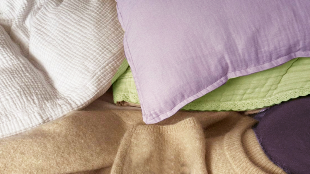
Light Pinks, Purple and Mint
A color palette that has a base foundation of light purple and mint green is profoundly spring. A light and gentile purple, such as lavender, periwinkle, or soft grape set against the crisp and refreshing tone of mint green is heavenly. The spring color combination gives off immediate energy that is not overbearing but refreshing like a dewy spring morning.
Many people often associate these colors with the Easter holiday decorating motifs, which is a fair association. Still, I feel the color palette has validity throughout the spring, not just over the holiday. Picture any room with soft mint pillows and light periwinkle love seats. Surprisingly, these colors can be used in almost any room in the house, interior or exterior! The colors inspire energy that is subdued and very friendly. This is a classic color combination for spring.
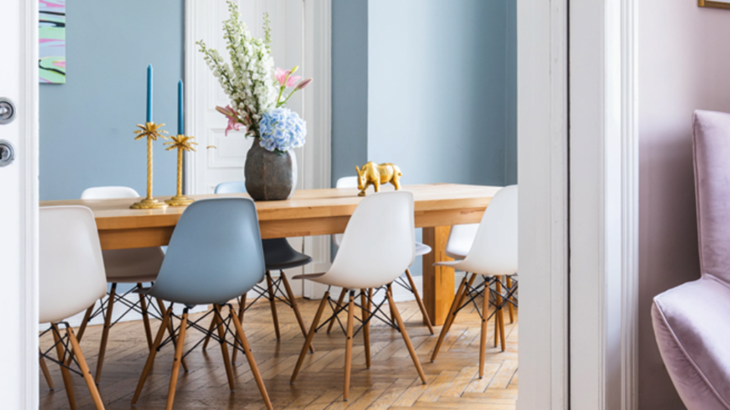
Pastel Blues and White
Embracing new life, more light, and energy is what spring design is all about. A soft, near-gray pastel blues is such a soothing color choice for spring. It’s like those early morning spring skies that are kissed by some light mist or fog. Blue is a calming, soothing color but juxtaposed to a clean white; it keeps the energy afloat in the space. I’ve discussed how blue and pastel blues/greens can be soothing bedroom colors, but softer blues do not have to be restricted to the bedroom or places of rest.
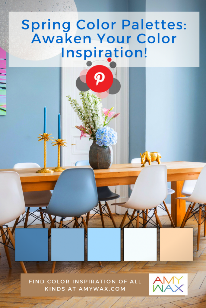
Spring is an excellent time to think about the color schemes of your mudrooms, washrooms, and bathrooms. If these spaces are too dark and sullen, they can take the energy right out of the space and right out of your guests! Picture walking into a beautiful mudroom with a soft, crisp-airy pastel blue closet and bench rest, set against clean white walls. It’s clean, friendly, and energy-providing!
Peach and Beige
Ok, I can already picture what some people are thinking here, and trust me when I say this color combination is not boring or old-fashioned! Peach is an excellent color to bring some organic vibrancy and life into a space and to keep that energy in check, and a nice neutral soft beige is just the right color solution.
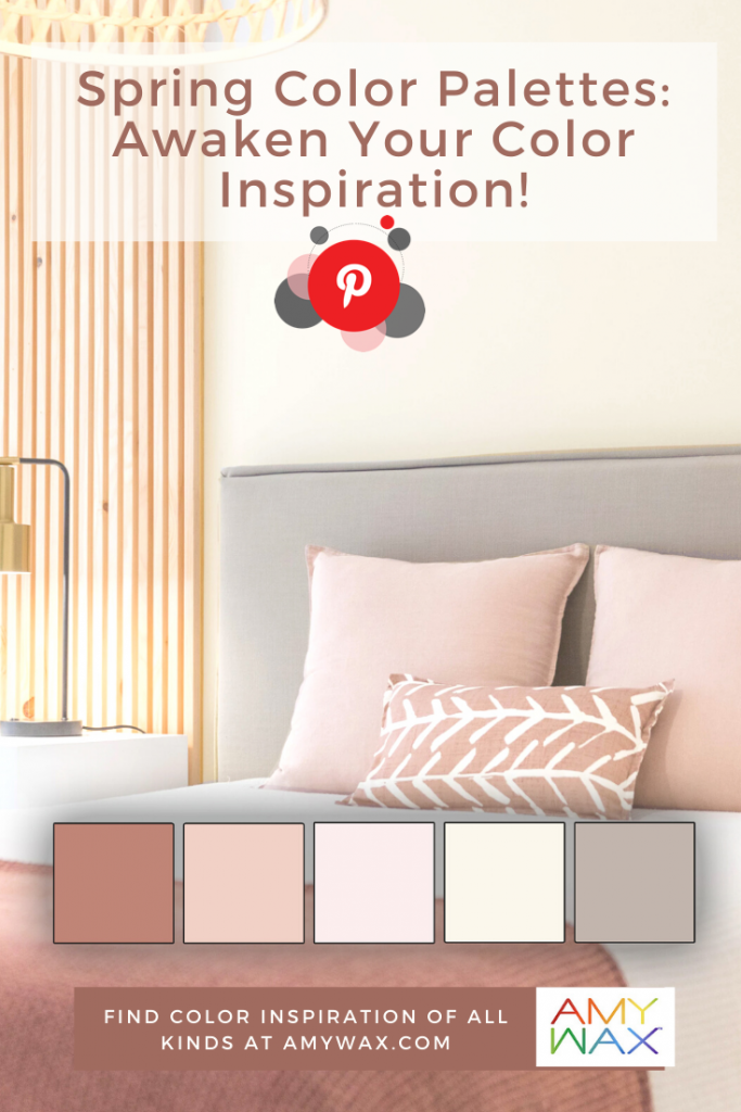
What used to be called peach is often a light terra cotta, giving it a more neutral feel with a splash of color! I’ve seen many beautiful color palettes for home interiors, such as bedrooms or reading rooms use a blush/peach and beige with incredible results! A bedroom with soft beige walls and peach accents sets a very charming and unique atmosphere, don’t underestimate the power of neutral colors!
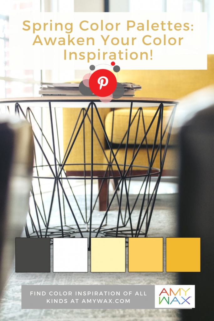
Yellow and White
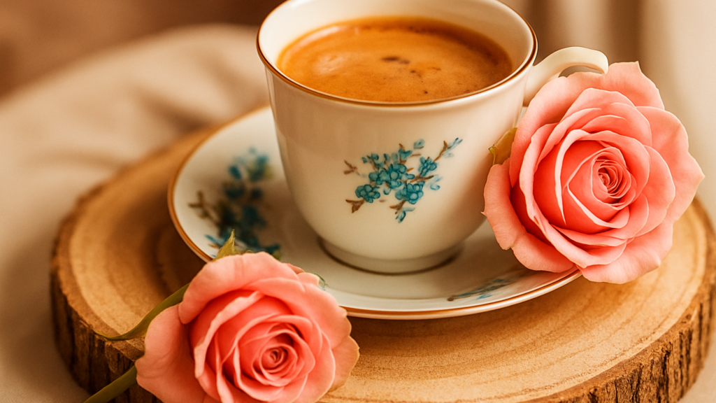
While this color combination is nothing experimental, it’s timeless and synonymous with spring, life, and happiness. It’s hard not to smile thinking about sitting in your kitchen with fresh coffee and pastries while soft yellows and whites help you greet the day. I’m a proponent of yellow and white color palettes all year long, but there’s something extra potent about these hues during the spring season!
Everyone has reasons to be excited about spring and spring design opportunities, so what are some of your favorite color inspirations to find/use during spring? I’d love to hear from you!