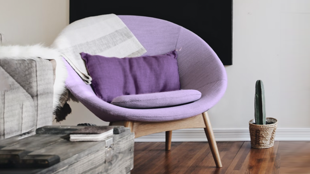
Alright, let’s talk purple. Lavender, plum, periwinkle, lilac, all of these colors are in the purple family. In years past, it was one of the most slept-on (no pun intended) colors for interior design. Sure, you may see a flash of purple here or there, but up until recently, it was often not considered a serious color as the focal point of an interior or exterior design. There is so much to love about the color purple. I love what the color can represent and how it plays with other colors. I am delighted that many more people have come around to using several colors within the purple family to drive color inspiration in different areas of their homes.
This article will discuss the “purple aesthetic” moment we’re in and why the color is so timeless and powerful. Also, we’ll discuss which different spaces within the home are perfect for a little purple influence!
There is not a single color in existence that doesn’t elicit an emotional response, and purple can bring up various feelings for different people. However, purple has long been a color synonymous with wisdom, passion, spirituality, bravery, and perhaps most of all, (and this is a surprise to many people) wealth!
Purple is not seen frequently in our natural world. Aside from select flora, exotic animals (like tropical sea life), and fleeting experiences like beautiful sunsets, it’s not seen naturally in too many parts of the world. Here’s an amazing story you probably have never heard before. Phoenician purple is one of the first manufactured purple dyes recorded. It was made from pigments extracted from sea snails in the eastern Mediterranean seas. The snails would secret a purple mucus (yuck!), and the pigment was extracted to make garments reserved only for the extremely rich and royal. (Remember when I said wealth?) It took thousands of snails to cultivate small amounts of the purple pigment, which is why it was so expensive. This connotation of purple being a color of wealth has permeated through the centuries, even after the color became easier to produce.
As much as I find the world history of purple fascinating, for my purposes, I enjoy knowing that purple activates the mind and senses of today’s homeowners. Purple may be less identified with wealth, rarities, and spirituality than it used to, but it still holds much power in creating an emotional response.
Purple is created by the energy and passion of red unifying with the collected calmness of blue; it has the potential to strike the perfect balance of serenity and vigor. At this intersection of color psychology, I find purple intriguing and useful with interior design schemes. Purple is the result of a great detente between primary colors.
Starting in 2020, or a little before, millennial pink became a prevalent statement color that led to a calmer and subdued design aesthetic. Light pastel purples and periwinkles began popping up in fashion, art, and even on iPhones. The trend picked up so much speed that Pantone decided to get in on the action and create their 2022 color of the year, “Veri Peri.” Clearly a color in the purple family, it is not a clear purple; instead, it’s the marriage of blue and purple. Many people see it as a beautiful periwinkle blue (Veri Peri) which many feel is as purple as can be!
I believe that the current purple movement is due to the color providing a reprieve from the doldrums of the pandemic. Purple allows serenity and energy to occupy the same space without being as brash or seemingly juvenile as something like bright pink. Like all trends, purple’s time has arisen because of the circumstances around us, and I think it will be here to stay for the foreseeable future.
I can hear you now, all saying, so what do I do with this information? How do I use this color? Does this mean everything needs to be the color of grapes?!
No, this will be easier than you’d think. Here are some suggestions as to how to start:
Purple compliments neutral colors beautifully!
From a lighter purple to deep plums, grays and beiges are harmonious with colors in this family. If you are getting dressed or decorating with a neutral color palette, include accent pieces in the purples, and they will be very (berry!) rewarding!
Purples compliment whites brilliantly!
From lavenders to purples, there is cleanliness with lighter purples that is undeniable. If you are working around a white kitchen or bathroom, add your splash of color in any shade of purple. From tile to towels, purples are a splash of color that adds an upbeat vibe to enhance any decor.
Purples are actually neutral colors!
What?? Well, think about this for a moment. Is there any color that purples cannot be used with? They pair beautifully with yellows and oranges, compliment blues from teal to navy, and often pair with greens of any shade. Taking a step back and thinking about how you are using it, you can easily see the versatility of this color family!
So, after reading this, how do you feel about purple? Are you excited to try it? Do you see that it is more versatile? Please share your purple-centric stories! As a paint color expert, I love hearing your opinions.