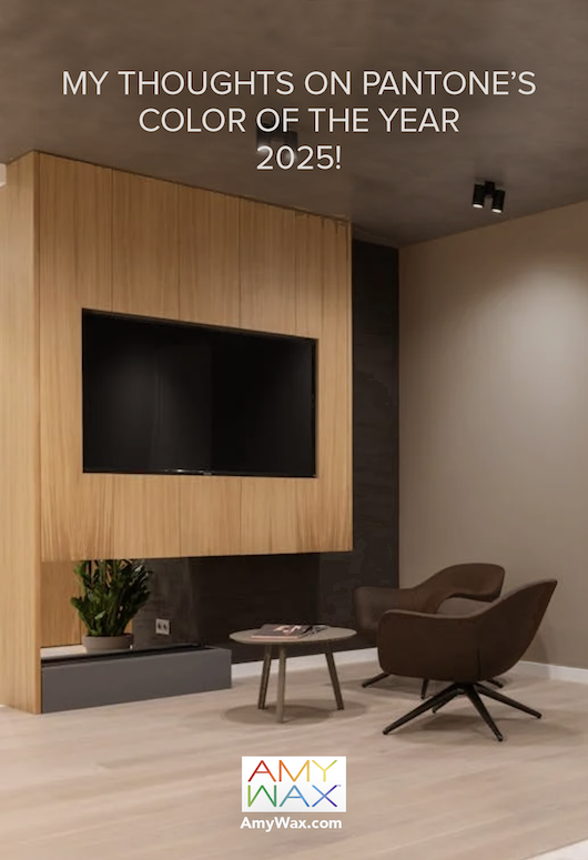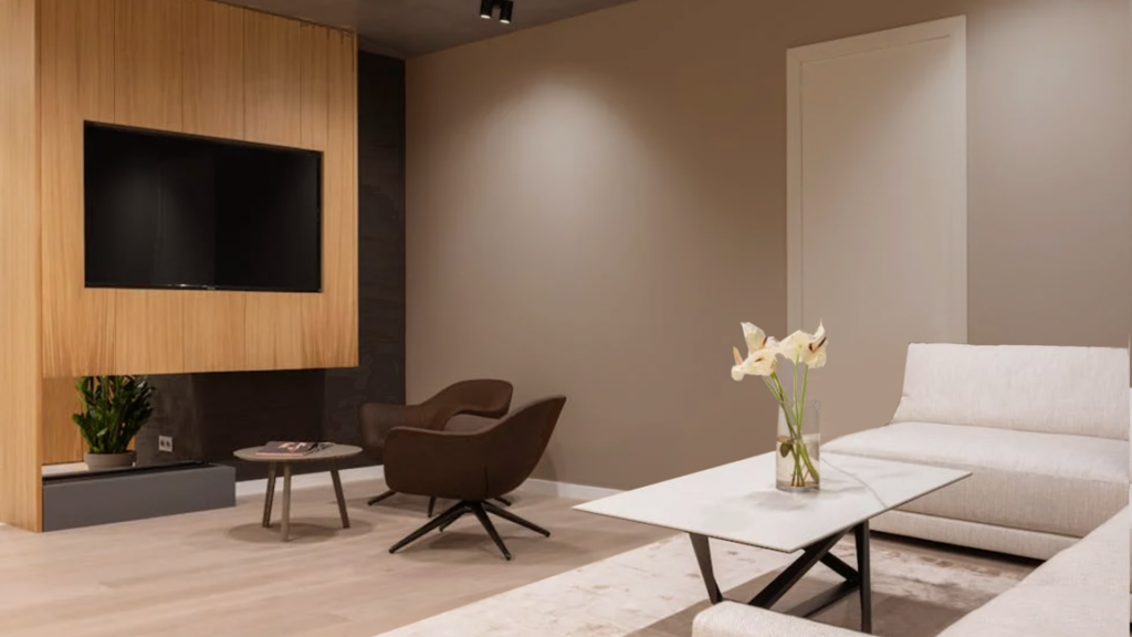
Each and every winter, when the world’s design authorities unveil their color choices for the upcoming year, setting the tone for creative industries, I am flooded with requests from people wanting to know my thoughts on the Color of the Year selections.
Everyone, and I mean everyone, gets excited about what Pantone announces each year. They set the gold standard of design and color influence; think of it as the Oscars for color. It was recently announced that Pantone’s color for 2025 is Mocha Mousse.
As Pantone describes it, Mocha Mouse is “a warming, brown hue imbued with richness.” The color does a wonderful job evoking the delectable qualities of chocolate, coffee, and other cafe-born delights, offering comfort and indulgence—just what we need this season, right? Let’s explore the psychology and emotional intention behind Mocha Mousse!
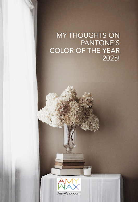
As a color expert, I see Mocha Mousse as a reflection of our collective desire for peacefulness and tranquility, which we long for more and more with each passing year. The term that I first think of when I see Mocha Mousse is mindful spaces. What’s more soothing, tranquil, peaceful, and focused than sipping a latte in a beautiful coffee house? Its neutrality makes it versatile yet warm, allowing it to be creative while enveloping us in a sense of coziness, warmth, and security.
I consider Mocha Mousse to be part of the Earth Tone family. Its warm shade brings a grounding element to any space, perfectly suited for biophilic designs that connect us to nature and foster well-being. It’s a color that whispers comfort while being ever-so-slightly focused and serious.
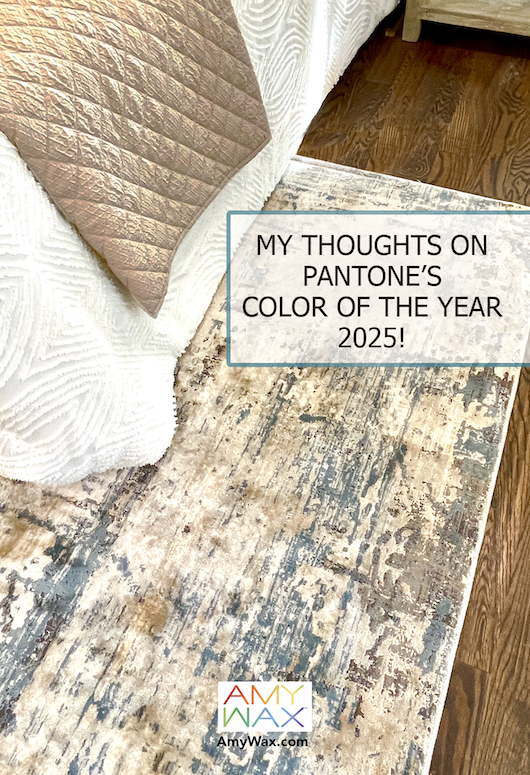
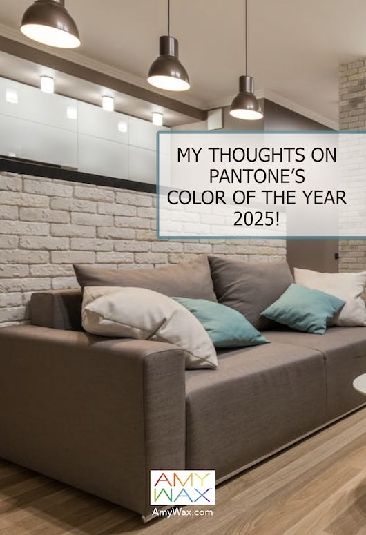
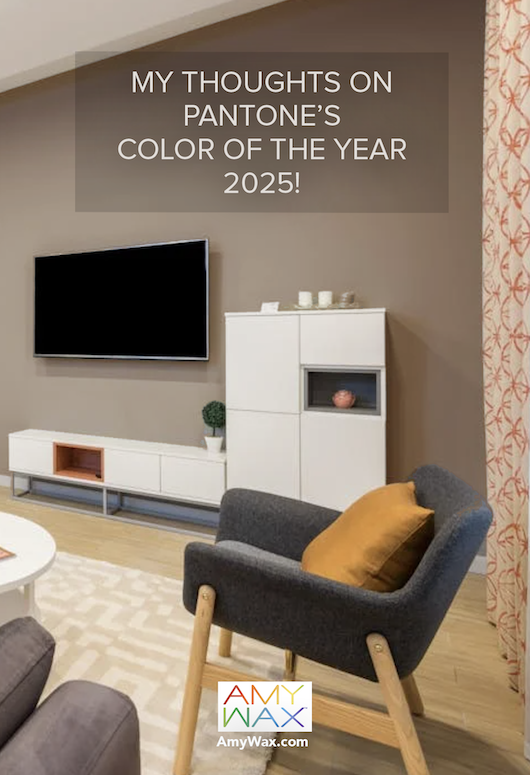
Mocha Mousse is an excellent choice for spaces that promote relaxation, comfort, and, dare I say it, indulgence. Living rooms, dens, and reading rooms are ideal for this warm, grounding hue. Its rich tone pairs beautifully with soft lighting and cozy furnishings. Mocha Mousse’s best use cases are areas where people want to unwind; there’s a bit of unexpected energy to the hue, allowing it to be used anywhere from a sitting room to the bedroom.
The warm color also works well in transitional spaces like hallways or entryways. When paired with natural textures such as wood, stone, or woven textiles, Mocha Mousse can create a welcoming ambiance that feels sophisticated and inviting. Using it with lighter neutrals or metallic accents could be very impactful in highlighting architectural details and adding some cohesiveness to those transitional spaces.
Forbes recently published a piece curating interior designers’ thoughts on Pantone’s selection of Mocha Mousse. As the sole color specialist in the group, I was delighted to be asked to give my opinion.
I was quoted saying:
“My thoughts on Mocha Mousse is that it speaks to our desire to be surrounded by colors that give us a feeling of peacefulness and tranquility. As a color in the neutral family, it is simple and warm, allowing us to be creative with it. Mocha Mousse lets us take on the feeling of being cozy, warm, and secure all at the same time.”
We all want our homes to be warm, cozy, and secure places. In 2025, Mocha Mousse will help provide that environment for countless families. None of us knows what the future holds, but we can depend on our spaces to provide sanctuary when we need it, and Pantone’s color of the year for 2025 will do just that.
It’s fitting that I cap off 2024 with my last article, highlighting how color can set us up for design success in 2025! I hope everyone found joy and color inspiration in 2024. I try my best to inspire every one of you, regardless of your style, tastes, or home design! I’ve always found that art, design, and color can be a saving grace for me, and perhaps they are for you, too!
Make sure to follow along in 2025. I have a lot more inspiration on the way, and I am eager to share it with you!
To a wonderful 2025!
-Amy
