You know that feeling you get when you walk into a room or see what someone is wearing, and it just feels “off?” The colors do not work with each other, the arrangement of items doesn’t work either. I’ve heard millennials use the term “bad vibes” regarding spaces like that, and I think we can all relate to that sentiment.
What I’m getting at here is that clashing colors can really throw off the emotional intentions of a space and leave visitors with a bad impression, both consciously and unconsciously.
In this article, I will discuss ways to avoid creating clashing color combinations and set your rooms up for success while avoiding the title of “bad vibes.”
If we revisit basic color theory, complementary colors oppose each other on the color wheel, such as blue and orange or violet and yellow. Analogous colors sit right next to one another on the color wheel, such as blue and blue-violet or yellow-green and green. There are also color schemes that follow those same principles, such as triadic, tetradic, and split complementary.
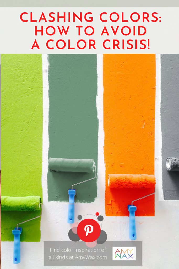
Now clashing colors are not simply colors that don’t fit into a formula within the color wheel; no colors will “clash” because of their properties. What do I mean by this? When I think of colors clashing, I consider the colors’ intensities and undertones.
For example, you may create clashing colors by pairing soft and smoky purple with a bright, vibrant, and electric green. It’s not exactly the colors that clash; the varying levels of intended intensity do not vibe well together. Think of color intensity could as vibrancy and saturation. When they clash, the intensity sets up two contrasting moods.
For the undertone component, I always like harkening back on the emotional intentions of a space or even the emotional intentions of an outfit. If you enter a bedroom and the walls, furniture, and other design elements are all cool colors, soft tones of blue, grey, and white, it doesn’t work to put a hot, fire-lipstick red comforter on the bed or a neon-yellow desk in the corner. The two different undertones clash because of the dominating but opposite energies they provide. Homeowners must carefully consider warmer and cooler undertones in every space.
Now admittedly, most people do not consider home interiors or exteriors when they think of clashing colors. The term is most often associated with fashion and outfit arrangements. While it’s probably more common to see colors clashing in unfortunate garment choices, it can happen in the home as well.
There are some strategies that I tell all my clients to use when they envision the color palettes before we begin and what they can add to their spaces long after the job is done.
I always help each client work through the noise of what they have been told they need and discover what they truly desire out of the spaces in their home. Whether that’s the bedroom, kitchen, entertainment room, or bathroom, color palettes are chosen to bring out the utility of the space and the desired emotions of the homeowners.
It’s very unlikely that a professional color specialist will recommend clashing color palettes in their client’s home. However, sometimes people get the impulse to add a striking piece of furniture, a new area rug, or heaven forbid, paint an accent wall themselves to change a room. Before selecting any new colors for a space, you must carefully consider whether the intensity and undertones will clash with what colors are already established.
Now, I’m not trying to scare anyone away from picking up some items to work as accent pieces. Accent colors and pops of color here and there will not clash because they will not occupy enough visual space to combat palettes already in place. No, I’m talking about adding large pieces of furniture and adding a substantial amount of color into the area – that’s when the real clash will happen.
Before adding any colors to your rooms, ask yourself, “what “tone” has been established already, and will this new addition disrupt that tone?” Competing tones will disrupt the color flow and intentions of the space.
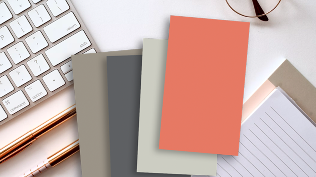
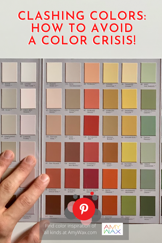
More than anything, I find planning your colors in advance will help avoid the crisis that can happen when colors clash. Plan your colors by looking at color swatches or paper color samples. Lay them out in front of you or actually sample paint colors on the wall!
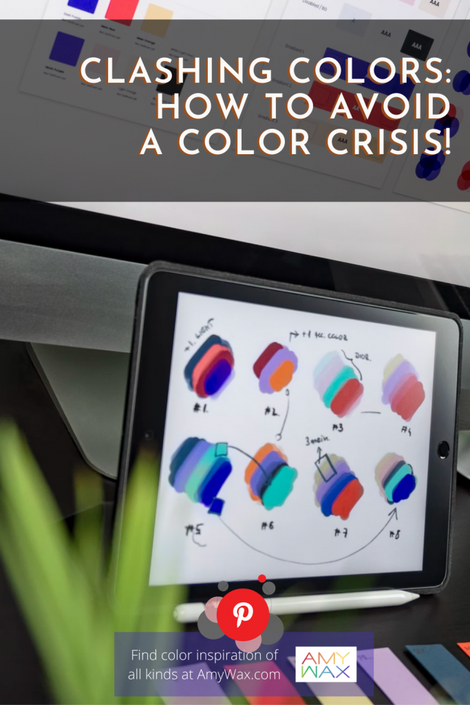
If you work better on the computer, plan out your color palette using a design program as your visual guide. For many people seeing your colors together first can avoid expensive mistakes! Take the extra time to get it right; it’s well worth it!
Do you have a story about clashing colors that left a long-lasting impression? Were you able to alleviate some clashing colors in your home with some adjustments? Let me know! I always love hearing color stories.