A new year is often synonymous with a fresh start and new trends — whether that’s fashion, movies, food, or, yes, color. As a color consultant, I often have to evaluate which colors are “in” vs “out” and as the calendar switches to a new year, 2020 is no exception.
The trends on color for 2020 are quite interesting. I’ve not only noticed a shift in color trends for 2020, but ironically, I’ve also noticed an overall shift away from the reliance on trends in general! People are getting more confident acting as their own color experts, choosing colors and trends that work in their individual spaces and with their unique styles.
That being said, there still are some definite trends you want to keep an eye on this year. Then, you can take those trendy colors and make them work for your space… instead of forcing your space to fit with specific trends.
Let’s look at some of the trending colors for 2020, how they’re different from the past few years, and how you can implement these colors this upcoming year.
I already mentioned that the biggest color trend for 2020 is going to be the lack of specific trends. Now, let me clarify that a bit.
Of course there are general trends to follow (that I’ll go over in this post, in fact). What’s different in the year 2020 is people aren’t afraid to break out of trending color palettes and schemes.
There’s less of a desire to fit into a mold, which means that people are creating personalized and unique environments that complement their rooms and aesthetics.
In my opinion, this is a result of Gen Z and Millennial color trends since those tend to be zany, out-of-the-box, interesting, and more innovative compared to more traditional colors trends from the past. This can be seen pretty clearly looking at the colors of the decades from the past to the present.
I started with this point for a reason. As I go over some other colors for 2020 in the rest of this post, keep in mind that you don’t (and shouldn’t!) follow all of these tips exactly. These are simply guidelines and ideas that can then be applied to your specific room, home, business, or wherever else you’d like to apply color
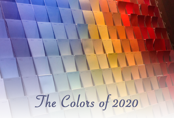
The Colors of the Year are colors declared by some of the biggest design names each and every year: Sherwin Williams, Behr, Benjamin Moore, Pantone, PPG, etc.
The colors nominated this year have a wide range, which reflects a concept I mentioned earlier. People are more open-minded when it comes to colors and choosing what’s right for them. It is worth noting that this year’s choices tend to be either bold or delicate — nothing in between!.
For example, Sherwin Williams’ color of the year is a very dark blue called “Naval.” PPG Paints also went dark with Chinese Porcelain, which is a deep & dark teal. Pantone came in with another dark blue called simply Classic Blue. These highly saturated colors have depth to them, but they are ultimately classic color choices.
Behr and Benjamin Moore however, chose softer, relaxing, and more natural colors like Behr’s “Back to Nature” (an earthy olive green) and Benjamin Moore’s “First Light” (an off-white with a pinkish hue). Sherwin Williams HGTV color of the year is a softer blush. Interestingly, each of these choices are on the softer side, contrasting from the Behr, Benjamin Moore and Pantone color choices.
This variety of colors of the year speaks directly towards the trend-breaking ideals of the new decade. People are generally more willing to tell their own story with the colors of their homes.
As you can see with the colors of the year named by Behr and Benjamin Moore, there’s a trend towards warmth with less emphasis on the cool grays of the past couple of years. Warmer woodsy and earthier colors are back in.
This doesn’t mean that we are less likely to use stronger or bolder colors. I am finding that we are more likely to be drawn to classic and traditional colors like the navy blues (remember Naval and Classic Blue?) that balance nicely with newer and more unique trends.
Navy and blue-greys can be used on their own or can be used alongside the quieter color options, these classic color choices are almost neutral on their own. They have a soothing effect as well, which allows you to both follow and not follow current trends (noticing a pattern here?).
The switch from strong and bold colors to softer and soothing ones can also be linked to the modern day emphasis on the natural. As biophilic interior design and greater emphasis on natural elements and textures rise in popularity, eco-friendly products and styles are also becoming more prevalent.
This means switching from bolder and unnatural colors (like the bright neons and shiny metallics that took over much of the 2010s) to ones that feel more natural like earth tones — many shades of green, natural wood, warm taupes and lighter beiges, natural stone, and others.
Using natural elements is a global trend that can be seen across many aspects of the design world, including color. Reclaimed wood, naturally dyed fabrics, matte metallics instead of shiny artificial ones, natural stone colors and emphasis on live plants are going to be increasingly popular this year.
Last, but certainly not least, is lighting. Lighting is as important as the colors in the room! In fact, lighting directly affects paint color appearance and can completely change the look & feel of a room.
It’s because of this that I urge you to think about lighting just as much as you think about the color of your room during the design process. As you’re going through design and color options, ask yourself the following questions:
When it comes to color and design trends in 2020, I’m noticing that designers, color experts, homeowners, and decorators alike are finally addressing lighting and giving it the attention it deserves.
This also brings us back to another 2020 design trend: biophilia. If you’re planning on following that trend this year, you’ll need to be aware of how much natural light your room will have, as that’s an essential part of biophilic design.
As you might’ve noticed throughout this article, the number one color trend I’m seeing this year is unique and personalized color choices in both residential and commercial applications.
That’s why I wanted to end on this question: what’s your favorite color for 2020? What color trends for 2020 are you interested in?
This is the year to truly make a space your own with colors that match your unique space and style. Use the 2020 color trends in this post and from paint companies as a guide, not as a rulebook.
I’d love to hear your thoughts on the topic! Don’t hesitate to contact me or leave a comment below!