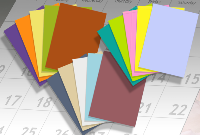
2020. A year — in fact, a decade — that once sounded futuristic, is finally here!
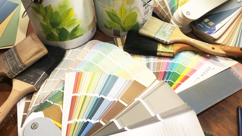
As a color consultant, I’ve seen the ebb and flow of color popularity throughout my career. And looking back even beyond then, it’s so interesting to see the color trends and patterns! Some colors that were once beloved and in every home (looking at you, orange) have now been placed on the back burner in lieu of the next big thing (hello, “millennial pink”).
At the same time, colors are no different than many other trends: they go in cycles. So, many colors have swung back around after being out of fashion.
What better way to ring in the new year, and the new decade, than taking a deep dive into the most popular colors of the decades that have gone by?
Let’s take a look at the top colors from the last 50 years. You’ll see some interesting patterns start to emerge, and maybe you can make some predictions on what to expect in the new roaring 20s!
The 1960s brought many quirky and experimental color palettes that wouldn’t soon fade in the 70s. Colors left over from the 60s, like bright yellows, oranges, and pinks were ever-present. Even the purples and olive greens made it into the 70s fitting in perfectly with an era defined by hippies, music festivals, and improved technology.
As color TV screens became the norm versus the traditional black and white, media decided to go all out with color. Television and movies found themselves exploding in unique, bright, and colorful palettes. This translated into the general color trends of the decade.
Colorful cartoons, bright bell bottoms, bold shag carpets and flashy toys like Light Brites and Play-Doh were descriptive of the 70s.
At the same time, we also saw somewhat of a dichotomy with color trends in this decade. Muted colors like olive green, dark purple, deep reds, and burnt orange stayed popular in homes and professional clothing as well. Looking back though, brights definitely took the lead as we turned into the next decade.
If you thought that the 70s were bright, then you should put on some sunglasses for the most popular colors of the 80s!
Neon colors and vibrant patterns make up a majority of the trends of this decade. Everything from neon pinks (hello, Miami Vice!) to lime green to almost blinding yellow was rampant in the 80s.
Even more technological improvements allowed media like video games and TV to step it up a notch. They started creating bright and fantastical ads, shows, games and music to match.
“Electric” is another great word to describe the colors of the 80s. Flashing neon colors became standard in everything from fashion (remember those great neon Nike windbreakers?) to advertisements (the rainbow Apple logo).
Similar to the 70s, the 80s also had other smoother color trends to balance each other out. Alongside the electric colors, pastels were also quite popular. The airy 80s pastels gravitated towards softer tones of pink, blue, yellow, and green.
The 80s also saw people experimenting with unusual color combinations like mauves and teals, peach and blues, and many other unique combinations.
After two decades of bright colors and zany combos, the 90s reacted with a color trend that included more subdued colors and combinations compared to previous decades. While the earlier portion of the decade definitely had its bold strokes, popular colors in the 90s blended into tan, beiges, and earthy reds alongside softer teals and blues.
Alongside these more muted and soft colors you would also often see some zany patterns leftover from the 80s, often with bold contrasts. However, instead of solely neon brightness, you’d see more inclusion of teals, reds, and blacks alongside the neon purples, pinks, and yellows to make up these patterns. Think: Fresh Prince and Saved by the Bell.
The 90s also saw the emergence of the grunge scene brought blue jeans, flannel shirts, combat boots, and darker makeup. As a result, earthier colors like browns, black, red, forest greens, and darker blues also increased in popularity to match with this new style.
As the 90s continued, more simplistic color patterns emerged with a heavy reliance on solid primary colors like yellow, red, green, and blue. Greys, maroons, and soft blues were also quite popular.
After Y2K came and went, we saw a retreat back to many neutrals and subdued colors like much of the 90s. This included a wide variety of interesting neutrals, generally with a gravitation towards earthier colors like:
This era also saw trends drifting toward metallic accents of gold and silver alongside an inclination towards natural colors like shades of green and blue.
However, like many of the other decades before it, the 2000s saw some duality in color trends, too. While neutrals and earthy colors dominated some demographics, bright colors that mimicked earlier decades also emerged.
Take the Apple iPods, for example. The lineup of colors included bright purple, pink, blue, green, and yellow that consumers ate right up. This was right alongside an ad campaign that encouraged rave pop music with a beat and dancing like no one’s watching while flashing these same bright colors. This was reflected in the general color trends of the time.
However, the colors didn’t permeate the trends and culture quite as much as in the 70s and 80s. You’d often see brighter colors like orange combined with more subdued colors like brown to keep things fun, toned-down, and modern all at once.
Last but not least we have the 2010s.
In this decade, we’ve seen a lot of Millennials getting nostalgic for the colors and patterns of their youth, which has led to a resurgence of 80s and 90s trends.
A gravitation towards colors that represent living large and an exuberant lifestyle like bright pinks (Lyft), colorful greens (Spotify, Starbucks), and periwinkle purples and blues (Twitch) became commonplace.
Fashion and style have become more outspoken and bolder than ever before as technology continues to play a big part in adding bright colors to everything from products to fashion to home decor. Just look at Instagram’s logo. Remember when it used to be brown?
Yet again we see a dichotomy occur. One one hand, you have the bright and bold colors of the modern age. On the other, we can see people leaning heavily towards sleek minimalism.
White, cream, soft pinks, pastel greens, black, and metallics like rose gold and silver all increased in popularity in this decade. Many rooms, brand color palettes, fashion choices, decor options, and more are monochromatic and simplistic to create a sleek and minimal design.
Toward the latter half of the decade, we’ve seen the return of “mid-century” as a design theme, often implying simple and straight with a color scheme that doesn’t steal the show to match. For many, less — and cleaner — has become more.
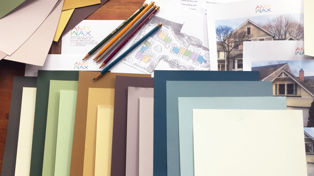
As a color consultant, I’m always hyper-aware of the current trends. But, I’m also constantly thinking about what the next big thing will be, and how people will adjust their tastes and preferences in each new decade.
I’m curious to hear your thoughts. Leave me a comment below or contact me to discuss these and other colors of the decades!