As a color consultant/color expert, I’ll sometimes run into a scenario like this: a client has a color they truly love, something animated and loud, something unexpected—but they’re not quite sure how to make it work with the rest of their home. It doesn’t seem to “fit,” and yet they don’t want to let it go; this is what I like to call difficult colors. But difficult colors aren’t meant to be eliminated. They’re meant to be handled with intention. It takes an expert to get this right, and I’m happy to share my advice with you on what to do if you’re the one!
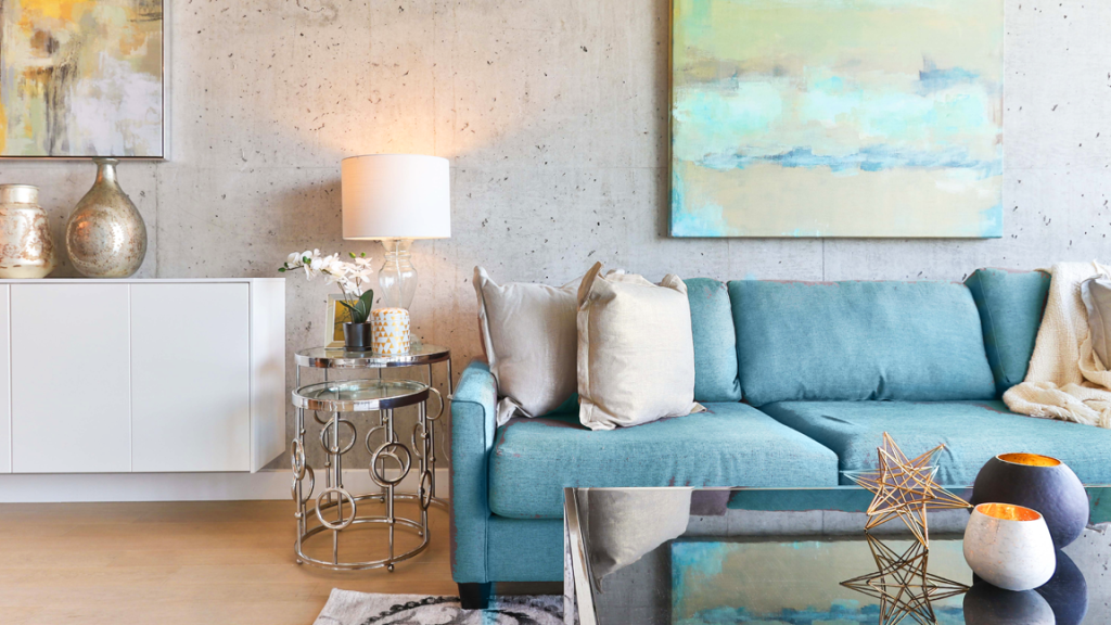
To many of my clients’ surprise, there are situations where their favorite difficult color(s) are surprisingly flexible. A space grounded in black and white, for example, can work a visual balance where almost any color can live comfortably.
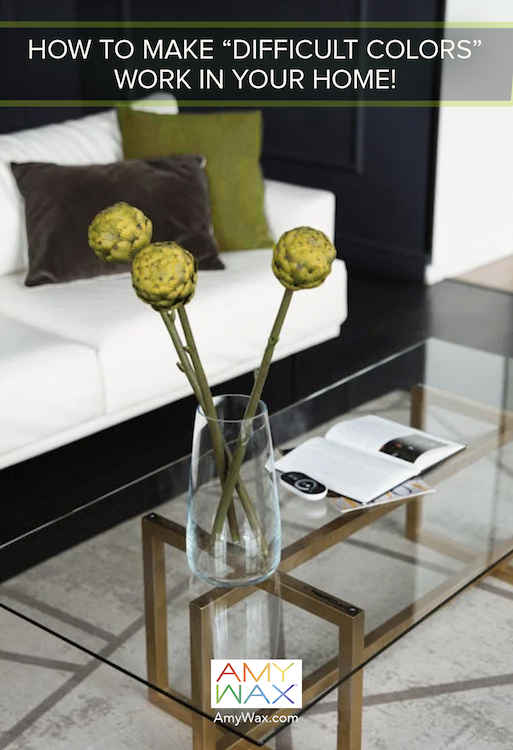
Picture an olive green pillow that feels right at home because the surrounding palette is so steady and supportive. When the foundation is simple (black, white, neutral), difficult colors become less difficult; they have room to breathe! This is often one of the easiest ways to introduce a color you love: simplify the surroundings.
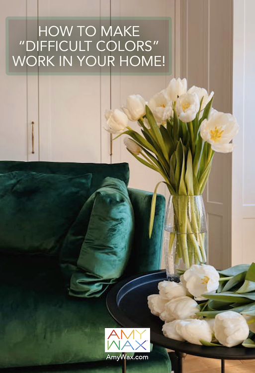
Sometimes the challenge with difficult colors isn’t a single shade, but a material that reflects multiple tones and bounces light in unexpected ways. Velvet, for example, can shift depending on the type of light, reading semi-green one moment, blue the next, or even gold. In these cases, the goal isn’t to match every variation, but to quiet the surroundings.
By layering in neutral tones and incorporating elements you love like fresh flowers, simple accessories, and natural supporting textures, you draw attention away from what feels unpredictable and toward what feels grounded. Difficult colors soften naturally when they’re no longer competing for attention.
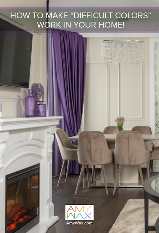
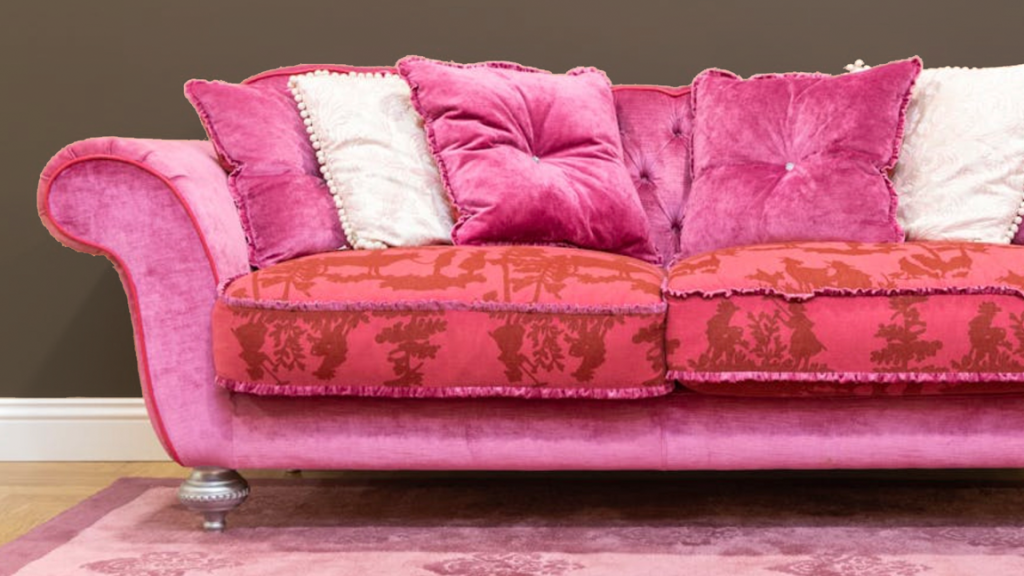
Risky colors like purple are the perfect example of a difficult color people love but often struggle to use. The purple aesthetic can feel too strong, too cool, or too present, especially in a room filled with warmer neutrals. The solution isn’t to eliminate it, but to soften its impact. Surrounding purple with lighter, calmer neutral tones allows it to settle into the space rather than dominate it. Adding a few accents, perhaps in similar tones or complementary shades, helps difficult colors feel intentional rather than random or isolated. When repeated gently, even bold, difficult colors begin to feel like part of a story rather than a distraction from your design!
And then there are moments when the best approach to difficult colors is the opposite of restraint, it’s go-go all-in!
If you have a truly bold or neon color that you love, sometimes the answer is to let it shine. Placing it against a darker background allows the color to stand out in a way that feels intentionally dramatic. Instead of trying to tone it down, you give it a stage and let it touch the sun!
This approach works especially well when you’re ready to embrace the color’s energy. Against deep charcoal, navy, or black, difficult colors like bright pinks or electric green tones can feel vibrant, modern, and alive, almost as if they’re glowing within the room!
In homes where the colors are completely quiet and understated, the bright accent color or what you originally thought of as the difficult color, can be just the giggle or smile the room needs!

The common thread in all of these situations is this: not every color needs to do the same job. Some colors lead, while others support. And some are simply meant to be moments, small expressions of personality that bring joy without overwhelming the space.
When you stop trying to force difficult colors to behave like the rest of your palette, they become much easier to work with. Whether you soften them, repeat them, surround them, or highlight them, the goal is always the same: to make them feel like they belong and be true to themselves.
The colors we love are worth keeping; difficult colors just need the right place and the right balance to work; try one of the suggestions I offered above!