We all get that temptation once and while to use loud colors, colors that scream for attention and can catch the eye from a block away; frankly, some of us like to use loud colors a little too much. But, how can anyone know when to implement loud colors in their home’s interior or exterior design motifs? How can someone know when to use loud colors in their fashion choices? It’s not as simple as some might think!
This article is meant to help anyone struggling with using bold colors for their homes, design schemes, or even outfits! As a color consultant, I want to help people understand where it’s appropriate to use bold and enthusiastic colors!
Loud colors (sometimes called bold colors) have a striking vibrancy and brightness to the hue; they’re meant to excite the senses and stimulate emotions heavily. These colors can be the perfect choice when looking to add vibrancy and energy to your color palette.
Loud colors are used in everyday environments, such as on traffic signs, road working equipment, and emergency vehicles. Bold colors are designed to catch the eye’s attention as quickly as possible and instill a message, such as caution and awareness; for example, a bright neon-yellow fire truck is painted this loud color to draw attention and create an instinctual cautionary response.
Along with the design world, bold colors will come in&out of fashion and have been doing so for decades. Some of the most notable examples would be the neon-colored fashion and furniture of the mid-late 1980s and early 1990s. The bold and electric colors were considered refreshing, the perfect opposite to the more natural earth tones of years before.
Some of the most striking loud colors would be any oranges, reds, yellows, greens, pinks, magentas, or even some blues, all with a high level of color saturation. The term “neon” is often used to describe some bold colors in reference to the electric-glowing nature of neon lights.
Loud colors have been more restrained in fashion, furniture, and design than they once were, and when the situation calls for it, loud colors can have a dramatic impact when they are used well; let’s see how it’s done!
Any paint color expert or fashion designer will tell you; loud colors need to be used sparingly to have the desired effect and not be overdone.
Because loud colors, such as parrot-green or a brilliant orange, are so vibrant and powerful, they can overwhelm the senses easily, which means they need to be balanced with colors on the softer side. Hues with soothing neutrality will work with bold colors to create a palette with harmony.
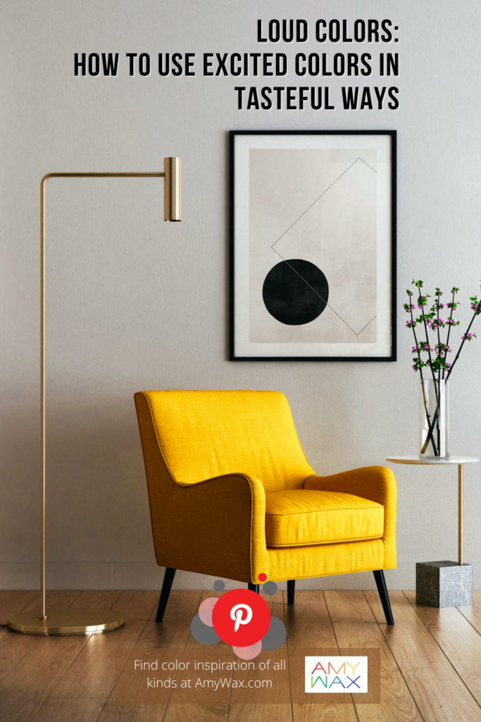
If you wanted to use a vibrant, loud color in your kitchen, it would need to be implemented as an accent color with touches here and there. For example, you may have white cupboards, but you could have bright red cupboard knobs! The knobs would bring just enough liveliness, friendliness, and excitement to the kitchen without being overpowering or headache-inducing. The base color presence of white helps to simultaneously highlight and restrain the bright red color, creating a lasting impression.
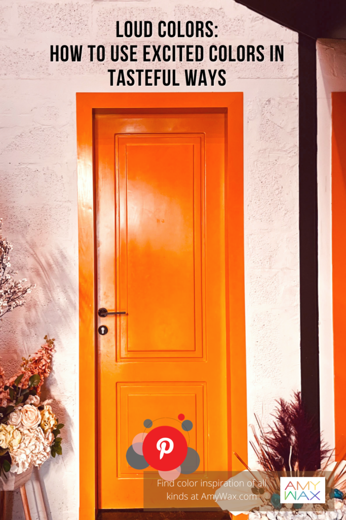
Are you looking to make a statement with your front door? It can be the perfect place to go a little wild! Adding color to just the door and its trim can create the super-fun statement you are looking for, welcoming people into your home.
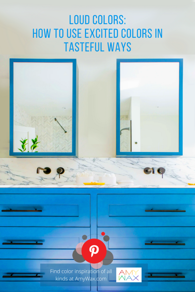
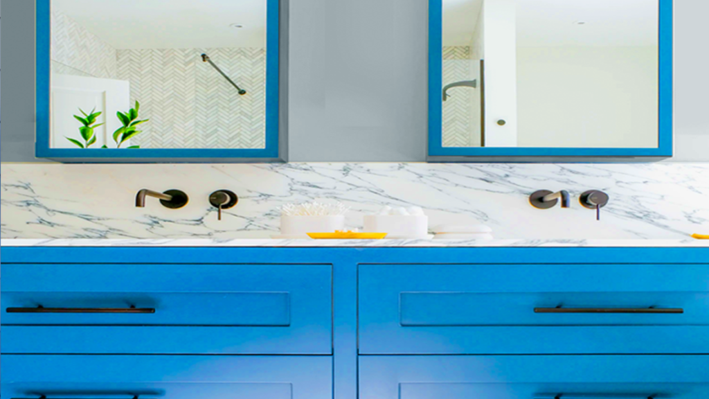
Bathrooms are another interior space that can benefit from loud colors. Usually one of the smaller rooms in the house, it is an opportunity to add colorful cabinetry that will really show off your sense of style! The cabinetry is often the only furniture in the room, so they don’t have to match anything, so go ahead, choose a bolder color if you’d like. It will certainly make you start your day with a smile if it’s a color you love!
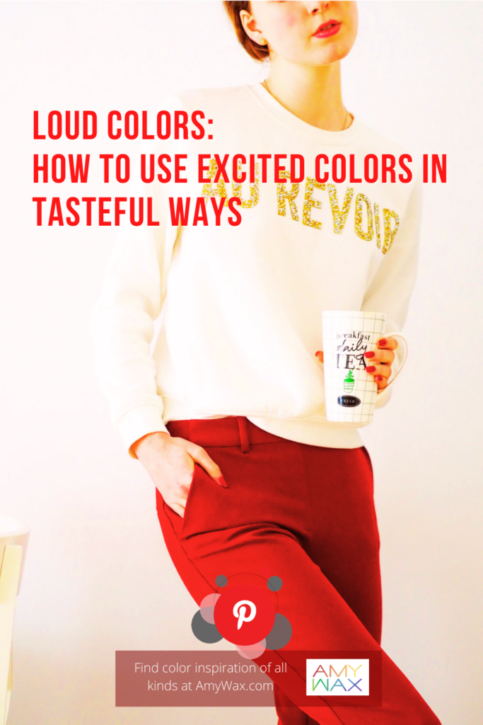
When it comes to choosing brighter colors in your fashion choices, I love wearing one loud color and letting it take center stage! A hot pink top is perfect against a black skirt; the contrast makes the brighter color stand out even more. Bright red pants are one of my favorite ways of wearing a bright color. Pair it with a lighter color top, and it’s a win-win color combination for any time of year!
The saying goes, “With great power comes great responsibility,” and I think this is also true for excited colors as well. With loud colors, there is a need for great restraint. Understatement is key for finding success with colors that are this enthusiastic, wherever they are used.
Generally, when I am working with loud colors, I use one color and make it the star of the show! It can be loud and bright to achieve the glowing look of neon or electric colors if that’s the look you are after. Pair it with a quieter color palette or a classic black or white, and you can go as bright as you want. Are you looking to spruce up your life? Maybe using loud colors is just the excitement you are looking for!
As a color expert, I love hearing your color stories! Have any interesting stories about finding unexpected success with bold colors? I’d love to hear them!