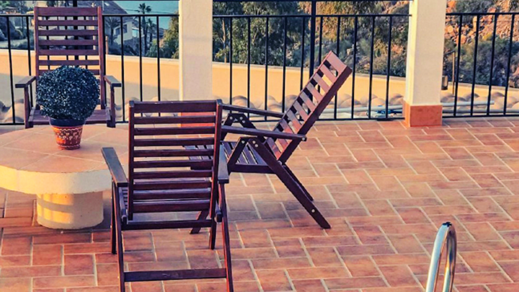
Summer is just about here, the time of year when we make the most of our outdoor patio areas! This time of year, we all (especially those in the Northeast) spend as much time as possible by the pool, lounging in the sun, enjoying a morning coffee (evening cup of wine), or BBQing on the stone patio during the hours in between! We want to make the most of the long days, beautiful weather, and flourishing flora around us.
To enjoy our outdoor areas to the fullest, we need color palette arrangements that support the mood, vibe, and aura we’re after. In most cases, with stone patios and landscape architecture, homeowners want to use color palettes that create a natural flow of relaxation and do not contrast and clash too much with the surrounding environment.
There’s a fine balance to strike when arranging outdoor color palettes. If you’re a consistent reader of mine, you’ll know that as a color specialist, I’m always in support of taking a leap of faith, making bold choices, and embracing colors you never thought you would! However, when working with a stone patio or professionally designed outdoor oasis, it’s important not to overcompensate and outdo the natural world around you.
Nature always wins, so you don’t want to compete for eye-catching colors. The natural landscape is perfect as it is, and you want to share the space, not attempt to overpower it. That’s why earth tones and stone color palettes can be just the sweet spot on the color wheel for your patio.
In exterior design, earth tones mimic the subtle hues found in nature. These include the soft greens of foliage, the gentle browns of tree bark, the pale blues of the sky, the creamy whites of beach sand, the hazy grays of beach shells, the earthy pinks/terracottas of clay and stone, and so much more. The integration of earth tones colors allows structures to become a part of the landscape, creating a cohesive and visually appealing environment, not one that clashes among itself. By using a palette inspired by nature and low in color saturation, designers can ensure that buildings and outdoor spaces feel organic and unobtrusive, promoting a sense of tranquility and unity with the environment.
Stone colors in neutral/natural tones, such as soft grays, beiges, and whites, provide an excellent foundation for patios, blending effortlessly with their surroundings. These subtle hues mimic the natural colors of rocks and earth, creating a seamless transition between the built environment and the landscape. It would be fair to say that stone colors are a subset or under the umbrellas of earth tones. For example, when these stones are complemented with light blues, the overall effect is tranquility and calmness, reminiscent of a clear sky or a gentle, rushing stream. Or, incorporating warm terra cottas and brick tones adds a touch of warmth and aids rustic charm, evoking the feeling of a sunlit earth.
Various stone choices will harmonize a patio with the natural environment, mirroring nature’s diverse textures and colors. For instance, flagstones in earthy tones can mimic the natural appearance of a forest floor. Or, with its soft, natural coloration, limestone can brighten a shaded area and provide a cool, serene atmosphere. A patio can feel like an organic landscape extension rather than an imposition by selecting stones that reflect the surrounding environment. The ultimate goal is a sense of unity and balance with the natural world, and stone color palettes accomplish this wonderfully.
While harmonizing with the landscape around your patio is a goal, you also want to delineate your outdoor areas from the surrounding environment, even if just so slightly. How and why is this done? Let’s explore further.
Defining function – When arranging the stonework of your patio, clear boundaries help differentiate areas for specific activities, such as dining, lounging, gardening, or even outdoor reading areas! This functional clarity makes the outdoor space more organized and user-friendly. While it’s great to have the stonework naturally absorbed into the landscape, it’s also important to have some clear function and flow to its placement.
Creating layers and depth – Delineating spaces adds layers and depth to your patio design, keeping it from being flat or two-dimensional. It also creates a visual storyline, something more intriguing, by guiding the eye through different areas, each with its unique purpose and design elements.
As a color expert, I say go ahead and use accent colors that add life to your outside spaces if you are truly inspired to do so. Stay focused on your goal with your patio design. You should tactfully add pops of color to your scene, adding a splash of color, a little at a time. For example, bright red or orange-tangerine cushions against a neutral-toned granite patio can draw the eye and create a lively seating area. Similarly, a few boldly colored planters with vivid flowers, like marigolds or petunias, can introduce pops of color that stand out against the muted stone backdrop. Pops of color are allowed, but keep them at a reasonable threshold.
I hope you enjoy your patios this summer; I know I will make the most of mine! Please share any thoughts, ideas, or inspirations you have found helpful when preparing your outdoor patio for the season; I’d love to hear from you!