Spring is in the air, and painting season is here! When the weather turns for the better, many homeowners start thinking about how color can reshape the feel of their home. While large-scale repainting projects take time and planning, the front door offers a more targeted opportunity, one where thoughtful color selection can enhance the architecture, define the entry, and boost curb appeal.
Previously, in my painted front door series, we explored ideas that address visibility and design challenges. With this article, I’d like to focus on how front door paint colors can improve curb appeal by showcasing architectural features, complementing surroundings, and creating a lovely entry experience!
People often begin thinking about curb appeal for practical, transactional reasons, such as repainting because the door looks tired (you’re tired of it), preparing to sell a home, or attracting seasonal renters. For others, it’s simply maintaining property value. A welcoming entry signals care and attention, helping potential buyers or visitors form a positive impression before they even step inside. For these homeowners, improving curb appeal is a smart investment.
Curb appeal isn’t only about resale value or first impressions for strangers. For many homeowners, it’s also about how their home feels to them each day. Pulling into the driveway after a long day and being welcomed by a beautiful entry creates a sense of calm, pride, and ownership!
There’s additionally a deeper/personal layer to curb appeal. Improving the exterior of your home can be an expression of care for your neighborhood and the people around you. A cheerful front door, thoughtful landscaping, or coordinated colors can contribute to a sense of beauty and community! It’s a quiet way of saying that you value where you live and the environment you share with your neighbors.
When selecting front door paint colors, it’s helpful to start with the materials and architectural details surrounding your entry. Brick, stone, siding, and trim all influence how color is perceived, and choosing a shade that complements them helps create an intentional look.
A color that works beautifully on one architectural style/material selection may feel out of place on another. A loud, lime green front door may work beautifully on a funky cottage in the Florida Keys, but not so much on a traditional Cape Cod-style home. The goal is to choose a color that unifies the home rather than works against its established styling.
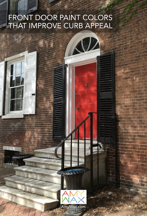
Traditional homes (Capes, Colonials, Ranches) frequently benefit from timeless colors such as navy blue or classic red. These shades feel grounded and appropriate while still holding some eye-catching prowess.
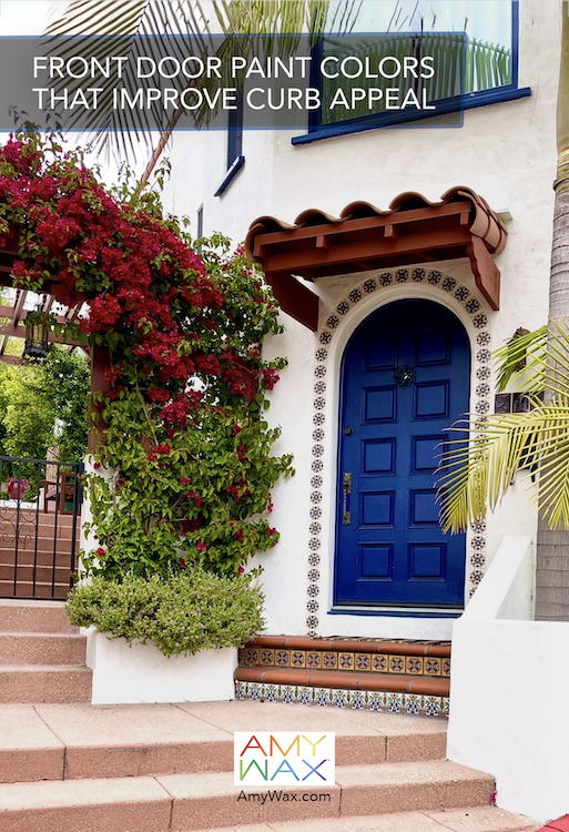
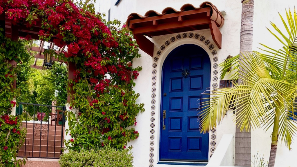
Period homes might have design elements that can inspire your color choice. In a Spanish-style home, there might be colorful inlaid tile or tile steps below the front door. Is there a roof tile or metal, or a colored mailbox nearby? Are there planters that carry a color to the front door? Look to what surrounds your door for inspiration; you might be walking by something every day that offers color opportunities.
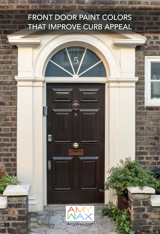
On the other end of the design spectrum, for more modernist and minimalist homes, the front door paint colors are meant to emphasize simplicity, texture, and warmth rather than bold contrast. Picture strong wood-grain finishes such as walnut, teak, or mahogany that add natural depth and create a welcoming focal point while maintaining clean architectural lines. For painted options, muted tones like charcoal, soft black, warm taupe, or deep bronze complement minimalist exteriors without overshadowing them.
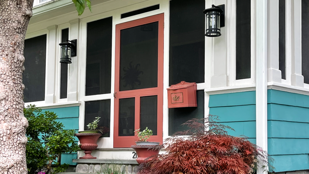
One of the most effective ways to improve curb appeal is by creating contrast between the front door and the surrounding exterior. A door that blends too closely with siding or trim can become visually lost. Introducing contrast helps define the entry when other features of the home do not.
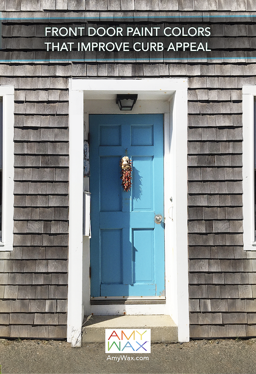
For example, a soft gray home may benefit from a deeper navy or a rich moss green front door. A warm stone exterior might pair beautifully with a muted blue or even a soft blush tone. The contrast doesn’t need to be dramatic, as minor adjustments can be just as effective!
Front door paint colors can also help draw attention to architectural features around the entry. Trim, moldings, columns, and surrounding details all contribute to the overall look. Picture a soft, neutral door paired with crisp trim, creating an elegant, timeless look. In other cases, a bold door color framed by neutral trim can become the focal point of the home.
Is your home part of a group of homes connected at the front, or part of a development? Choosing your own front door can be the perfect way to make your personal statement or to identify the door as yours. Color can define your home while also being an informational or directional tool!
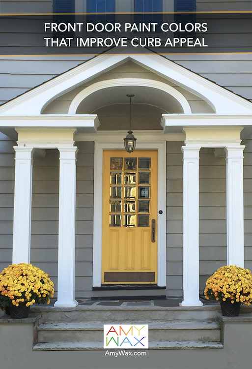
Nature stands as your greatest ally, so work with it to improve curb appeal! Plants, flowers, and planters can support the door color and create a welcoming entry experience. A yellow door, for example, looks great when flanked by greenery or seasonal flowers. A navy door may pair beautifully with soft neutral planters. It’s these details that help connect the door to the overall environment and create a welcoming, natural-feeling environment.
As a color consultant working nationwide, I always make this point to my clients: the front door is often the first smile your home offers, setting the emotional tone before anyone, from friends to family, steps inside. Whether it feels warm and welcoming, calm and refined, or cheerful and expressive, the front door’s paint color shapes the first impression and influences how people experience the home as a whole. The front door is a huge opportunity to make your own personal statement. Choose the color wisely to get it just right!
Curb appeal regularly lies in small, thoughtful details; sometimes, the small changes make the biggest impact. When the entry feels welcoming and in harmony with the home’s character, it naturally sets the stage for everything that follows inside.