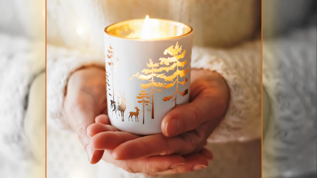
As the holiday season enters full swing, it’s time to consider what design and holiday color options are at your fingertips! When I speak with clients or friends about how they plan on decorating for the holiday season, I sometimes get a big sigh as if to say, “is that even a question?” As a color consultant, I get it; we can all get fatigued by changing household decor, which has become somewhat predictable year after year. However, I would argue that it’s not the flurry of holidays that has us gassed for energy. The lack of diversity in decor selection leads to a lack of inspiration.
Suppose you find yourself less-than-inspired at the thought of pulling out the same box of Christmas, Hanukkah, or Kwanzaa decorations this year. In that case, it’s time to change things and find new inspiration from alternative holiday color arrangements!
While my accompanying blog, “Holiday Colors Part I; Reinvigorating the Classics!” covered ways to invigorate the classic holiday colors with new life, this blog, part II, will explore exciting new color and decor arrangements for the holidays that offer some visual and emotional variation to the holiday season. It’s time to add a little holiday excitement. Are you ready? Here goes!
If you’re unfamiliar with the term “monochromatic design,” it means using one base color but incorporating different shades and tones of that color to create distinctive variations. When excited correctly, it looks stunning and creates an unforgettable design experience. The holidays are a perfect time to experiment with monochromatic color arrangements.
You know that feeling of awe and reverence when you walk through a freshly snow-covered scene in nature? Even if you can capture 1/100th of that feeling in interior design, you’re working some magic. That’s how I feel about using wintry whites in a monochromatic color design scheme.
Now, white in its purest form will not have different tones and shades to work with, but warmer whites, like eggshells and creams, can have a dynamic presence when arranging a monochromatic theme. Picture walking into a cozy living room with a fireplace roaring and soft warm-white throw blanket and pillows draped over the furniture. There’s a white Christmas tree in the corner with cream-colored ornaments draped all over. To cap it all off, some cool, blue-white starry string lights hang above the windows to complete the wintry magic.
There is purity and cleanliness in a white palette. There’s no denying the elegance of this understated style!
If white is not your preference for a monochromatic theme, other base colors will also work beautifully! Variations of a blush-pink in a monochromatic scheme can look wonderful. Still, you must be wary not to have it verge into Valentine’s Day territory, so try and keep the pinks lighter and less saturated. Blues, oranges, and greens also look fantastic – a monochromatic arrangement may be the solution to fight some design fatigue this holiday season!
Never underestimate the power of silver and gold, especially during the holiday season. While they may not be new in the sense of holiday incorporation, you can arrange the two metallic colors in new ways every year.
I often talk about design being cyclical, well, a “campy” design trend of silver Christmas trees has returned to the spotlight, and I love it! In the 1960s, many families adopted the fake Christmas tree solution, replacing pine and real trees in the home. As you can imagine, some funky and crazy-colored trees came out of this movement, one of them being the silver tree.

Silver trees can present themselves as elegant and serious, something you may see in a high-end hotel lobby, or on the other extreme, they can be fun and funky in a private home. Either way, it is a look that displays some pizazz! I love both approaches, but depending on your personality, you can decide how you’d like to present them. They have a magical effect of redirecting light, and you can give them a pop with an illuminated color wheel, and the whole room will glow like magic.
Gold speaks for itself, and its association with beauty, royalty, elegance, and power has been known for millennia across the globe. It can sometimes be challenging to balance gold with other colors, but a glowing white or dramatic black will offer an effective counterpoint to gold’s dominant presence.
Whether it’s a Hanukkah arrangement on an old mantle or a New Year’s Eve dining room presentation, try adding in some neutrals with your golds, and for an extra added pop of color, throw in a splash of delicate pinks or luscious purples as an accent color!
The combination of these unique colors can display a holiday decor that your family and friends will long remember once the holiday has passed by. If you’re looking for a way of making a statement this holiday, I suggest giving the metallic colors a try!
One of the hardest challenges when arranging new holiday decor is trusting yourself and committing to a new design. Don’t overthink it! Don’t get immobilized by fear! Embrace the change and enjoy a fresh new take on holiday decor.
If you’re looking for more color ideas, check out the Color911 color app – There are many prearranged color themes, and each one shares color palette ideas built in, and you can even create your own palettes! Color expert or not, it will be a huge help this holiday season!