Boy oh boy, it’s hard to believe we’re entering the holiday season once again, but here we are! Is it just me, or does the season start earlier every year and somehow go by quicker!? Regardless, the holiday season is a great time to try out new holiday colors and incorporate timeless classic arrangements.
Over the next few weeks, I will release sequential articles focusing on holiday color decor. Because there’s so much to discuss regarding holiday colors and design inspiration, each piece will have a different focus. Some color ideas will surprise you; I am looking forward to sharing this three-part series exploring a fresh new approach to holiday colors and decor!

This piece will cover how to best incorporate classic holiday colors into your home and reinvigorate the arrangements via new twists. The holiday season really is a color specialist’s dream, so let’s get started!
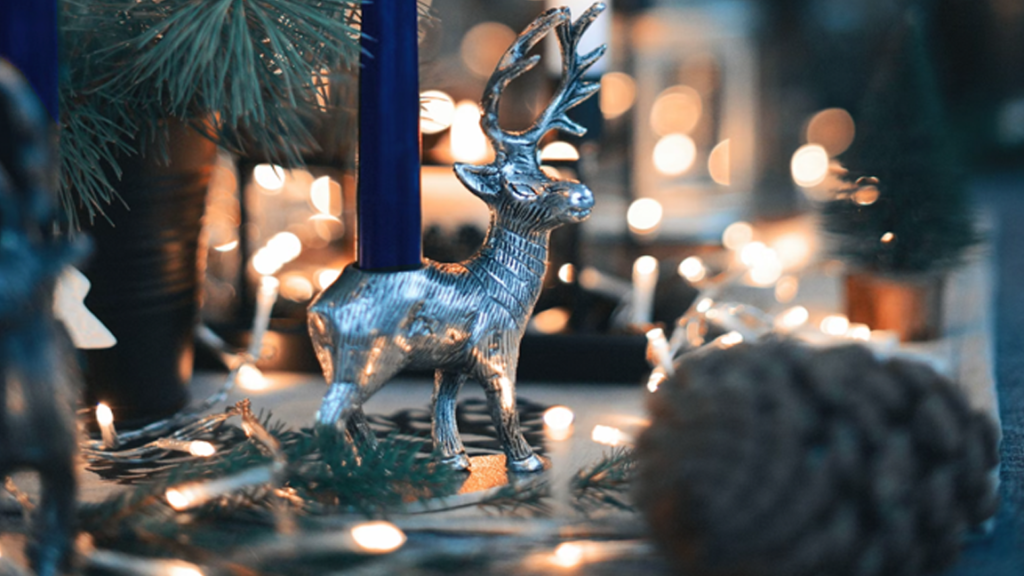
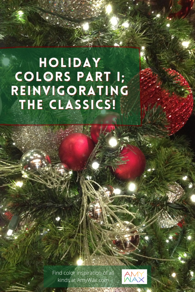
Without much hesitation, I’m sure you can picture the classic holiday color palettes when you close your eyes. The most prevalent classic colors are red, green, gold, silver, white and blue. Reds and greens are most synonymous with Christmas-themed decor, while blue and white are often identified with Hanukkah-themed decor. Silvers and gold are found in both celebratory styles and are a center point of New Year’s Eve color arrangements.
In the world of artists and design professionals/color experts, we use terminology to discuss color variations crafted from the color wheel. A quick lesson: tints are when color is added to pure white to create a lighter version of that color; an example would be pink, tinted to be a lighter shade of red. Shades are when black is added to a color to darken it, and we often say a “darker shade of” to highlight this point. A tone is when grey is added to a color to mute its vibrancy.
Although those might be the technical definitions, a lighter or darker shade can generally imply a paler or more intense saturation of a color. The tone of color relates to its “colorfulness,” for example: “Is the paint color a bright red, or does it have the tone of a deeper burgundy.”
To keep the timeless color arrangements fresh, dynamic, and inspired each year, it’s critical to use different tints, shades, tones, and textures whenever possible! Now, I’m not saying to use a completely different color in each room of your home, and uniformity from space to space matters, but you can try different colors to match the emotional intentions of the space.
For example, I may use lighter red and green tints in a bathroom outfitted with less saturated base colors. Light-cranberry red tinted candles could be arranged on the countertops and window sills, while light mint-green towels are draped over different surfaces.
For an exterior example, let’s use the front door. I love the way whitewashed driftwood wreaths look. If you’ve not seen these, they are wreaths meant to look like colorless driftwood you can find on the shore on a winter’s day. They’re stark white and look beautiful when juxtaposed with a pop of holiday color. I would use darker shades of holly red and green for this wreath scenario. While more serious and weighted than the indoor greens and reds of the bathroom example, they’re still adding a much-needed splash of classic color to the home’s entrance.
If the whitewashed wreaths aren’t your preference, why not make your own wreath!? Start out with the pines and be creative; add berries, twigs, or anything to add color, and make it your own! Add some soft-twinkling string lights for an enchanting presentation that works both during the day and at night!
Are you looking for inspiration? You can go the classic route, as in the color theme featured from the Color911 app, or find a new theme of whole new colors that inspire you!

Sometimes, the design inspiration needed isn’t created by using new colors but by bringing the classic colors to areas that historically lack color.
Let me set the stage here:
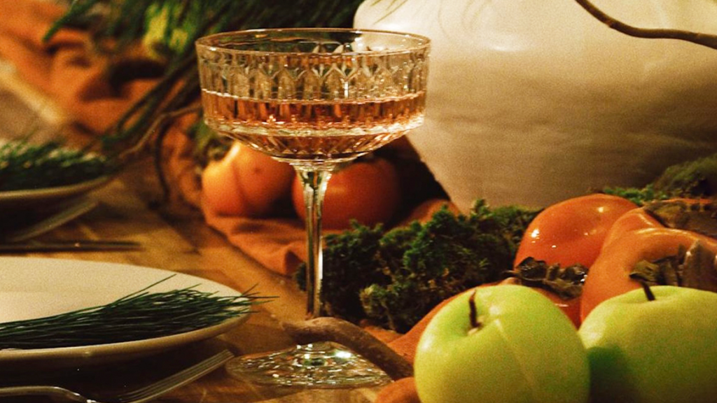
You’ve invited family and some close friends over for Hanukkah, and you want to make a splash with a dinner presentation but don’t know where to start. Should you hang the same paper accordion menorah wall decoration, you’ve used for decades? No! It’s time to change things up.
You buy a few 24” star-shaped white paper lanterns and gracefully arrange them from the ceiling; they put out a soft, warm light from above. What was once lonely colorless glassware is now accompanied by blue-colored glassware, illuminated by candlelight so you can see the bubbles and imperfections in the glass. Finally, all the food arrives at the table on silver platters. The holiday color arrangement here isn’t new, but it’s presented in an entirely fresh and elegant way!

Quite honestly, I’d be sad if I didn’t see at least a few of the classic holiday colors around my house during the season, but then again, I am always looking for a fresh new approach, exploring how we can use color to improve our lives!
What are your thoughts on decorating with traditional holiday colors? Changing things up does not take away from your traditions of days gone by; it could be tweaking them a bit or going with a refreshing new look. Trying new ideas is not about replacing the reds and greens or blues and whites of the holidays; it’s about improving them, even if it’s just the slightest bit!
I’d love to hear your thoughts, whether there’s a place for new innovative color arrangements during the holidays or if you are deeply entrenched in the traditional vibe your family has enjoyed year after year.
What are your favorite color arrangements for the holiday classics? Please share your memories with me; I always love hearing from you.