March, it’s not quite winter and not quite spring. It’s a month that can surprise you with warm afternoons or unforeseen blizzards. Of all the transitional months of the year, I feel March is the biggest wildcard and a tough time of year to find design/color inspiration. It’s a month that falls smack-dab in the middle of a seasonal transition; most find difficulty committing to one color palette or the other. Is it too early for the happy pastel spring colors? Is it too late for the moody and solemn winter colors? Where do we begin!?
If you find yourself stuck in the “design purgatory of March,” I’ve got some color specialist strategies and suggestions to keep your inspiration flowing! And no, it’s not adding “Kiss Me, I’m Irish” signs in your bathrooms, but if that’s your thing, go for it as well!
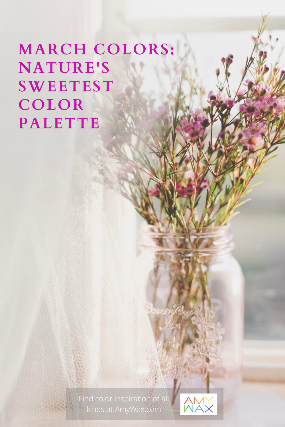
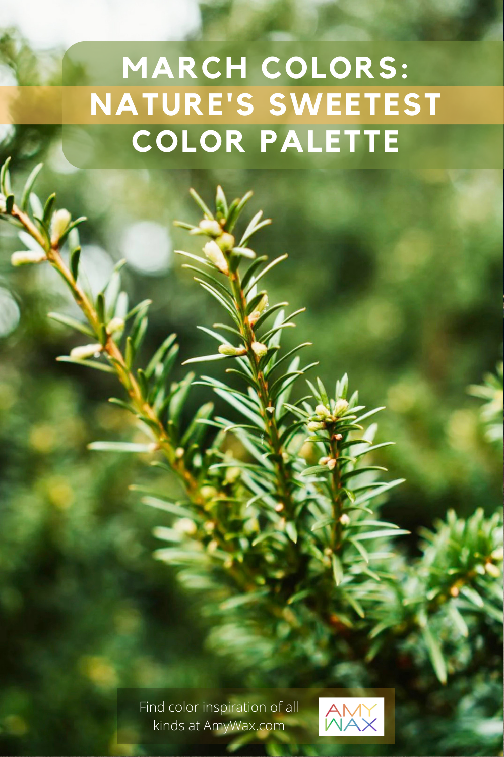
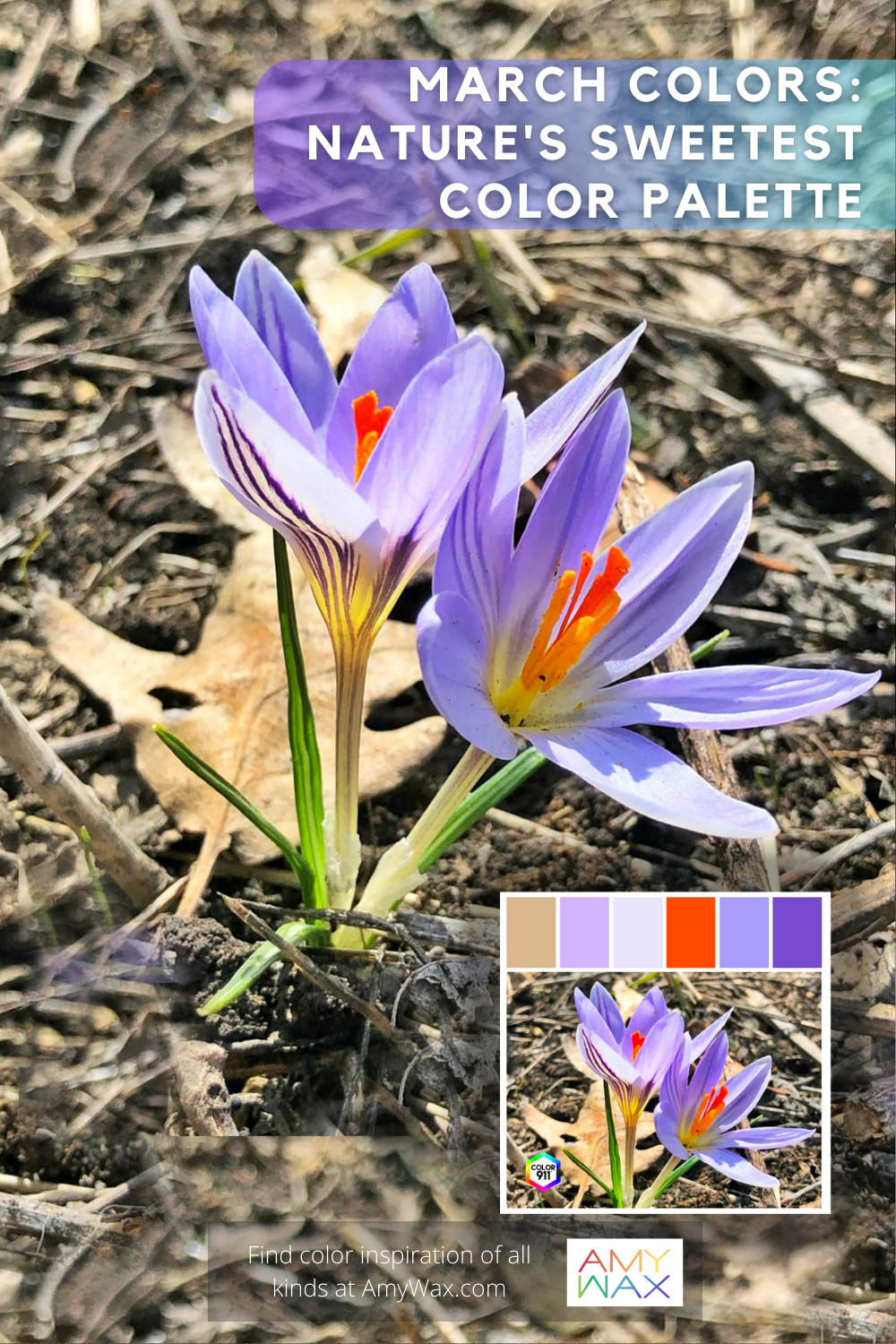
Now, I know that everyone’s March will be different from a weather standpoint. March is different in Bangor, ME, than in Charleston, SC, and it can be a very different story in the Mid to West Coast. Regardless of where you are, there are still degrees of nature “reawakening” in all regions. I want to emulate the colors of this reawakening with my design choices. From my standpoint in the Northeast, March is a fascinating time when colors present themselves in nature for fleeting moments of beauty.
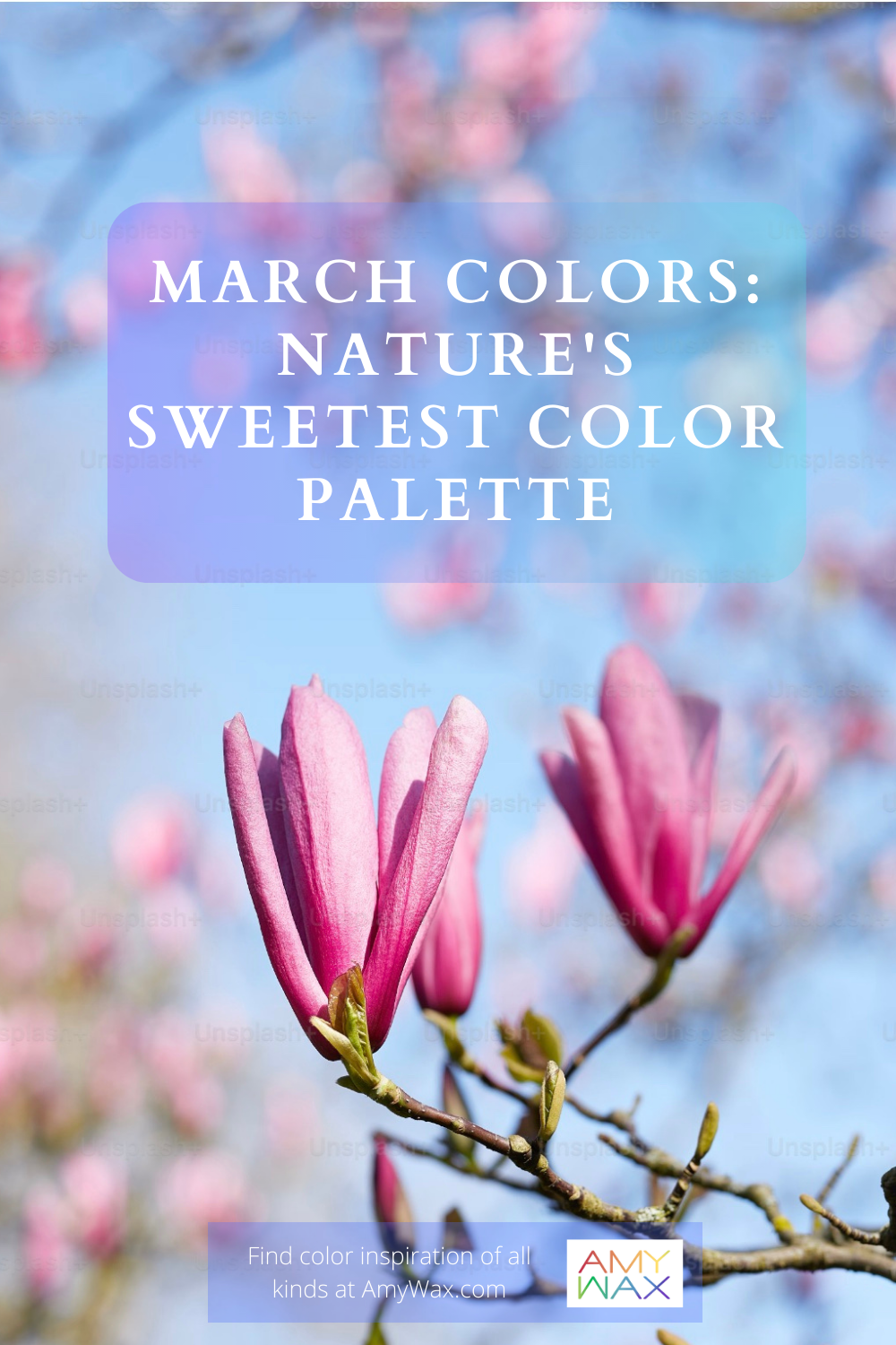
So, what are these fleeting color moments of nature-inspired beauty? When I think about March, I picture:
Nutrient-rich, densely packed, and heavily saturated soil. The deep, dark, near-black coffee-brown soil has been absorbing all the snow and rain from previous months and is anxious to start feeding the flora soon to bloom.
Grass that is just begging to come out of its dormant state. It’s no longer the greyish-yellow color it holds in the depths of winter; it’s now a faint yellow-green, the fairest of chartreuse.
Oak, maple, and cedar trees with very light grey and brown patterned trunks laid bare without any leaf cover begin to add pops of color as the new buds emerge.
Deep, dark, mossy greens – moss-covered rocks sitting next to a trickling spring growing daily with the seasonal thaw.
Faint, albeit warmer sunlight. The whiter, cooler, harsher winter sun rays dissipate to make way for a slightly warmer, more golden tone.
Unlike later in the spring, when the more saturated/concentrated seasonal colors are at their peak and best utilized for pops/accents, March colors can provide an inspiring base color to arrange your palettes around. What do I mean by this? Because most of the colors I’m suggesting are synonymous with March are earth tones, they are well suited to be at the core of the design scheme and layered with non-earth tones colors elsewhere on the color wheel.
Isn’t it just a reinvigorating time of year when the daylight gains an hour, and you start to move the outdoor furniture back into position!? Here we are, March! I love getting outdoor furniture ready for the season, and you can use March colors as the first palette to grace the outdoor season!
As the March colors I’m discussing are not at odds with the natural environment but an extension of them, the patio, porch, deck, or firepit is a great place to add them in. Picture wooden patio furniture with an exposed finish, graced by chartreuse outdoor pillows and blankets; some light sky-blue glasses sit atop the outdoor dining table, and pops of pale pinks and purples bring some added lively delight to the whole scene via a wildflower-filled vase. That’s a beautiful afternoon anyone could appreciate.
The thematic feeling we want to keep, honor, and use in our March design is slow, delicate rebirth/nature’s reawakening, which can be accomplished with a light touch and careful eye. I love the idea of mudrooms, entryways, and bathrooms all getting March-inspired makeovers for the month.
Adding runners, throw rugs, and throw pillows with the earth tones I mentioned above will make us feel like nature is reawakening within the home. Add faint pink pops of color with candles that look like cherry blossoms (and imagine if they smell just as sweet!) Add some new countertop plant life in areas that are cold and barren; bring nature inside!
We often hold back from enjoying colorful fresh flowers in the winter because we await spring’s permission to enjoy these colorful displays. It’s time to flush that idea away; let’s use colors to ease us into the coming season!
Softer March colors have an appeal all their own. Many flowers are harder to get over the winter months. It’s time to see what’s available without holding back. Let nature’s beauty gracefully guide you into the next season. It’s as if our senses have been dormant all winter. It’s time to gently wake them up in sweet, colorful, or even aromatic ways!
Some people want to wait for late spring/early summer to begin changing over their interior and exterior spaces, and I say, why wait!? Work with the energy that March provides us, embrace nature’s budding, blossoming moments, and incorporate them into your design!
Don’t be binary and go straight from colder to warmer design; embrace the in-between and transitional periods, too! I like the softer palettes of spring; sometimes, I even prefer them to the bolder colors of summer. A fresh approach to color can be just what you need to experience a fresh new look!
Are you looking for some March colors? I suggest taking an afternoon nature walk, snapping beautiful photos, and loading them into the Color911 color app!
The app will present you with arrangements to use in your home, directly drawn from your photo library. Keep the color swatches you create and see how they work in different spaces; it might be just the inspiration you’re looking for!