We’re all familiar with the blazing, loud, and vibrant colors of summer that reign everywhere, from the poolside to the ice cream parlor. Colors that scream, “It’s summertime, and don’t you forget it!”—colors gleaming with joy, nostalgia, and energy. I’m talking about creamy-bright lemon yellow, tangerine orange, key lime, hot pink, and fire engine reds. Colors that are cemented in our minds and have been for decades.
Well, this article is not about those colors, this piece will observe the other side of summer colors. We’re going to discuss soft summer colors and soft summer color palettes. You may ask yourself, “Soft summer colors, what are those? I’ve never heard that term before.” You’re not alone, the color strategy/concept is relatively new and has roots in the fashion world, so it’s not yet very well known, but I’m here to change that!
Soft summer colors offer an alternative to traditional, louder summer colors. They originally gained notoriety/popularity in fashion, but I have seen, for years now, the worlds of design overlap, or should I say work hand in hand! Metallic fabrics were predecessors to metallic tiles and other surfaces; textural fabrics easily transitioned into home decor.
For me, soft summer colors intend to embrace the enchanted magic of summer without being too flashy about it. If traditional summer colors were an afternoon rock concert or energized day at the beach, soft summer colors are a walk in the park at twilight, a misty morning by the oceanside, or a calming meditation session in the forest. Ooh la la! Soft summer colors are meant to reminisce a serene summer landscape and evoke gentle/subdued feelings of relaxation.
Soft summer colors are the counterpart to the loud, lively, and highly saturated summer colors I referenced above. Soft summer colors can be cool or warm but are all muted, non-confrontational/understated hues. Some examples of soft summer colors include:
Cool grays often have subtle undertones of purple and blue; they always remind me of an early, misty, foggy morning by the ocean just before the sun breaks through.
Pale blues are often used in color palettes not intended to be soft summer arrangements, but their presence is almost guaranteed to be present here. Think of soft powder blues, muted sky blues – any blue that’s more airy/has a lighter feel and mood.
I love lilac, and even though the flower only graces us from mid-May to early June, the color and the scent are cemented in anyone’s mind who is familiar with them. A soft, powdering lilac is just a whisper of purple and is ideal for a soft summer color palette. Even gray with a hint of lilac can be just right!
A pale yellow adds a delicate bit of color to an otherwise cool/neutral landscape; you can’t miss it. This creamy yellow can be just what you need to add a little sunlight to your summer color palette. Picture a field of Nemesias or Petunias against a pale blue sky; absolutely serene.
A soft coral red, similar to pale yellow, can add just a touch of warmth and pop to an otherwise neutral color palette. I love it, as it’s inherently summer, has always been a member of the coastal color palette, and reminds me of days at the beach.
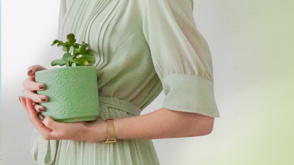
Soft summer greens tend to veer away from the warmth of a yellow-leaning green and favor more of a blue-green base. For example, a subtle soft summer green may be muted sea foam or muted forest green.
The soft chroma of an off-white or ivory are lovely counterparts to all the colors listed above, and it’s as if you have a clean white with a warmer ambiance. They juxtapose warm colors against cool but remain calm while doing so.
Suppose you’re curious to “dip your toes” into soft summer color palettes but may not want to start with home interior arrangements. In that case, I’d suggest creating a few color combinations within your wardrobe this summer and seeing how you feel about the arrangements. They won’t be for everyone, so don’t feel bad if you don’t gravitate toward a slower-muted color presentation. But, for those that don’t like the animated ensemble of traditional summer colors, it may just be the ticket!
The two areas of the home that I find immediately lend themselves to a soft summer arrangement are the bedroom and the dining room.
The bedroom is inherently a place to decompress, unwind and relax, so the emotional intentions of soft summer colors are matched by the design of your space. Picture a pale blue comforter atop ivory-white sheets, soft coral-pink overhead hanging lampshades, and subtle green pops of accent color in the form of potted plant life.
For the dining room, without much overhaul needed, the arrangement of plates, seating, and lighting can capture the spirit of soft summer colors. Picture some soft lilac, natural stone dining plates atop a white tablecloth, with yellow Petunias sitting in a muted taupe vase as the centerpiece. Just lovely, and it feels so so good!
I love summer in all its shapes and forms. Whether you prefer the classic colors of summer or prefer to try something different this year, make sure to embrace the season and all the colors that come with it!
If you’re unsure which color palettes you’d like to use this summer, take a peek at all my pre-approved arrangements in the Color911 color app! I’ve shared a color palette with this softer summer vibe, but there are many more to choose from. Find the color palette that inspires you and use it as your guide; what could be better than that!? I hope you’re inspired!