Autumn has a way of reminding us that color isn’t just something we see, it’s something we can feel, smell, taste; color is something we experience. Color can engage all of our senses and bring us back to a different time and place. The warmth of the season doesn’t come only from the hues themselves, but from how those hues are brought to life.
Warm colors are the heartbeat of fall. They represent the turning leaves, glowing sunsets, and cozy fires that define the season. Rich oranges, golden yellows, and deep ambers bring instant comfort. But warmth isn’t limited to paint swatches; it’s about creating an experience that wraps a room in that same comforting energy.
What do I mean by this? Picture stepping into a space where the cabinetry and flooring glow in chestnut and honey tones, complemented by creamy walls that catch the afternoon light. The combination feels like standing in a late-October sunbeam; the fall color palettes wrap you in warmth. When we experience these warm colors, it is often the textures accompanying the colors that activate us, triggering a sensory experience.
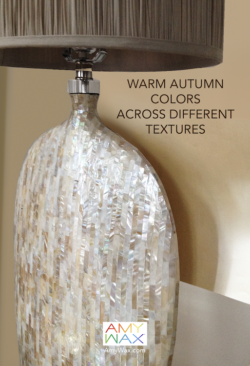
Color and texture are partners in design; one rarely works its magic without the other. Texture gives warm colors depth and dimension. Texture turns a flat wall into a statement, or a neutral palette into something unexpectedly rich.
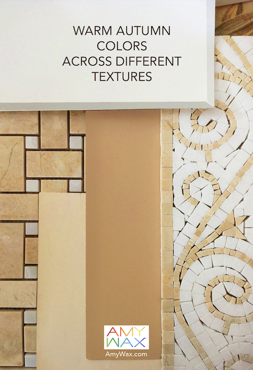
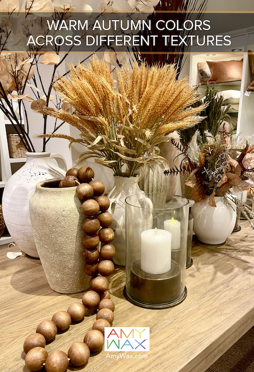
Picture a room full of tiles and stone, each piece in shades of caramel, sand, and golden wheat. These materials don’t just display color; they hold it. The interplay of matte and glossy finishes, smooth grout, and raised mosaic patterns brings warmth to life in a way that feels visual and tactile.
Material and texture can tell the story of the season; they’re vessels through which the warm autumn colors can thrive. Here are some of my favorite textures and materials to embrace for autumnal comfort/warmth.
As a color consultant/color specialist, I know the real magic happens when color and texture work together to shape mood. Picture having dinner in a dining room where cinnamon-orange walls are grounded by polished wood and offset by creamy trim. It’s a classic and cozy combination, ideal for fall foods or long conversations over coffee.
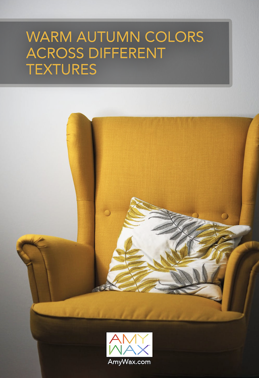
Picture a single chair upholstered in golden mustard, a pop of warmth in a corner that instantly draws the eye. The color alone is sunny and inviting, but the softness of the fabric takes it further, adding touchable comfort to visual warmth. Warm autumn colors are timeless because they engage our senses on multiple levels and draw us immediately back into memories, times of joy, and comforts.
Whether you’re layering textiles, showcasing wood grain, or choosing stone with variation, the warm colors within the textures make warmth tangible. It gives color a life beyond the surface, something you can see, feel, and even sense in the air.
As you plan your fall décor, look beyond the paint, let texture guide your palette, and let your materials tell the story!