For years, “coastal” has been one of the most recognizable styles in interior/exterior design. It instantly brings to mind white shiplap, blue accents, salty-gray shingles, and beach-inspired décor (Cape Cod Colors is one of my all-time most popular blogs!) While those classic elements certainly have their place, I think many homeowners are ready for something that feels softer and more natural. Lately, I’ve been thinking about what I like to call “Watercolors.”
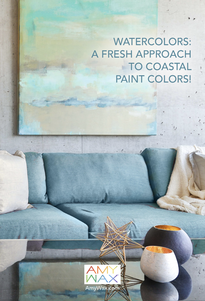
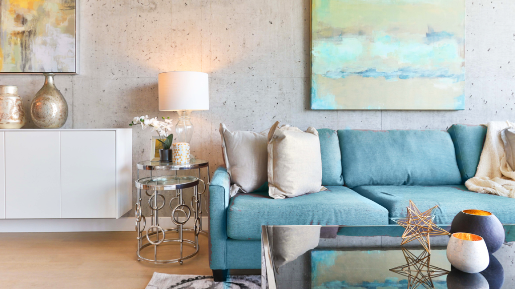
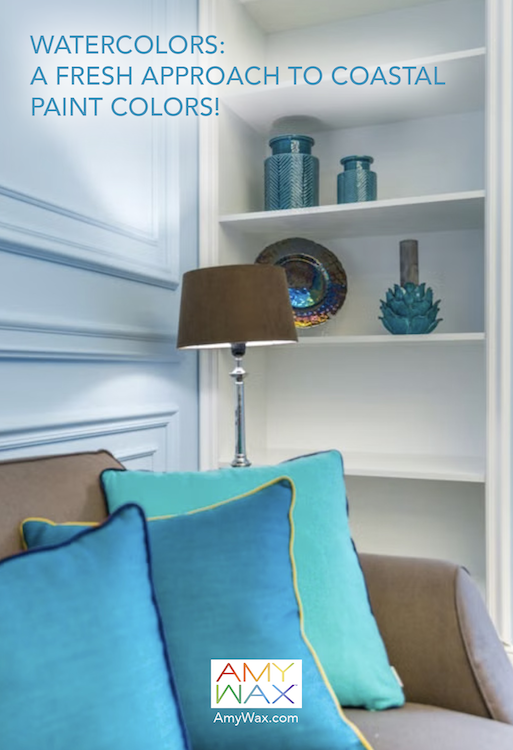
Rather than decorating around a coastal theme, Watercolors take their inspiration directly from nature. Think of the soft blues where the ocean meets the horizon, the muted greens of dune grasses, warm sandy beiges, weathered driftwood, sea glass, and the hazy sky just before sunset. Instead of trying to recreate the beach, this type of watercolor palette captures the feeling/magic of being near the water!
As a color consultant, I find this approach helps create homes that feel lighter, calmer, and less tied to a particular decorating trend. It also builds beautifully on many of the ideas I’ve shared over the years about coastal colors while offering a fresher, more nuanced perspective.
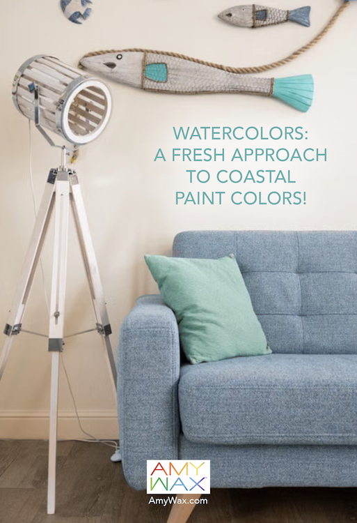
One reason traditional coastal decorating can sometimes feel dated is that it often relies on recognizable accessories to tell the story. Nautical stripes, anchors, shells, and beach signs, and even the fun plastic lobster, certainly work in the right setting! But they can easily become the focus instead of the backdrop. They can also appear dated and kitschy, becoming a distraction rather than complementing your decor.
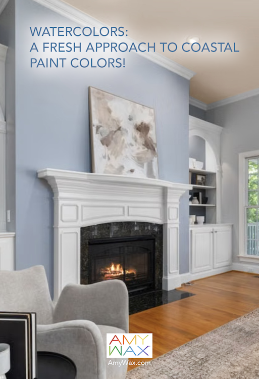
The Watercolors approach begins with color. Imagine walls painted in soft blue-grays that seem to dissolve into the daylight. Pair them with warm sand-colored upholstery, weathered oak furniture, muted greens, and creamy off-whites. The result isn’t a room that announces “I like the beach!” Instead, it quietly evokes the peaceful feeling of being there.
One of the things I appreciate most about coastal paint colors is that nature has already shown us how beautifully they work together. Walk along almost any shoreline, and you’ll notice the subtle transitions. The sand isn’t simply beige. The water isn’t just blue. The sky carries hints of gray, lavender, soft white, and pale green depending on the time of day. That’s exactly why these palettes feel so harmonious indoors.
A paint color consultant, like myself, studies these natural relationships because they create interiors that feel balanced/organic rather than forced. If you’ve enjoyed exploring earth-tone colors or my recent thoughts on earthy colors, you’ll notice that Watercolors naturally extend those same ideas with the addition of ocean-inspired blues and greens.
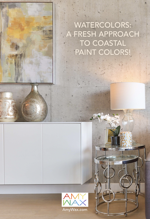
The beauty of Watercolors is that no single color needs to dominate the room. Soft blue cabinetry paired with warm white walls. Linen draperies that echo the color of beach grass. Pale green accents mixed with woven baskets and textured fabrics. Each layer contributes quietly, allowing the room to feel relaxed rather than overly designed.
This softer approach also gives homeowners the flexibility to build on an existing palette rather than start over every season. It feels much like a watercolor painting itself, where each color gently blends into the next rather than competing for attention!
These colors become even more beautiful as daylight changes. Morning sunlight warms sandy neutrals. Afternoon light enriches blue-green tones. As evening approaches, muted grays and gentle greens reveal an entirely different personality. This changing relationship with light is one reason I encourage homeowners to view paint colors throughout the day before making a final decision.
Any real color specialist understands that selecting paint isn’t simply about choosing a favorite color. It’s about understanding how that color will live within your home from sunrise to sunset.
While I talk about adding color to your design and the many ways to do so, I wear another hat: that of an artist. I consider adding artwork to your home’s spaces as a creative way to make decor feel more personal. Purchase and display artwork that you love and that brings a unique perspective to the story you want to tell!
As you see in the images I have shared, the artwork tells the story of adding the soothing, colorful vibe of watercolors to your palette. Whether your artwork is realistic or abstract, I will leave that up to you. Find artwork you love to add your vision of the watercolor palette to your decor!
Whether you live beside the ocean in your cape-style home or hundreds of miles away, there’s something universally calming about these palettes.
If this type of palette speaks to you, you might also enjoy exploring my thoughts on beach colors and sunwashed colors, where nature once again becomes the greatest source of inspiration. Perhaps that’s why I like thinking of this palette as Watercolors rather than simply coastal. It’s less about decorating for a location and more about creating a feeling!
As a color expert, I believe the most successful home colors create atmosphere. Watercolor-inspired coastal paint colors offer a fresh way to bring the serenity of nature indoors, creating spaces that feel welcoming and beautifully connected to the surrounding landscape.