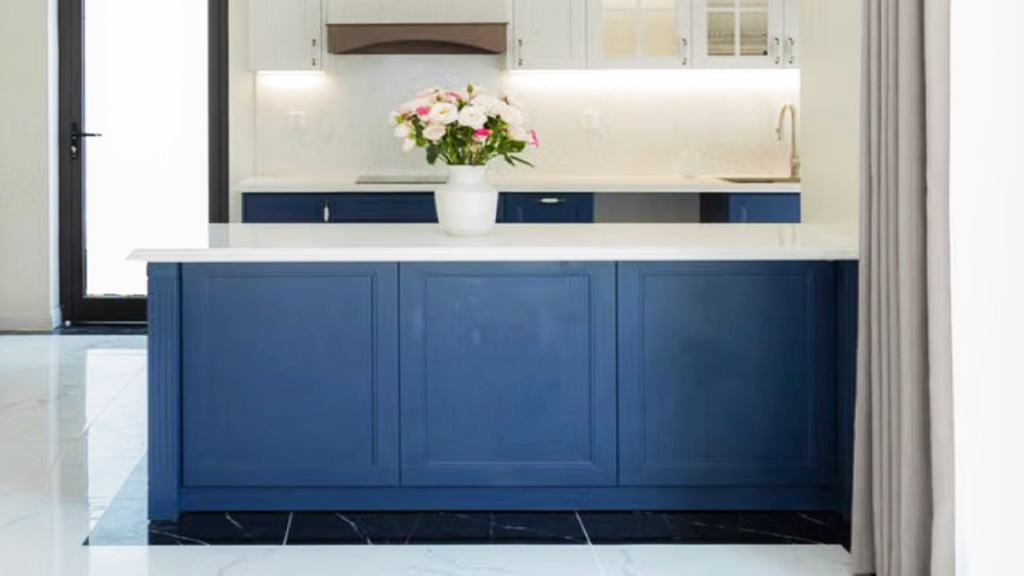
When summer temperatures soar, most of us instinctively reach for the thermostat and a bubbly cold drink! We close the blinds, turn on the ceiling fans, and hope the air conditioning can keep up with whatever temperatures the latest heat wave is throwing at us. But have you ever walked into a room that simply feels hot, even when the temperature says otherwise?
While your air conditioner controls the actual temperature, your home’s color palette influences how warm or cool a space feels. The colors surrounding you, the fabrics you choose, and even the textures in the room all contribute to your perception of comfort.
As a color consultant, I often remind homeowners that creating a cooler-feeling home isn’t always about lowering the thermostat. Sometimes it’s about changing what your eyes—and ultimately your mind—experience every time you walk into the room.
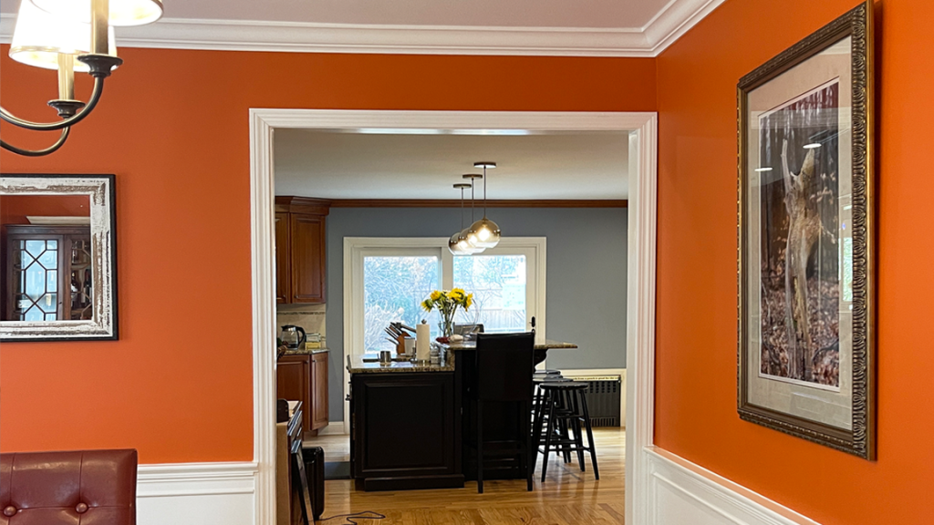
Color has a powerful psychological effect. Deep reds, golden yellows, burnt oranges, rich terracottas, and darker browns naturally remind us (instinctually) of fire and warmth. They’re beautiful colors, especially during autumn and winter, but in the middle of a July heatwave, they can make a room feel visually heavier than it really is or should be. That doesn’t mean these colors should disappear entirely. It simply means that summer is a wonderful time to let cooler tones take a more prominent role.
As a paint color consultant, I consider not only what colors work beautifully together, but also how they influence the overall feeling of a home throughout the changing seasons. This is why many homeowners tend to stick to more neutral colors for their walls and larger spaces – neutrals can be shifted more easily to match cooler or warmer color intentions, depending on the seasons.
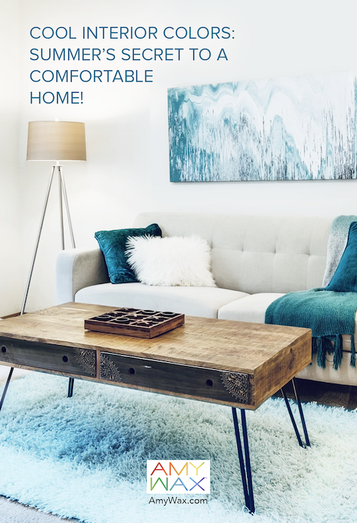
One of the easiest ways to create a cooler home is to surround yourself with colors inspired by water, sky, and nature. You can use these cool summer colors and other sensory tricks to make hot spaces feel cooler and more inviting!
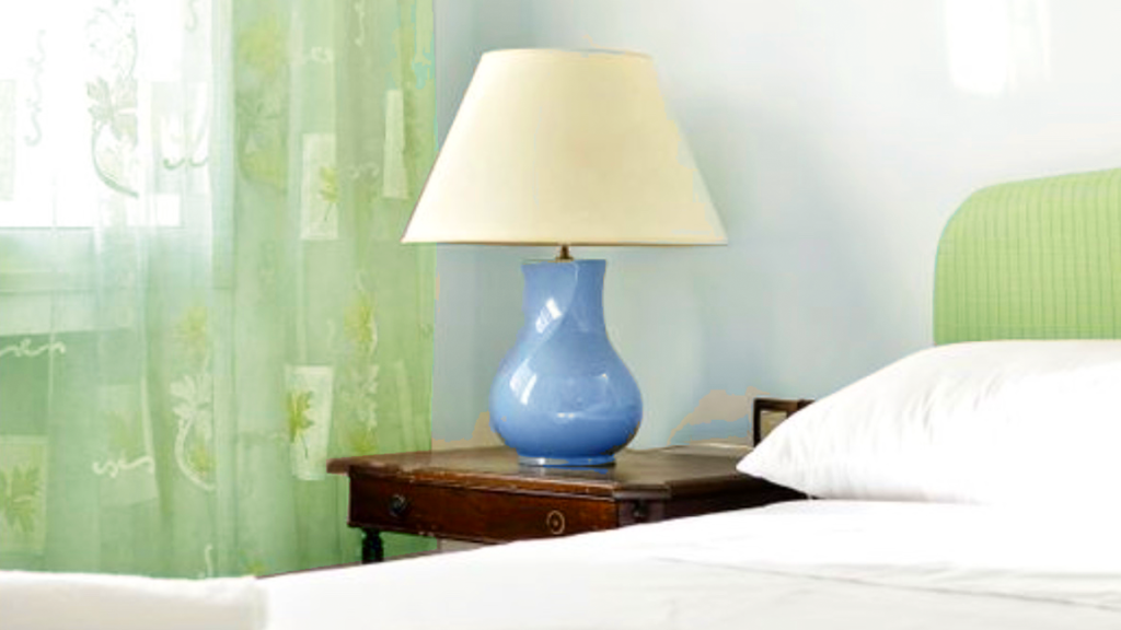
Cool soft colors, like blue-grays, misty greens, pale aqua, gentle sage, and cool off-whites, all have a remarkable ability to make a room feel lighter and more refreshing. These cool interior colors don’t actually lower the temperature (maybe slightly, depending on light absorption), but they do change how we emotionally experience the space.
Nature offers the perfect inspiration. Think of a quiet lake in the early morning, sea glass washed onto the shore, or the pale blue sky just before sunset. Those are the kinds of colors that encourage us to slow down and breathe a little deeper.
Paint isn’t the only place color lives. Summer is the perfect time to swap heavier textiles for lighter ones that reinforce the feeling of coolness. Linen bedding, lightweight cotton throws, woven baskets, sheer window treatments, and softer upholstery all contribute to a room that feels more open and breathable. Even changing pillow covers, table linens, or artwork can subtly shift the mood without requiring a major redesign.
If you’ve been inspired by my recent thoughts on Watercolors and coastal paint colors, you’ll notice many of those same soft blues, sandy neutrals, and muted greens work beautifully during the hottest months of the year!

Summer offers more daylight than any other season, so let it be part of your design! Pull back heavy draperies during the day and allow natural light to move freely through the home. Soft wall colors respond beautifully to changing daylight, creating gentle shifts from morning through evening. This is also why choosing the right white matters. Warm off-whites often reflect sunlight more softly than stark bright whites, creating interiors that feel bright without becoming harsh.
Any experienced color specialist understands that light is every bit as important as the paint itself. The same color can feel completely different depending on the room’s orientation and the quality of daylight throughout the day.
One reason cool interior colors feel so comfortable is that they already coexist outdoors. Soft greens beneath shady trees. Pale gray stones along the shoreline. Gentle blue skies reflected on quiet water. These natural arrangements have a calming effect because we’ve been responding to them our entire lives, and it’s embedded in our evolution!
I’ve mentioned this philosophy before when discussing earth-tone colors. Nature consistently shows us that softer, cooler palettes create environments that feel peaceful and restorative.
As a color expert, I know the best interiors work with both our senses and our emotions. At the end of the day, comfort isn’t measured only by the thermostat. It’s measured by how your home welcomes you after a long afternoon in the summer heat. The right palette can make a room feel lighter, fresher, and more relaxing without changing the actual temperature by a single degree!