For businesses of all types, shapes, and sizes, the right color palette shapes brand identity and creates a more connected customer experience. The colors can impress potential clients, allowing them to trust (or not) the business they visit. They can even impact commitment to the brand or purchasing behaviors. So, if anyone operating in a commercial space says, “Colors don’t matter,” they’re wrong!
As a color consultant, I’ve worked with many different commercial clients over the years, and whether I’m arranging an interior color scheme or selecting exterior hues, understanding/working with the different psychologies of color is essential for creating spaces that support business goals.
This article differs slightly from my residential-focused pieces, but I wanted to share some of my strategies/ideologies for working with commercial spaces. I don’t care if you work in the headquarters of an international hedge fund in the city or a small mom-and-pop shop in the sticks; working with business color psychology, not against it, is important to businesses of all sizes!

Color selection in business environments sets the tone for an entire brand experience. The emotional intention of the space is communicated through color. It can be surprisingly successful if the visitors are unaware of the connection.
Think about it this way: Bright, energetic, loud colors can invigorate a space, which is desirable in a funky hair salon or bar. Conversely, muted, sophisticated tones create an atmosphere of calm professionalism better suited for an office-type setting, offices of professional services, or even a spa! Every business has a unique personality/ brand identity; the trick is matching it with the right colors to support it rather than clash with it.
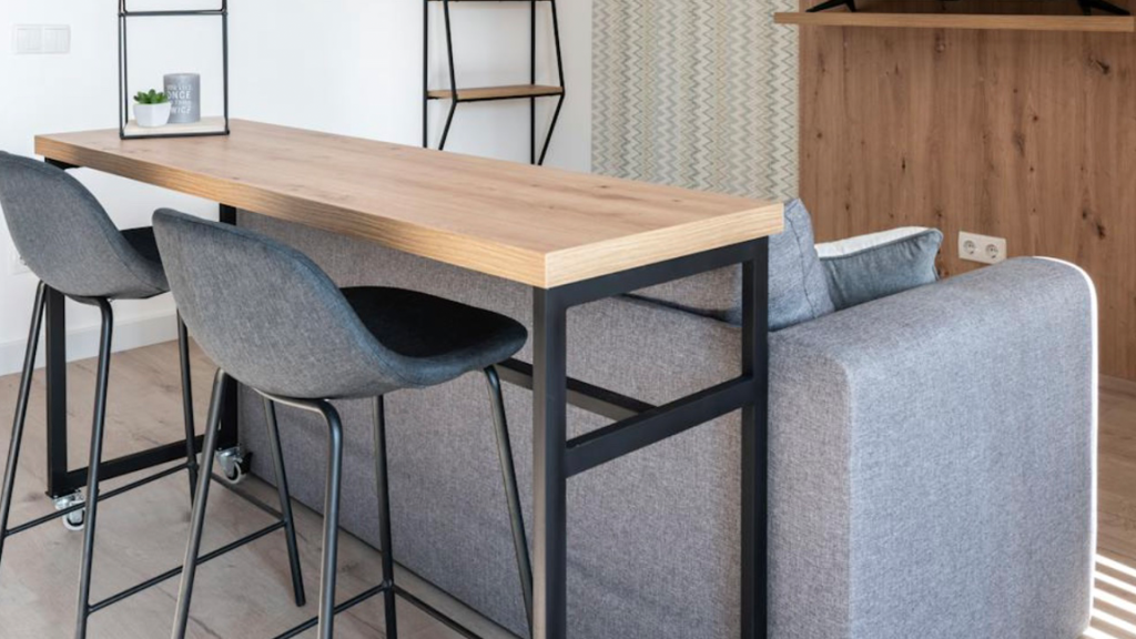
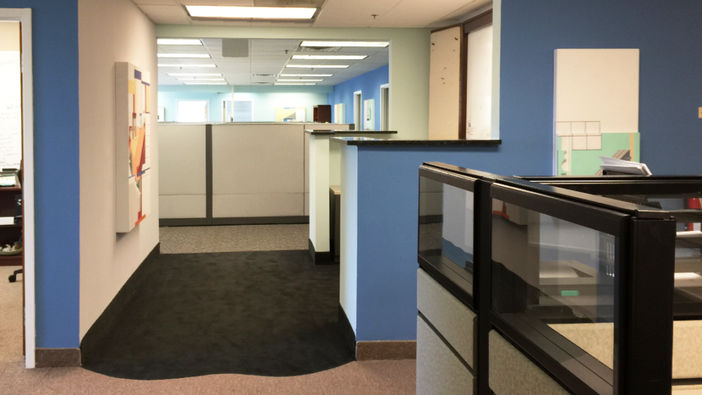
In office environments, productivity and focus are the underlying goals. Blues and greens, often associated with clarity and calm, are popular choices for workspaces. However, there are times when softer colors that are comforting and soothing, with accents of white molding, can create the mood of an easy-going business with attention to detail. The softer feel might be just the message you want to convey to your employees and clients.
Regarding specific colors, softer ones might be pale salmon pinks, soft sage, lighter blues, or teal. These colors can encourage composure and creativity without overwhelming the senses.

For businesses that thrive on high-energy interactions, like sales floors at dealerships or creative agencies, pops of red, orange, or vibrant yellow can introduce enthusiasm and a baseline of energy to keep everything moving!
Bolder colors that embrace you can present confidence and structure. These bolder colors might be richer blues, contrasting charcoal, or grays with a hint of saturated green or rich plum. They will definitely make a statement!
On the other hand, retail spaces require an entirely different approach depending on the goods sold. For example, luxury boutiques often use monochromatic palettes—warmer pink/beiges, sleek grays, elegant blacks, and warm neutrals—to create an air of sophistication. These quieter colors also do not distract from the products on the shelves or services they provide. Conversely, playful brands embrace vibrant, high-contrast hues to engage customers and encourage them to have fun and explore.

I always recommend that my clients avoid sparse wall space. Adding artwork to an office introduces engaging subject matter and a pop of color to an otherwise sterile-feeling environment. Thoughtfully chosen art pieces can serve as conversation starters, inspire more decor creativity and the impression of creative thinking, and contribute to a dynamic workspace.
Incorporating softer, warmer hues into an office can make it feel more inviting and homelike, reducing the sterility and “soullessness” that have characterized traditional workspaces. Picture earthy tones, warm neutrals, and subtle pastels to create a cozy, comfortable ambiance. Rugs, soft seating, and natural materials like wood transform an office into a place where employees feel at ease and motivated, enjoying the experience of being in the office.

The exterior is a customer’s first impression of a business, and color plays a major role in shaping expectations. A neutral foundation, such as warm beige, slate blue-gray, or classic Charcoal, offers a timeless look. However, strategic use of accent colors can make a storefront more inviting and spark the interest of anyone walking by!
For example, a wellness/lifestyle studio might use soothing blues and soft greens to evoke relaxation. At the same time, a tech startup may opt for bold, modern hues like electric blue or techy lime green to convey aggression/innovation. Restaurants and cafes may take a different approach, using rich, warm tones—terracotta, deep red, the color of cashmere, or even a chocolatey brown—to help guests feel right at home. Orange is well known for enhancing your appetite; I think that is worth a try, don’t you?
Color is one of the most influential elements in any business space. It can attract, energize, soothe, and help define a brand’s identity. A well-planned color palette is a must-have for any business that wants to reach (and retain) its customer base for years to come!