Pastel colors have a unique past, and they can serve two very different purposes. They can help us create spaces that allow us to decompress, gather our emotions, and empower ourselves with positive energy. They can also inspire us! With a fascinating past, history tells us that pastel colors come from happier times in so many ways. Perhaps we should draw on that positive energy, take a fresh look at pastel colors, and bring them back into our lives!
Meriam-Webster defines pastel as: “any of various pale or light colors.” Let’s elaborate on this a little more. Pastel colors are low-saturation colors intended to be soothing and non-obtrusive; simply, pastel colors are pale, muted versions of the bolder colors we see on the color wheel, whatever colors they are. Pastels are typically created by introducing an element of white if you are painting. On the computer, it means lowering the saturation of the color, giving it a softer, matte appearance.
Pastels have a history of different styles in different decades, such as the art deco period from the 1920s through the 1930s. Softer colors were also popular after the war in the 1940s and 50s in what we refer to as retro, in interior design. MidCentury Modern has its own style but also includes pastel colors in its color palettes. Be sure to take a look at my blog post on Retro Colors and why we love them. Both of these periods reflected elegant times in our country’s history when we felt good and were happy to show off with colors that portray that sense of elegance!
After some decades of silence, pastel colors broke back into the mainstream consciousness in the 1980s, most notably in men’s fashion and heavily featured in the popular show “Miami Vice.” The show followed two undercover detectives as they navigated the underground crime scene of 1980s Miami. The show has essentially spawned its own branded style, and the slick pastel suits worn by detective Crockett and Tubbs are just as iconic, almost 40 years later. The show helped cement pastels as a color choice that represented confidence and coolness.
Long since the days of Miami Vice, pastel colors have been heavily adopted in fashion lines and interior design schemes that can be synonymous with vacation, relaxation, the ocean, and even wealth and riches. There’s a stereotype that some associate with vacationing in the North East in the summer, where the wealthy and elite will sail into port wearing nautical-themed pastel clothing, drinking Cape Codders without a care in the world.
While some of these associations are true of pastels in widely-adopted design and fashion, the emotional intention of pastel colors is to soothe, relax, and create harmony within the mind.
I want people to understand that pastel colors have many more uses and energies than what is associated with them in pop culture. The misconceptions that pastels are only meant for summer weather, parties, and Ferrari-driving police need to be put aside so that everyone can enjoy pastel colors for different functions and design goals! Here are some examples of pastel colors that create fashion statements or spaces that soothe, relax, and replenish the spirit.
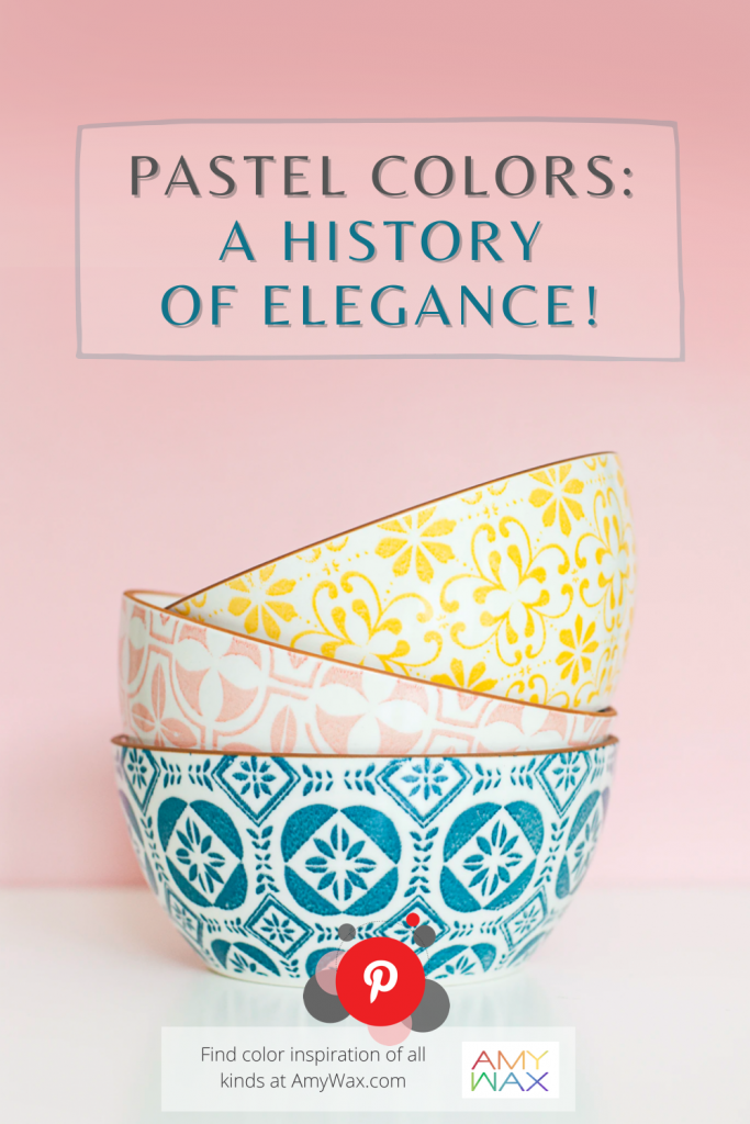
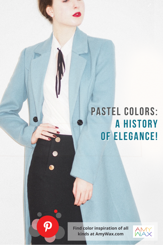
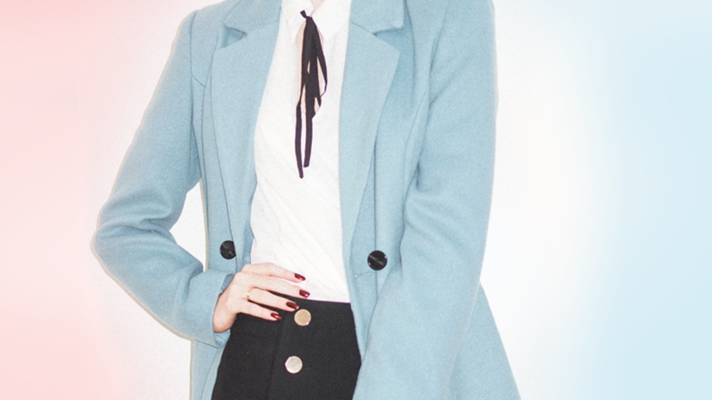
If there is ever a family of colors that has not gone out of style, it is pastel colors! Elegant and understated, pastels are one of the few colors that defy age and complement so many people, all shapes and sizes! You can wear them with neutrals, contrasting black and whites, rich grays, or crisp clean whites. Whether you are attending a casual event or formal evening party, pastels are as elegant as the day is long. Although I often wear black, don’t be surprised if you find me in soft pinks, lavender, or blush along with my charcoal grays or basic black. Feel free to give it a try!
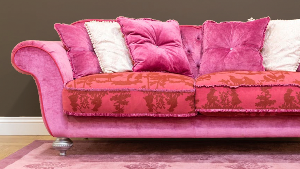
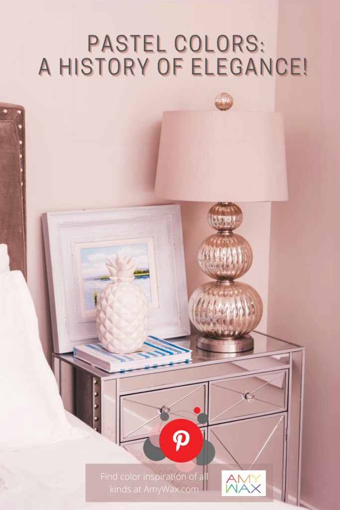
Pink is a remarkably versatile color, and depending on the hue, it can be animated and bold, or in the case of pastel pink, soothing and restful. The bedroom is an ideal environment for pastel pink, as it’s a place intended for rest and relaxation. A personal retreat, if there ever was one!
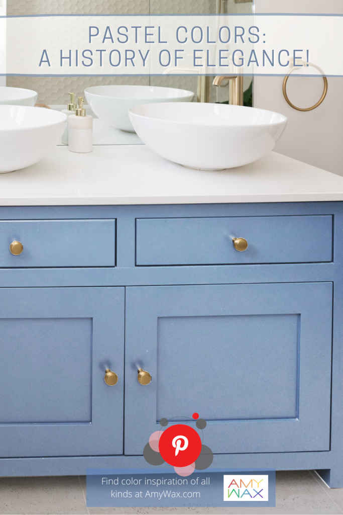
Blue cabinetry for the bathroom has come into the design spotlight in the past few years, and I can’t recommend pastel ocean blue or a delicate sky blue enough! I love the way a friendly yet refined blue plays on the senses, and while it’s not a color most associate with the bathroom, blue has the power to create a quiet mood; what better way to start (or end) any day!?
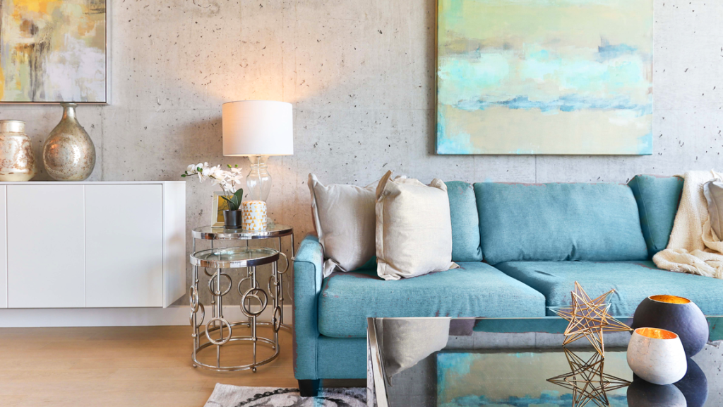
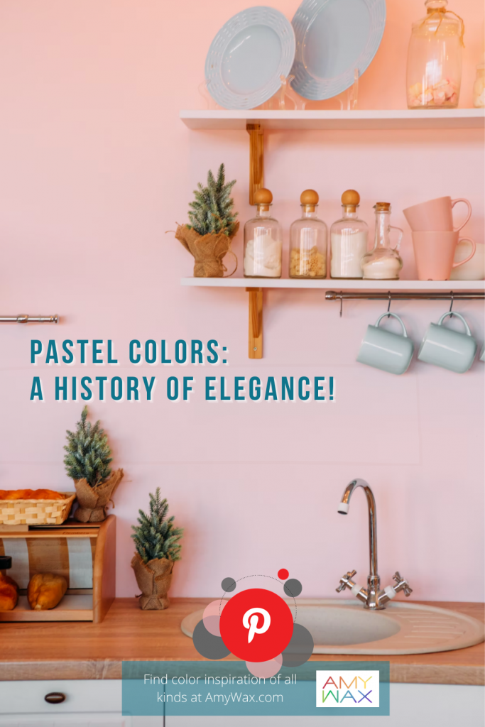
I love the concept of cool, pastel colors of blues, greens, or pinks in the kitchen! Green is a color that reminds us of nature and the earthly splendors all around us, while aqua-greens or pastel blues have a hint of oceanic tones to them. This color blend in pastel is friendly, nature-oriented, and relaxing as can be. Regardless of the food you are serving, pastel colors can be the perfect backdrop to the various color palettes you will have on your plates!
So, what are your feelings regarding pastel colors? Do you enjoy their presence or find them too limiting? As a color expert, I love hearing your thoughts!