I enjoy talking about all things color and design. As a color specialist, I look for new ways to incorporate colors everywhere, in big or small ways; color can always impact spaces for the better. While I love curating colors for a large home or even a commercial office space, today, I will provide some insights and suggestions for an area of color that often gets overlooked: the area rugs beneath our feet!
Area rugs have been used worldwide for millennia; they’ve been found in many different regions/cultures, such as the Egyptians, Persians, Greeks, and even eastern nomadic tribes who used them for practical purposes like insulation, comfort, and protection against cold and damp floors. People began adding more artistry to these area rugs, giving them more than just functional but also decorative/cultural value.
Today, we use area rugs for many reasons, varying from functional utility to beautiful pieces of colorful artistry and all variations!
Colorful area rugs will not all be placed into a space with the same intention as the next. Some area rugs are meant to serve as accent colors and complement other furniture or art within the space. Some colorful area rugs are meant to be the focal point, to draw the eye onto them as a piece of wall art would.
Regardless of the intention, area rugs help add color, dimension, and delineation to a space that may not have it otherwise, so I’m always in support of area rugs; not so much wall-to-wall carpeting, but that’s a whole different subject!
Area rugs help to create a space within a space; they help define areas of larger rooms, so placement is key to highlighting sections that are meant to be clearly defined. For example, people who live in larger studio apartments or lofts with big open floor plans with few walls will often use area rugs to help create order in the space. In an open floor plan, the rug can define the space, as in, “This is the living room area,” etc. One area rug may be placed between chairs in a reading nook and another under a dining table.
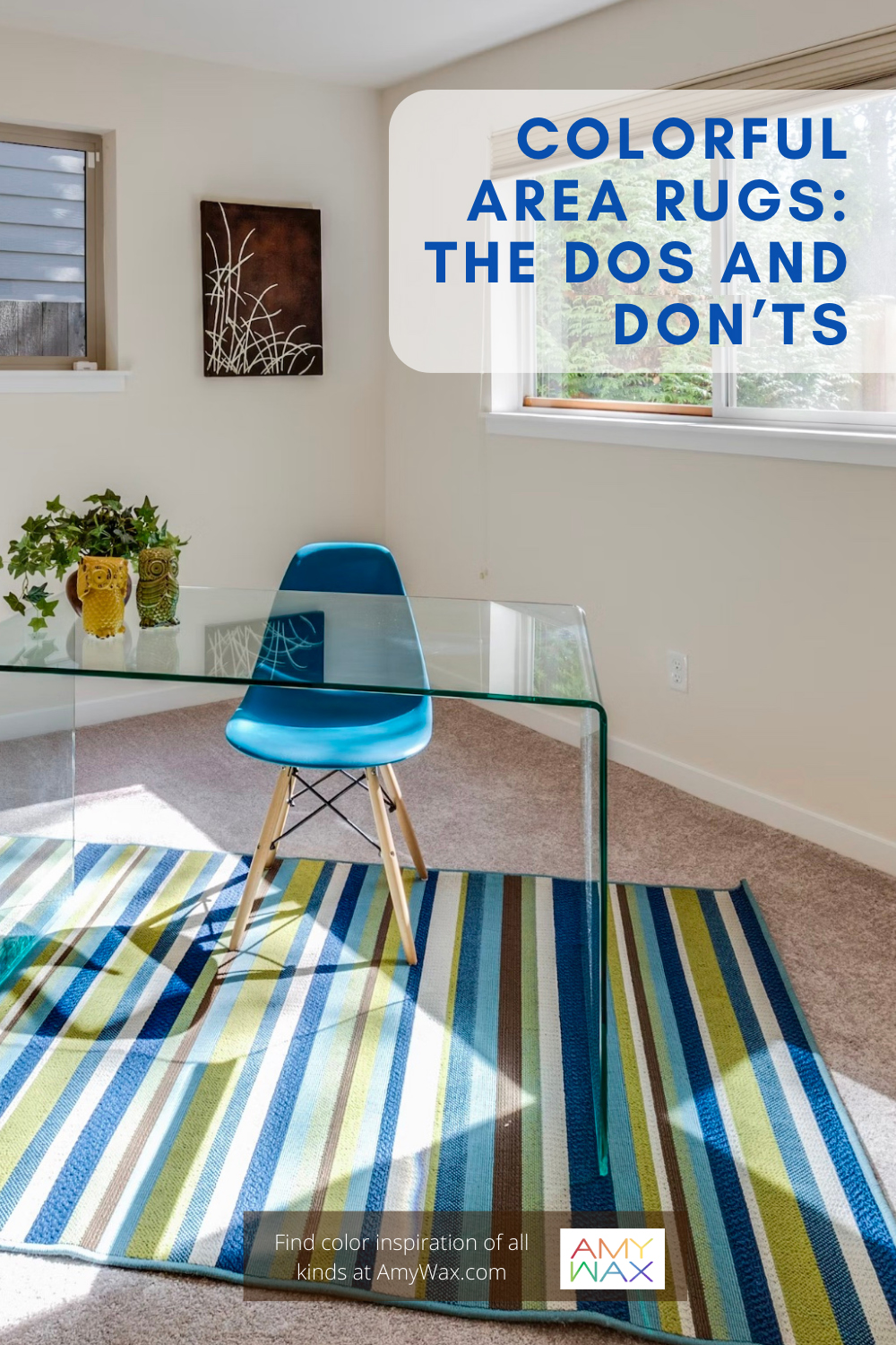
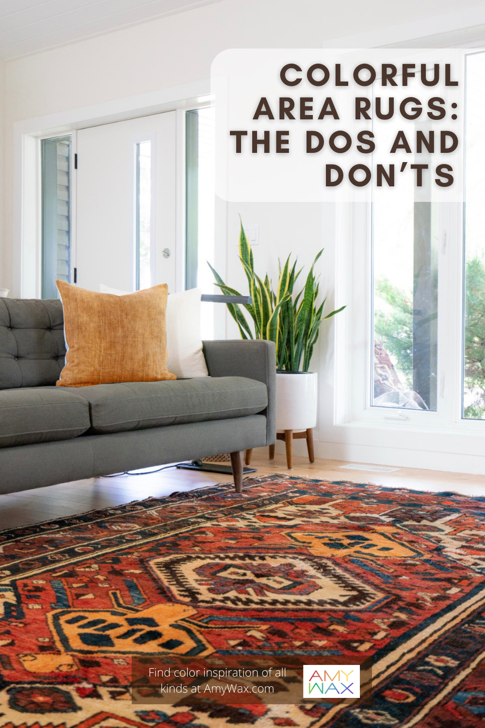
An area rug must be just the right size to fulfill its potential within the space. If it’s too large, it can overwhelm the area, expand out of it, and become a distraction. It won’t be visually effective if it’s too small, leaving the impression that something is missing or that the room’s design is unfinished in some way. I often find that people choose rugs that are too small for a space, placed under the coffee table and not under any surrounding furniture. Ensure the rug can be seen from anywhere in the room and not disappear under a single piece of furniture!
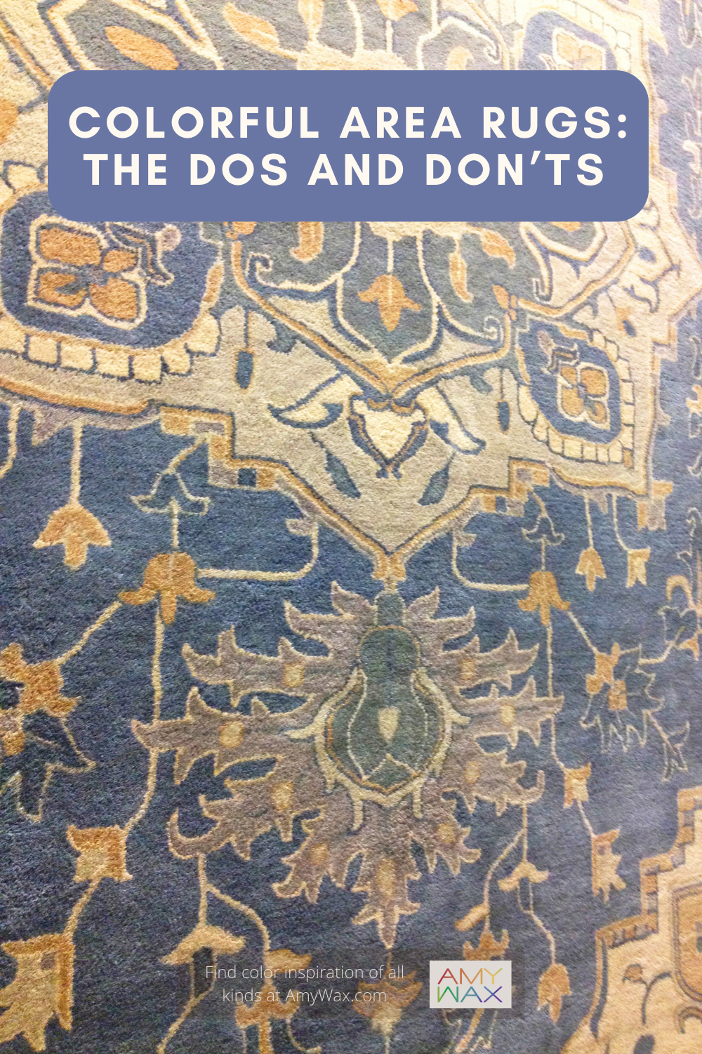
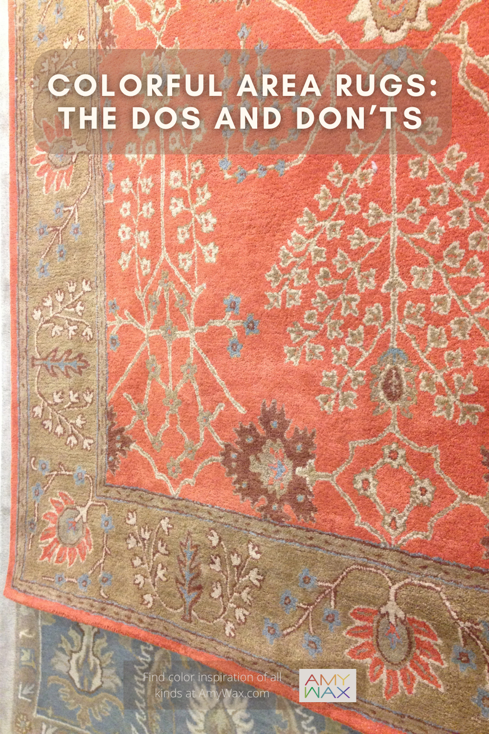
Area rugs should either purposely complement or contrast with the surrounding colors of the walls, furniture, ceilings, and other room layers; the colors need to clearly serve a purpose in the overall scheme. If colors are “directionless” and chosen haphazardly, it can create a clashing color dynamic that’s neither intentionally dramatic nor sublime but just stuck somewhere in the middle. For example, unless you’re a big Cleveland Browns fan who loves orange or a person looking to decorate their home in the rugged and rustic browns from nature, I would not suggest placing a bright orange or earthy brown area rug underneath deep brown sofas or love seats; the effect would not be contrasting or complimentary – it would feel like the room is missing a well thought out color palette.
Texture greatly influences how an area rug presents and contributes to the space. For example, if you go with an excessively plush rug that you can really sink your toes into, it will present a more intimate, warm, and cozy atmosphere. Opting for a lean rug with short, flat-woven fabric will project a more minimalist, contemporary vibe. It all depends on what you intend the space to project emotionally. Beware, choosing the wrong texture can work against your desired vibe within the space.
As with all of my color suggestions, balance is key. With a visual balance, the room will feel on track. So, if you intend to use a loud color for your area rug, ensure it is counterbalanced with softer neutrals (or at least softer colors) accompanying it. The same goes for a neutral, understated area rug; keep the energy alive with colorful artwork, decorative accent pieces, or upholstered furniture. As I have said before, it’s all about balance!
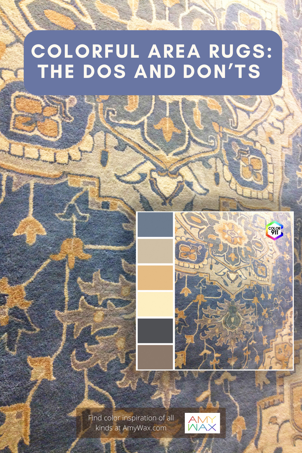
Just because something sits under our feet does not mean it is valueless regarding interior design! It is remarkable what power an area rug can wield in the right hands. If you’d like to find suitable area rugs for your rooms, try arranging a color palette with my helpful Color911 color app!
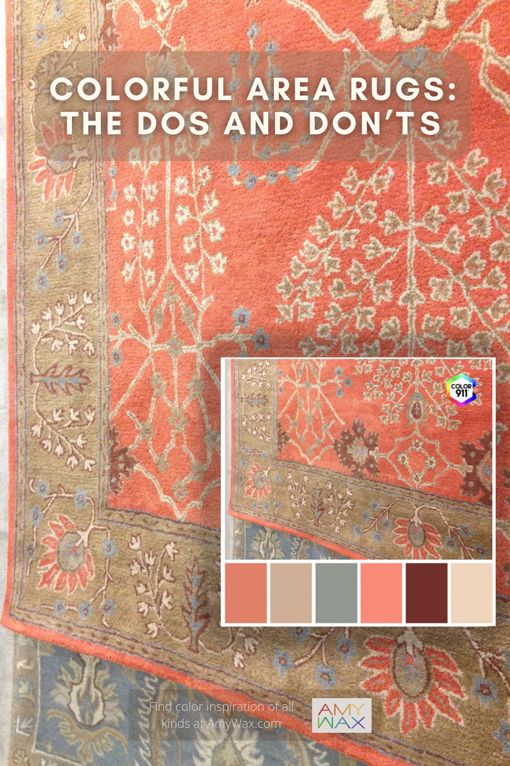
Before you go to the store or lay that first rug down, find a color theme in the app that inspires you. Use that theme or its color palettes (already made for you in the app) as your guide to what color rug you should pursue and what colors you should use in the rest of your design.
Did you find a rug you love? Whether it is colorful or not, capture the colors and create color swatches with the Color911 app, save the colors on your phone, and buy items to match without taking the rug with you. Rugs can be the anchor in a design or the perfect piece to finish a room. Buy the right piece, pull your colors together, and it can be just what you need to create a design you’ll be proud of!