We all have different ways of decompression, de-stressing, and relaxing. For some, it’s putting on some soft jazz and opening up a bottle of Sauvignon Blanc; for others, it’s taking an afternoon walk while the sun begins to set. For others, it’s hitting the gym and lifting weights! Means of relaxation will vary from person to person.
Just as different people have preferred means of relaxation, the color selections we surround ourselves with also contribute to a relaxed state of mind. I’ve covered color psychology in this blog. With this piece, I’d like to explore relaxing colors and, more specifically, how, even though there’s a consensus on what colors trigger relaxation. Relaxing colors will not be the same for everyone, and you might be surprised to know that they can be dramatically different from one person to the next!
As a color specialist, I’ve had the privilege of working in the intricate world of colors and spent thousands of hours learning their profound impact on human emotions and psychology. Colors can elicit every emotional response imaginable, and no two responses will be the same from person to person. A color palette that one individual may find comforting while another may find it loud or even uninspired. Our tastes in music and art vary, our tastes in food will surely vary, and not surprisingly, our preferences for colors that promote relaxation and tranquility can vary dramatically!
Color experts work to find the best color balance available for all who enter a space by clearly understanding the emotional intention of the area; this is accomplished by working closely with the client, whether it be a commercial or residential space, and understanding what aura they want the colors to create. It’s impossible to please everyone completely with each color arrangement created, but the goal is to create an environment that will please most when they see and “feel” it around them.
Traditionally speaking, there are characteristics/attributes that make colors more relaxing than others; these include:
Colors contributing to a relaxing state are typically not excited, loud, or highly saturated. High levels of contrast create more distraction, which creates more energy and causes more strain on the eyes. On the other hand, softer colors and shades with more muted saturated points tend to blend into the surroundings, creating less contrast. Lower saturation levels contribute to a sense of subtlety and understatement, which yields a more serene and peaceful ambiance.
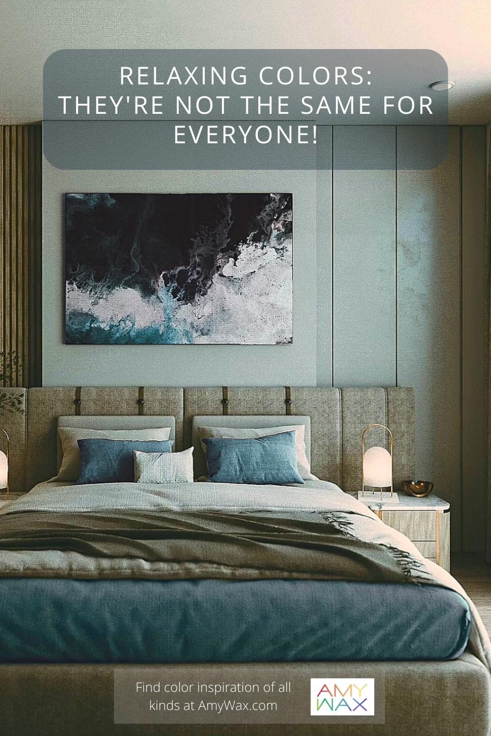
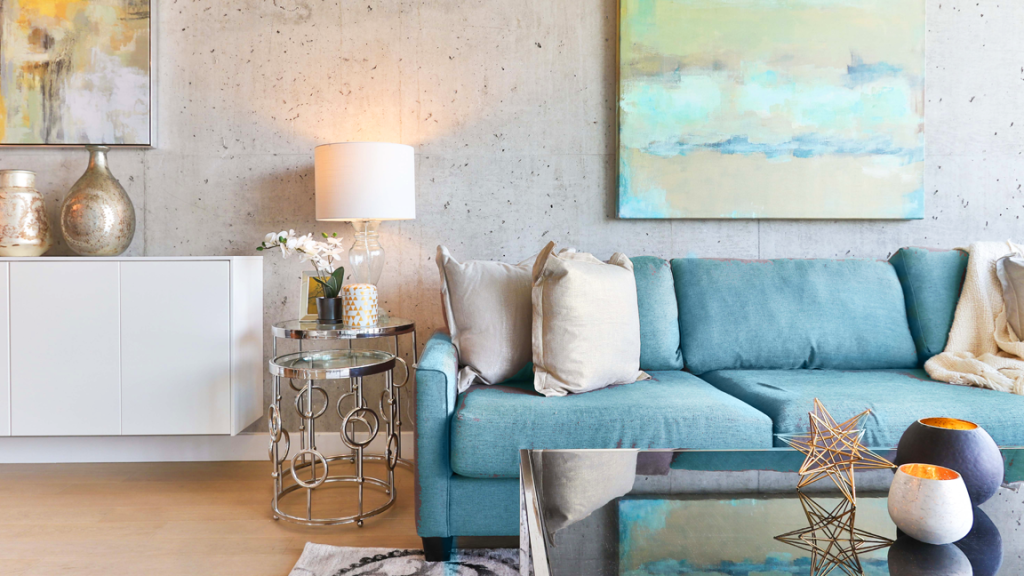
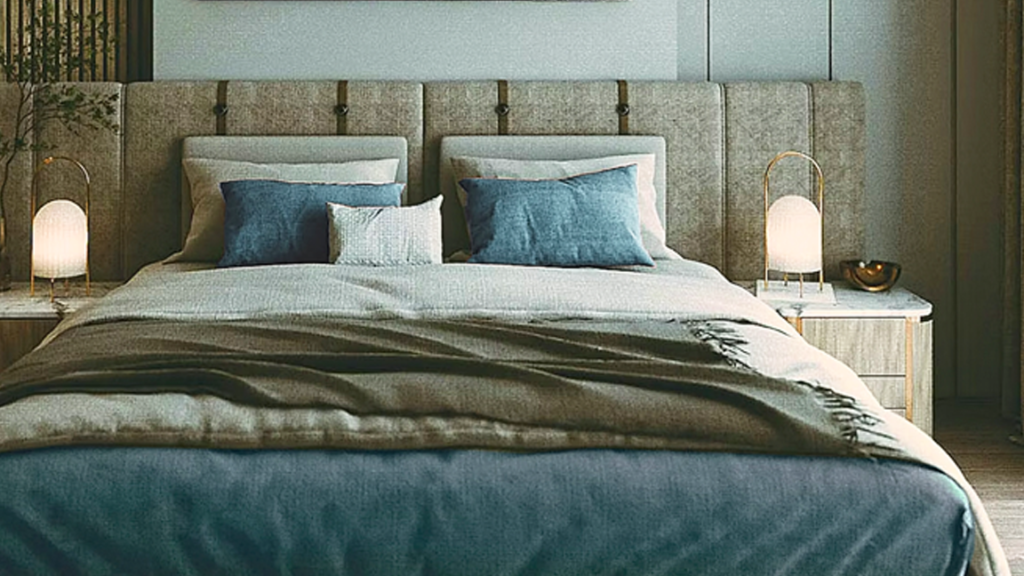
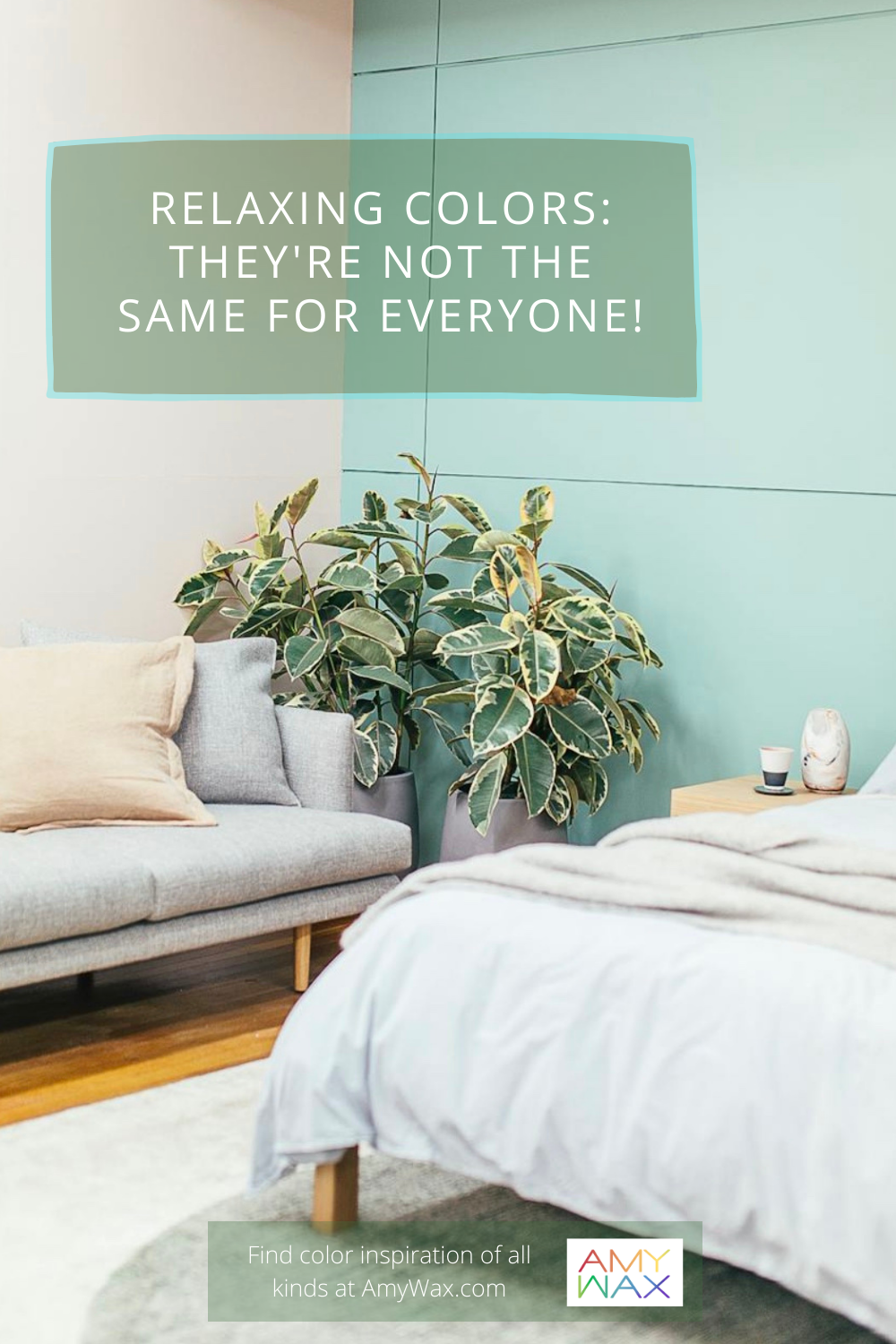
Some of the most immediately recognizable relaxing colors are those on the cool spectrum of hues, such as delicate shades of blue, green, and purple. While not all warm colors evoke more excitement, cooler colors are more closely associated with serenity, peace, quietness, and being clear-minded. That being said, there are times when this does not exactly apply…read on.
Relaxing colors do not butt heads. They flow seamlessly from one to the other; again, it’s why contrast is avoided when arranging relaxing color palettes; this doesn’t mean that relaxing color must be monochromatic, but the variations in hues and saturation must be minimal to maintain a relaxed presentation.
Everyone has deep, long-standing associations and experiences with color, whether they consciously know it or not. These associations may evoke positive or negative feelings, and if that’s the case, certain colors will trigger a negative response, not a positive, relaxing one.
For example, If I recommend that a client choose a soft sky blue or gentle lavender for the bedroom, but they tell me those colors make them feel melancholy. Perhaps they had a room with those colors in the past, and it was not a happy time in their life. I would pivot to something with a little more “quiet energy,” such as a soft teal or quiet earth tone, and that slight variation can make a significant difference in how they vibe with the space.
For clients who want to create a relaxed atmosphere but don’t necessarily want to lean toward cooler colors, I find that earth tones are a wonderful alternative to traditional relaxing color arrangements. Earth tones can have hints of warmth; warm neutral tones, like a winter white or whispery soft beige or pale peach, can add a comforting and inviting element to a space without overpowering its calming effect. Life experiences can also become intertwined with our comfort level with colors. Think of a warm sandy beige, a soft brown soil, or muted moss green. These colors are not cool or even at low saturation points. Still, their combinations are reminiscent of nature and the beauty of the world around us, which many people find instinctually relaxing.
As I mentioned, this is where I find people’s life experiences affect their relationship to color: times when rooms that were the most supportive (or not) are tied to a color that will forever be associated with that memory, good or bad. Talking that through can be tremendously helpful before choosing relaxing colors for a home.
So, tell me, what colors help you relax? Do you find that the traditionally cool color selections help you relax, or do you find something different, like a rich charcoal gray, that embraces you and puts you into that quiet zone? Please tell me, I’d love to hear what color association you have with relaxation.
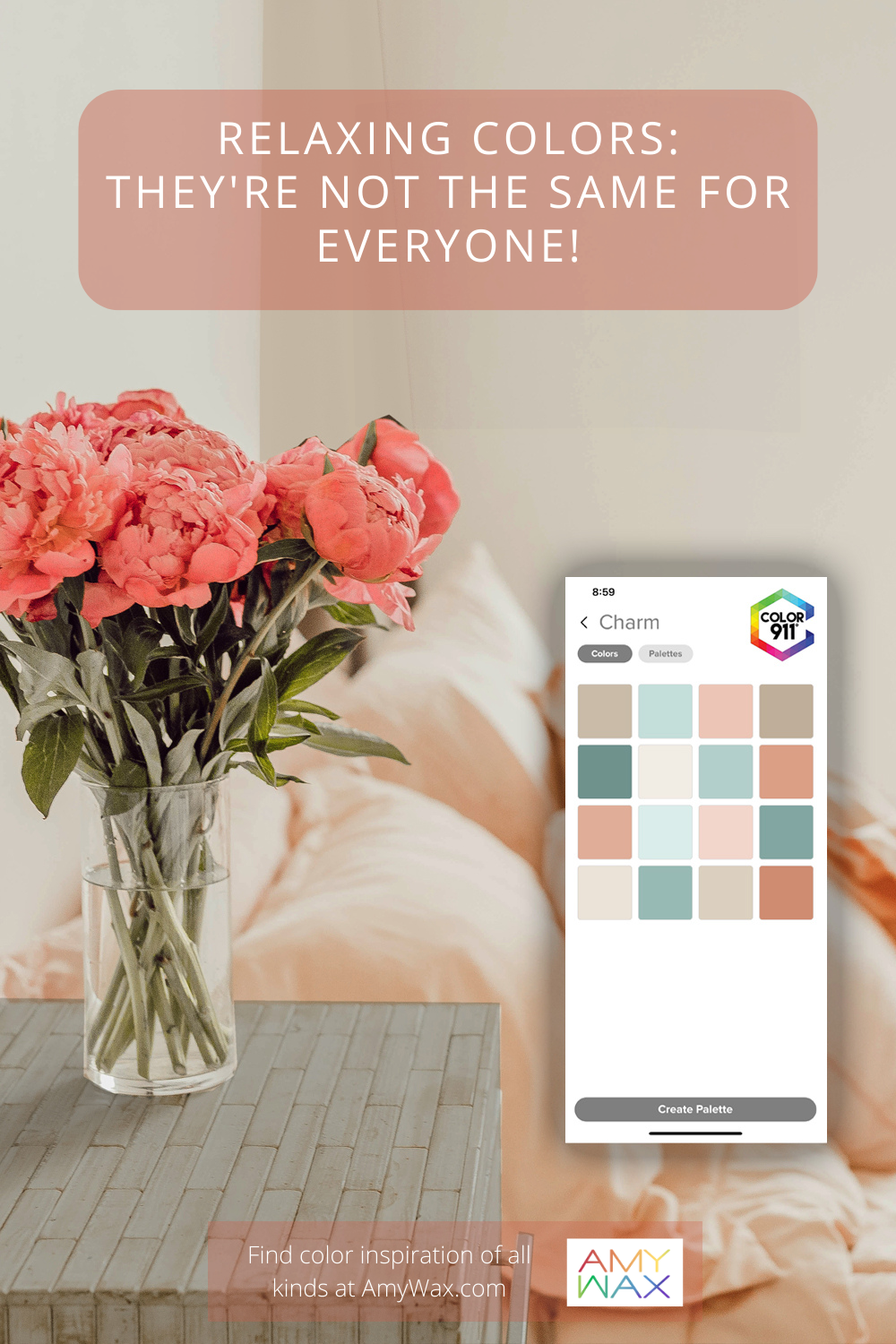
If you’d like to explore some relaxing color arrangements I’ve curated, please check out the Color911 app for dozens of options!