Walk down almost any commercial strip or business park, and you’ll notice a pattern. Gray façades. White trim. Neutral interiors. Clean, modern, and often completely forgettable! There’s nothing inherently wrong with neutral color design/color schemes; they can be calming and timeless. But when every storefront, office, and mixed-use building leans the same way, the result is a landscape that blends rather than stands out. And in a world where first impressions matter more than ever, using an unimaginative color palette is clearly a missed opportunity.
The good news? Creating a memorable storefront or commercial space doesn’t require bold/jarring color or risky short-sighted design choices!
Neutral palettes dominate commercial design for understandable reasons. They feel “safe.” They age well, and for stakeholders, they don’t offend (or at least they think they don’t). Developers and business owners often want something that appeals to everyone and ages gracefully. Not to mention, something they can sell/turnover that doesn’t require the buyer to endure reconstruction costs.
But safe doesn’t always mean effective. When everything is gray, white, or beige, nothing stands out. Customers subconsciously respond to places that draw them in, inspire them, and feel welcoming and intentional. Commercial business owners should aim to foster a sense of identity that aligns with the business’s core, their message, or even what they are selling!
Storefronts offer one of the best opportunities to use color in a way that feels natural and engaging. Unlike large commercial buildings or high-rises, storefronts operate at a human scale. They’re experienced up close and on foot; color plays a major role in how inviting they feel.
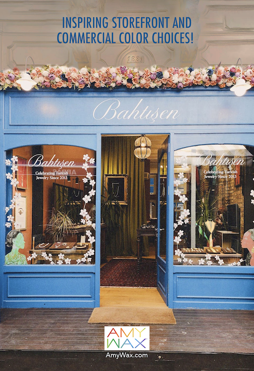
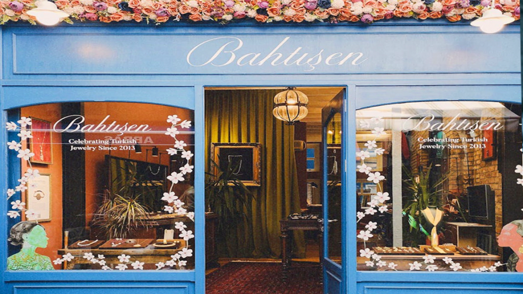
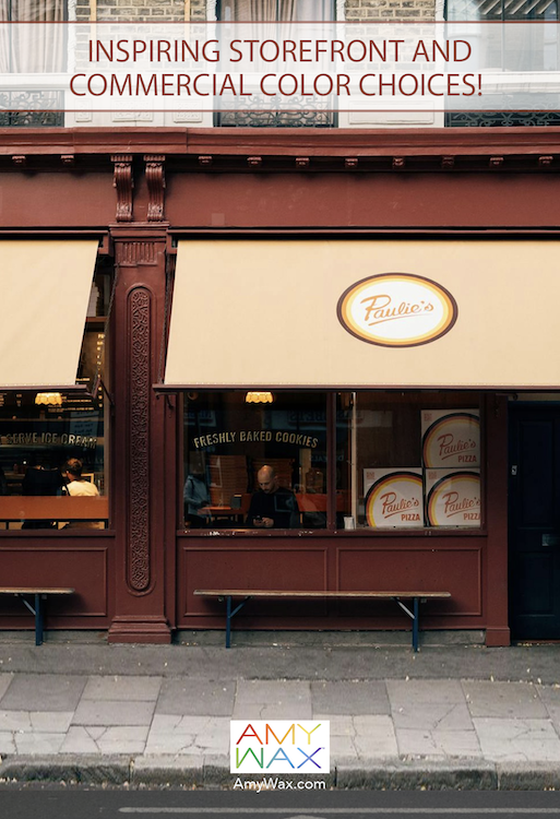
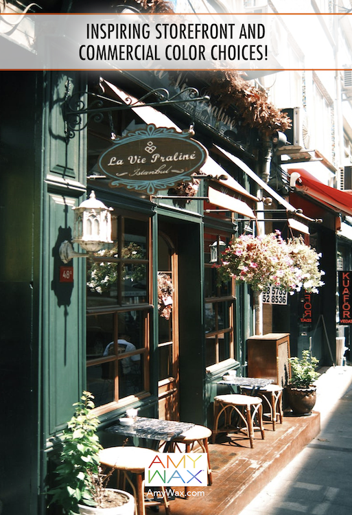
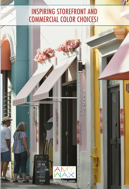
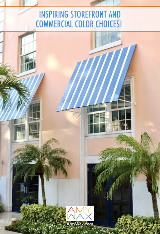
A soft blush façade with striped awnings, a muted blue storefront with crisp trim, or a deep green exterior paired with warm wood details can all send a subtle message: come in, stay awhile! These colors don’t shout for attention, but they do create warmth and memorability.
Awnings are a particularly effective tool; they can add color without committing to a full façade change and can be updated more easily over time or as the residents change. Even something as simple as a striped or tonal awning can bring charm and character to an otherwise neutral building.
For larger commercial properties, the approach is different, but no less important. High-rises and office buildings benefit from restraint, but that doesn’t mean they have to feel cold or anonymous.
Here, color works best in the details:
Instead of painting entire façades bold/loud colors, color consultants often rely on depth and contrast, like layering stone, metal, glass, and greenery to create dynamics and harmony. Consider adding the building or company name in a creative, possibly colorful way!
One of the most important questions to ask when choosing color for a commercial space is: What should this space feel like? Some businesses benefit from colors that energize, think warm terracottas or playful pastels that suggest creativity and movement. Others do better with grounding tones: deep greens, soft blues, or earth tones that convey trust and calmness.
A café might want to feel cozy and inviting. A boutique may lean into charm and personality. A professional office may prioritize calm confidence. Color helps tell that story before a single word is spoken.
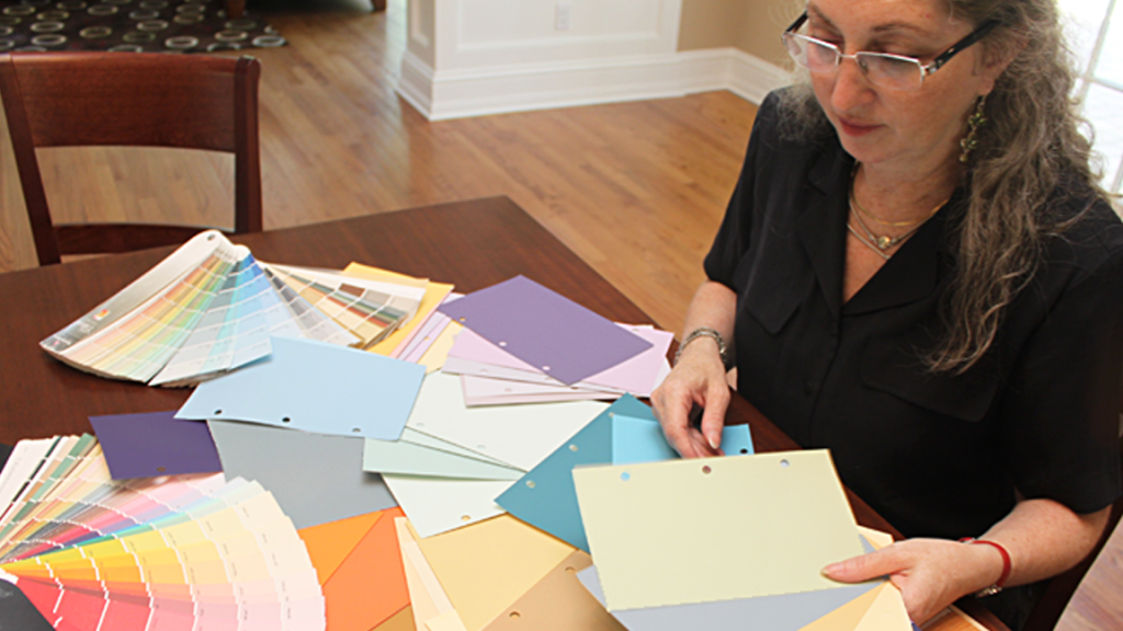
The most successful commercial designs are rarely impulsive. They’re planned thoughtfully, often long before paint is ever selected. Inspiration is gathered. The surrounding environment is considered. Materials are chosen with the utmost care. This kind of design thinking allows color to evolve naturally within the space, rather than being thrown on as an afterthought. When designing your storefront or interior space, think about which colors tell your story. When it’s done well, your story is told with your clients in mind!
The goal isn’t to outshine neighboring buildings or compete for attention. It’s to create a space that feels intentional. Sometimes that means a softly colored façade paired with classic architecture. Other times it’s a pop of color in an awning, a beautifully painted door, or a storefront that reflects the warmth inside. Even small choices, like trim color or exterior lighting, can dramatically change how a space feels.
As a trusted color expert, please remember this: In a sea of gray and white, thoughtful commercial color choices are a quiet form of confidence. It signals care and shows that the place of commerce isn’t just rinse-and-repeat, it’s about welcoming the customer inside, which is what it is all about!